https://youtube.com
https://youtube.com
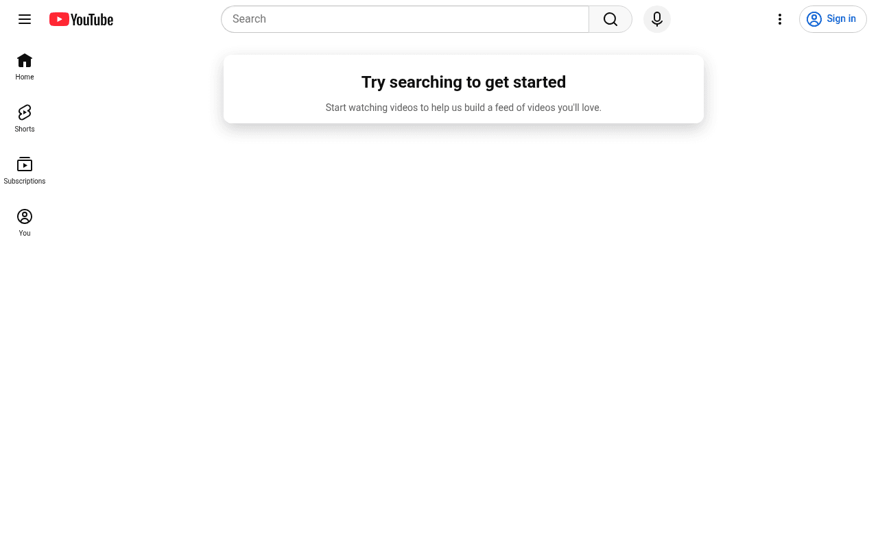
Screenshot of youtube.com
35of 100
F

YouTube's homepage is showing a logged-out visitor a blank white canvas with a single card saying 'Try searching to get started' — the world's second-largest search engine is failing to merchandise its own content. No trending videos, no featured channels, no value proposition — just an existential void and a Sign In button.

Your action plan

Ordered by conversion impact. Click any fix to see the before → after.

1
Surface trending and recommended content for logged-out users
High ImpactSome WorkMain content area — currently blank white space below the 'Try searching to get started' card
Currently
Empty page with single prompt card and no video thumbnails
Recommended
Display trending videos, top categories, and featured channels in a multi-column grid identical to what signed-in users see, gated content can prompt sign-in on click
Logged-out homepage abandonment is driven by zero content value signal — Netflix and Spotify both show content previews to unauthenticated users, dramatically increasing conversion to sign-up

Copy rewrites

Ready to use

Drop-in replacements for your highest-leverage text. Each rewrite explains the conversion principle behind it.

Main prompt card headline
Try searching to get started
Find anything. Watch everything. Search to begin.
Benefit-first framing replaces a passive instruction with an active value promise, increasing motivation to engage
Main prompt card subline
Start watching videos to help us build a feed of videos you'll love.
Search any topic to discover videos — sign in to save your favorites and get a personalized feed.
Specificity and dual-path CTA — gives both anonymous and sign-in paths a clear next action, reducing decision paralysis
Meta description (SEO and social sharing)
Enjoy the videos and music you love, upload original content, and share it all with friends, family, and the world on YouTube.
Watch trending videos, discover new creators, and share what you love — free on YouTube, the world's largest video platform.
Specificity and social proof — 'trending' and 'largest' add urgency and authority missing from the generic current version
💡

The killer move

High Impact
Implement a logged-out homepage with curated content rows like YouTube TV does

YouTube TV and YouTube Kids both show rich content grids to unauthenticated users — applying the same pattern to youtube.com for logged-out desktop visitors would immediately demonstrate platform value, reduce bounce rate, and create natural sign-in prompts at the moment of content desire rather than before it.

How visitors experience your page

Second-by-second walkthrough.

1 mixed4 weak
0-3 secondsWeak
0-3s first impression: YouTube logo, search bar, Sign In button, left nav with Home/Shorts/Subscriptions/You, and a single centered card on a white background
Visitor recognizes the brand instantly but sees no content — the page communicates nothing about what to watch or why to stay, creating immediate bounce risk for casual browsers
3-8 secondsWeak
3-8s orientation: The 'Try searching to get started' card with subline about building a feed — nothing else in the content area
Visitor understands they need to act first before getting value — this reverses the normal content-then-engagement funnel and creates friction, especially for new users unfamiliar with YouTube
8-15 secondsMixed
8-15s exploration: Left sidebar navigation items: Home, Shorts, Subscriptions, You — all requiring sign-in or interaction to populate
Curious visitor may click Home or Shorts hoping for content, but Subscriptions and You are clearly account-dependent — moderate chance of search bar engagement from motivated users
15-30 secondsWeak
15-30s consideration: Blank white lower page, no content, no social proof, no trending section, no featured creators
Visitor who has not searched or signed in sees nothing to justify staying — high probability of back-navigation or tab close at this stage
30+ secondsWeak
30s+ decision: Footer with legal links, About, Creators, Advertise — no content has loaded without user action
Only highly motivated visitors who already know what they want to search will convert; casual discovery visitors have been given no reason to stay, sign up, or explore

Health check

8 dimensions, weighted by conversion impact.

First impression & hero
20%
3/10
Blank canvas with a single prompt card — no content, no value demonstration, no reason to stay above the fold
Copy & messaging
20%
4/10
'Try searching to get started' is functional but passive — no benefit framing, no platform value communicated
Call-to-action
15%
4/10
Sign In button exists but has no benefit context; the page offers no secondary CTA path for anonymous browsing
Trust & social proof
15%
2/10
Zero social proof visible — no user counts, no trending content, no creator highlights on the entire page
Visual design & layout
10%
5/10
Clean and on-brand but the layout is 90% empty white space — design competence wasted on absent content
Page structure & flow
8%
3/10
Single card in a sea of white with no logical content hierarchy — flow ends immediately after the prompt
Technical & SEO signals
7%
7/10
Performance score 89, LCP 1.3s and CLS 0.00 are excellent — technical foundation is strong even if content is absent
Differentiation & positioning
5%
2/10
The homepage of the world's largest video platform communicates no unique value — a blank page differentiates nothing

Page speed

Based on real Chrome user data
89/100
Overall score
Combined performance rating
1.3 s
Largest paint
Time until the main content is visible
0.00
Layout shift
How much the page moves while loading
1.5 s
First paint
Time until something first appears
81 ms
Responsiveness
How fast the page reacts to clicks

Want mobile analysis and fresh re-runs?

Buy roasts to unlock mobile analysis, re-analyze on demand, and more for youtube.com.

See roast packs →