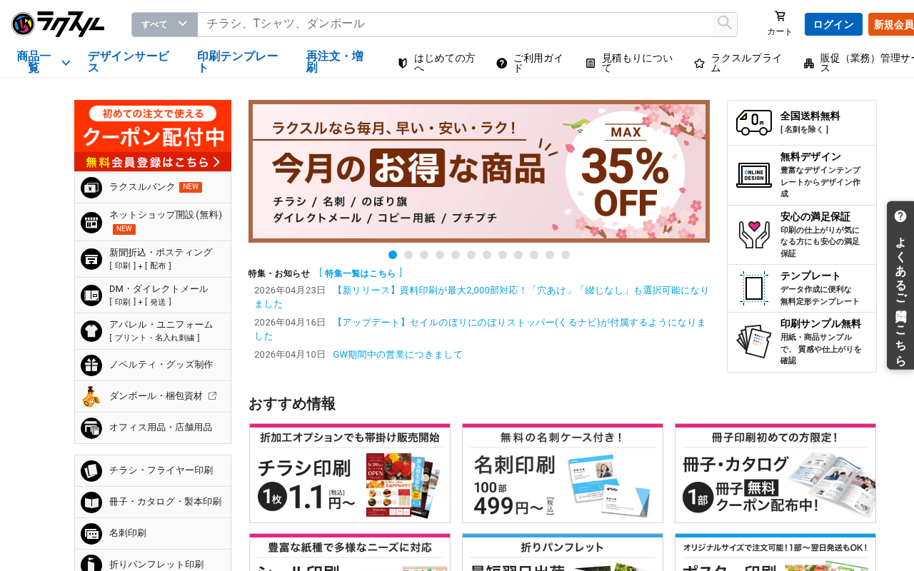
https://raksul.com
https://raksul.com
Screenshot of raksul.com
55of 100
C−

The hero banner screams '35% OFF' but buries the value proposition under a cherry-blossom carousel that competes with a left-rail category menu, a right-rail trust block, AND a coupon banner — four competing focal points above the fold. The page works like a department store flyer, not a conversion machine: everything is promoted, so nothing is.

Your action plan

Ordered by conversion impact. Click any fix to see the before → after.

1
Consolidate above-fold focal points into a single hero CTA
High ImpactSome WorkHero carousel + left category rail + right trust block + coupon banner — all visible simultaneously above fold
Currently
Four distinct content zones compete for attention: coupon banner (left), hero carousel (center), trust icons (right), nav mega-menu
Recommended
Reduce right trust block to 2 icons max above fold; move coupon banner inline with hero CTA button; give hero one clear CTA button: 新規会員登録で初回クーポンをもらう
Hick's Law: decision time increases logarithmically with number of choices. Four competing CTAs above fold measurably reduce click-through on any single one.

Copy rewrites

Ready to use

Drop-in replacements for your highest-leverage text. Each rewrite explains the conversion principle behind it.

Hero carousel headline
ラクスルなら毎月、早い・安い・ラク!
チラシ1枚1.1円〜。最短翌日発送、全国送料無料。
Specificity principle: concrete price anchor (1.1円) and delivery promise outperform vague benefit claims. Mirrors the product card copy already on page for consistency.
Left-rail coupon banner CTA
無料 会員登録はこちら
無料登録して初回クーポンをもらう →
Benefit-first CTA: stating what the user receives (クーポン) before the action reduces friction and increases click intent.
Meta title
印刷のことなら格安・激安の印刷通販【ラクスル】
ネット印刷ならラクスル|チラシ1枚1.1円〜・翌日発送・全国送料無料
Specificity and differentiation: price anchor + delivery speed + free shipping in title improves CTR from search results (Backlinko CTR data supports benefit-led titles).
H1 tag (below fold)
さっそく印刷のラクスルを試してみませんか?
印刷通販ラクスル — 50万社が選ぶ格安・翌日発送の印刷サービス
Social proof + specificity: the current H1 is a weak question with no value signal. This version anchors authority (50万社) and key differentiators for both SEO and on-page conversion.
💡

The killer move

High Impact
Launch a personalized first-visit overlay with a single product recommender

First-time visitors (detectable via cookie) see a 3-question modal: What are you printing? How many copies? When do you need it? — then land on a pre-filtered product page with the coupon pre-applied. This collapses the category-navigation friction into a guided funnel, directly addressing the paralysis caused by 15+ left-rail categories, and ties the coupon incentive to a specific conversion action rather than a passive banner.

How visitors experience your page

Second-by-second walkthrough.

2 strong2 mixed1 weak
0-3 secondsMixed
0-3s First impression: Logo, search bar, login/register buttons, left category rail, hero carousel with 35% OFF, right trust icons, coupon banner
Visitor recognizes a print service but faces 4 competing visual zones. Brand is established but the eye has no clear landing point — likely scans discount first, then hesitates on next action.
3-8 secondsStrong
3-8s Value assessment: Hero carousel product list (チラシ/名刺/のぼり旗), 35% OFF badge, trust icons (全国送料無料, 無料デザイン, 満足保証), coupon offer
The combination of discount + free shipping + free design + satisfaction guarantee is genuinely compelling. Visitor likely feels this is a credible, value-oriented service and moves toward category exploration.
8-15 secondsMixed
8-15s Category navigation: Left rail with 15+ category links, おすすめ情報 product cards (チラシ1.1円, 名刺499円, 冊子), news/updates section
Price-anchored product cards are effective conversion triggers. However the left rail has too many options without hierarchy — visitors seeking a specific product may click correctly, but undecided visitors risk paralysis.
15-30 secondsStrong
15-30s Trust validation: ラクスルで売れている印刷商品 grid with prices, 活用事例 case study section, お役立ちコンテンツ
Best-seller framing with prices builds confidence. Case studies add legitimacy. Visitor is likely moving toward a specific product page — the page is doing its job here, though testimonials with names/companies are absent.
30+ secondsWeak
30s+ Decision or exit: ご注文の手順 flow diagram, ご利用ガイド links, SNS icons, massive footer with category links
The order flow diagram is buried far below fold where only committed visitors reach it. First-time visitors who needed this reassurance earlier may have already exited. No exit-intent capture or persistent registration nudge exists.

Health check

8 dimensions, weighted by conversion impact.

First impression & hero
20%
5/10
Discount is visible but four competing above-fold zones dilute focus; no single dominant CTA or trust anchor in the hero.
Copy & messaging
20%
6/10
Price-specific product cards are effective; hero headline is vague and the H1 is a weak question buried below fold.
Call-to-action
15%
5/10
Registration CTA exists but is small and disconnected from the coupon offer; no persistent or contextual CTA throughout scroll.
Trust & social proof
15%
6/10
Free shipping, free design, and satisfaction guarantee icons are present but no customer count, review scores, or named testimonials appear.
Visual design & layout
10%
6/10
Clean grid system and consistent iconography, but above-fold density creates visual noise that undermines hierarchy.
Page structure & flow
8%
5/10
Order process diagram is far below fold; new visitor onboarding logic is inverted — trust-building content should precede product grids.
Technical & SEO signals
7%
6/10
PageSpeed 80 is acceptable; CLS 0.13 fails Core Web Vitals threshold; 41 images missing alt text hurts accessibility and image SEO.
Differentiation & positioning
5%
6/10
Price leadership is clear via specific price points; speed and free shipping are stated but not dramatized against competitors.

Page speed

Based on real Chrome user data
80/100
Overall score
Combined performance rating
1.7 s
Largest paint
Time until the main content is visible
0.13
Layout shift
How much the page moves while loading
863 ms
First paint
Time until something first appears
111 ms
Responsiveness
How fast the page reacts to clicks

Want mobile analysis and fresh re-runs?

Buy roasts to unlock mobile analysis, re-analyze on demand, and more for raksul.com.

See roast packs →