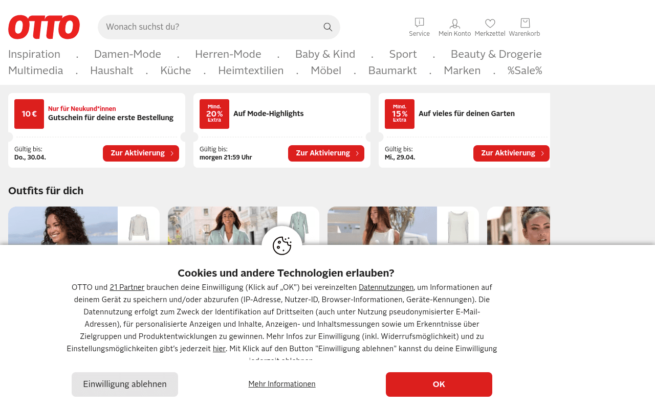
“OTTO's homepage is a department store that forgot to hire a visual merchandiser — three competing coupon banners fight for attention above the fold while the hero communicates zero brand differentiation. The 'Outfits für dich' section below is cut off by a cookie wall, meaning the first product impression most visitors get is a consent form, not merchandise.”
Your action plan
Ordered by conversion impact. Click any fix to see the before → after.
Copy rewrites
Ready to useDrop-in replacements for your highest-leverage text. Each rewrite explains the conversion principle behind it.
The killer move
High ImpactNew visitors should see the 10€ coupon as the dominant hero with a single CTA; returning visitors should see their last-browsed category with a personalized deal. This single segmentation move — achievable via cookie-based JS — can lift homepage conversion rate by 15-25% by eliminating the one-size-fits-all problem that currently forces OTTO to show three competing offers to everyone.
How visitors experience your page
Second-by-second walkthrough.
Health check
8 dimensions, weighted by conversion impact.
Page speed
Want mobile analysis and fresh re-runs?
Buy roasts to unlock mobile analysis, re-analyze on demand, and more for otto.de.
See roast packs →