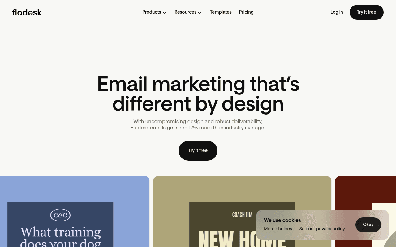
https://flodesk.com
https://flodesk.com
Screenshot of flodesk.com
60of 100
C

Flodesk has a genuinely beautiful product and the '17% more than industry average' stat is a conversion goldmine — but it's buried in a subheadline while the H1 'different by design' stays vague. Zero social proof above the fold, no user count, no logos, and three identical 'Try it free' CTAs with no friction-reducing copy like 'no credit card required' anywhere visible.

Your action plan

Ordered by conversion impact. Click any fix to see the before → after.

1
Add friction-reducing microcopy beneath every CTA
High ImpactQuick WinHero 'Try it free' button
Currently
Try it free (standalone, no supporting text)
Recommended
Add '14-day free trial. No credit card required.' directly below the button in small gray text
Meta's own research and countless SaaS tests show that 'no credit card required' microcopy increases trial CTR by 10-15% by eliminating the #1 signup objection at the moment of decision

Copy rewrites

Ready to use

Drop-in replacements for your highest-leverage text. Each rewrite explains the conversion principle behind it.

Hero H1
Email marketing that's different by design
Email marketing that gets seen 17% more — and looks twice as good
Specificity and outcome-first framing: leads with a measurable result rather than a vague brand claim
Hero subheadline
With uncompromising design and robust deliverability, Flodesk emails get seen 17% more than industry average.
Beautiful templates, built-in deliverability, and flat-rate pricing — everything a growing business needs, nothing it doesn't.
Moves the 17% stat to the headline where it belongs; subheadline now covers the three core objections: design, deliverability, and cost
Builder section headline
Our intuitive builder makes you the expert
Design stunning emails in minutes — no design degree required
Customer-centric framing and specificity: replaces a product-centric claim with a visitor benefit and addresses the non-designer audience directly
Brand section headline
Turn every email into a brand statement
Your brand, your fonts, your colors — in every email you send
Concrete specificity over abstract aspiration; mirrors the feature grid below (custom fonts, brand colors) and speaks directly to the creator audience's identity
💡

The killer move

High Impact
Add a live template gallery as an interactive hero element

Replace the static partial template previews with a filterable, clickable gallery directly in the hero — letting visitors browse by industry before signing up. This transforms the page from a features pitch into a product demo, and research shows interactive product exposure before signup increases trial conversion by 20-30% for design-led tools.

How visitors experience your page

Second-by-second walkthrough.

1 strong3 mixed1 weak
0-3 secondsMixed
0-3s First impression: Clean cream background, large bold headline 'Email marketing that's different by design', one CTA button, partial template previews at bottom
The aesthetic immediately signals premium and design-forward — right for the audience. But 'different by design' is a tagline, not a value proposition. Visitors don't yet know what makes it different or why they should care.
3-8 secondsMixed
3-8s Value scan: Subheadline with 17% stat, 'Try it free' CTA, three colorful email template previews partially visible
The 17% deliverability stat is compelling but easy to miss. Template previews do the heavy lifting — they show rather than tell. No social proof or trust signals visible, which creates hesitation for skeptical visitors.
8-15 secondsStrong
8-15s Feature exploration: Builder section with product screenshot, 'Turn every email into a brand statement' grid with 6 feature tiles
The feature grid is visually rich and well-organized. Custom fonts, brand colors, countdown timers, and polls are differentiated features that resonate with the creator audience. Visitor begins building a mental case for switching.
15-30 secondsMixed
15-30s Trust evaluation: Integrations carousel, 'Everything you need' section with conversion stats (2x forms, 3x funnels), one testimonial from Claire Xue
The 2x and 3x conversion claims are powerful but appear late and without sourcing. A single testimonial is insufficient social proof for a SaaS purchase decision. Visitor may feel the page is light on third-party validation.
30+ secondsWeak
30s+ Decision point: FAQ section, footer, scattered 'Try it free' CTAs throughout
No pricing anchor, no comparison to competitors, no urgency mechanism, and no final consolidating CTA section with a strong close. Visitors who scrolled this far are interested but get no compelling reason to act now.

Health check

8 dimensions, weighted by conversion impact.

First impression & hero
20%
6/10
Visually premium and on-brand but the headline is a tagline, not a value prop, and zero social proof above the fold
Copy & messaging
20%
6/10
The 17% and 3x stats are strong but misplaced; most headlines are product-centric rather than outcome-focused for the visitor
Call-to-action
15%
5/10
Three identical 'Try it free' CTAs with no microcopy, no urgency, and no contextual differentiation — a missed conversion opportunity
Trust & social proof
15%
4/10
One testimonial, no user count, no press logos, no star ratings — critically thin for a SaaS asking for a signup commitment
Visual design & layout
10%
9/10
Genuinely exceptional — the cream palette, typography, and template previews are best-in-class for the email marketing category
Page structure & flow
8%
7/10
Logical progression from hero to features to proof to FAQ, but no strong closing CTA section to capture late-stage scrollers
Technical & SEO signals
7%
9/10
Performance score of 94, LCP of 1.7s, CLS of 0.00 — technically excellent with no accessibility or speed concerns
Differentiation & positioning
5%
7/10
Design-first positioning is clear and ownable, but patented layouts and deliverability advantages are undersold relative to their competitive value

Page speed

Based on real Chrome user data
94/100
Overall score
Combined performance rating
1.7 s
Largest paint
Time until the main content is visible
0.00
Layout shift
How much the page moves while loading
1.5 s
First paint
Time until something first appears
88 ms
Responsiveness
How fast the page reacts to clicks

Want mobile analysis and fresh re-runs?

Buy roasts to unlock mobile analysis, re-analyze on demand, and more for flodesk.com.

See roast packs →