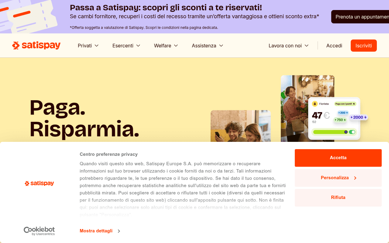
https://satispay.com
Screenshot of satispay.com
60of 100
C

The hero says 'Paga.

Risparmia. Investi.' but the cookie banner eats half the viewport before visitors even read it. The full-page screenshot reveals a page that is 90% pale yellow void — enormous whitespace gaps between sections that kill scroll momentum and bury the 6-million-user social proof far below the fold where it belongs in the hero.

Your action plan

Ordered by conversion impact. Click any fix to see the before → after.

1
Surface social proof inside the hero section
High ImpactQuick WinHero headline area — 'Paga. Risparmia. Investi.'
Currently
Headline + referral code subtext + single CTA, no trust signals visible above fold
Recommended
Add '6 milioni di utenti · 450k negozi · Recensioni 4,8/5' as a trust bar directly beneath the headline, before the CTA
Nielsen Norman research shows trust signals adjacent to the primary CTA increase conversion 15-30%; currently this proof is buried mid-page

Copy rewrites

Ready to use

Drop-in replacements for your highest-leverage text. Each rewrite explains the conversion principle behind it.

Hero headline
Paga. Risparmia. Investi.
Paga. Risparmia. Investi. — tutto da un'unica app, gratis da scaricare.
Specificity: adds the zero-cost barrier removal which is the #1 objection for payment app adoption
Hero subtext
Iscriviti con il codice WEB e ottieni 5€
Scarica l'app ora, inserisci il codice WEB e ricevi 5€ sul tuo conto Satispay.
Clarity and urgency: spells out the exact action sequence, reducing cognitive friction and making the reward feel immediate
Brand positioning statement
Per noi pagare è un po' come dire 'piacere di conoscerti'.
Oltre 6 milioni di italiani pagano, risparmiano e investono con Satispay ogni giorno.
Social proof over metaphor: replaces a vague brand sentiment with a concrete credibility signal that builds trust faster
Announcement banner CTA
Prenota un appuntamento
Prenota ora — scopri lo sconto riservato a te
Urgency and personalization: 'riservato a te' mirrors the banner headline language and adds exclusivity to drive clicks
💡

The killer move

High Impact
Add a real-time social proof ticker to the hero

Display a live or simulated counter showing payments processed today or new users this week — fintech apps like Wise use this to create FOMO and credibility simultaneously, turning the abstract '6 milioni' stat into a visceral, present-tense signal that the network is active and growing.

How visitors experience your page

Second-by-second walkthrough.

1 strong2 mixed2 weak
0-3 secondsMixed
0-3s first impression: Announcement banner (competitor switch offer), nav with Iscriviti CTA, large yellow hero with 'Paga. Risparmia. Investi.' headline and product UI screenshots — then cookie consent modal blocks lower half
Brand is immediately recognizable and the color palette is distinctive, but the cookie modal forces attention away from the value proposition at the worst possible moment
3-8 secondsMixed
3-8s value scan: Hero headline, small referral code text, single 'Scarica l'app' CTA, product UI mockups showing payment flows
The 5€ incentive is present but undersized; visitor understands this is a payment app but hasn't yet seen why it's better than alternatives — no differentiation visible yet
8-15 secondsWeak
8-15s credibility check: Must scroll past large yellow whitespace to reach social proof; 6M users and 4.8/5 rating are below fold
Visitor who hasn't converted on the CTA is looking for reasons to trust; forcing them to scroll through empty space to find proof increases drop-off probability significantly
15-30 secondsStrong
15-30s feature exploration: Three audience segments (Privati, Business, Welfare) with brief descriptions; Buoni Acquisto section
The three-column audience split is clear and well-structured; B2B and B2C visitors can self-select their path, reducing confusion and improving relevance
30+ secondsWeak
30s+ decision: Single testimonial from Andrea, logo strip of partner companies, news articles
Only one named testimonial with no photo is thin social proof for a financial app; visitors considering sharing payment data need stronger trust signals — security certifications, press logos, or volume of reviews

Health check

8 dimensions, weighted by conversion impact.

First impression & hero
20%
6/10
Strong brand identity and clear product category, but cookie modal and buried incentive undercut above-fold conversion potential
Copy & messaging
20%
6/10
Headline is punchy but the brand tagline prioritizes poetry over proof; referral incentive is undersized relative to its conversion value
Call-to-action
15%
6/10
'Iscriviti' and 'Scarica l'app' are present but the primary CTA lacks urgency and the 5€ hook isn't visually tied to the button
Trust & social proof
15%
5/10
6M users and 4.8/5 rating exist but are buried below excessive whitespace; only one testimonial and no security/regulatory badges visible
Visual design & layout
10%
7/10
Distinctive yellow palette and clean typography are on-brand; product UI mockups are well-executed but whitespace management is poor
Page structure & flow
8%
4/10
Full-page screenshot reveals massive dead zones between sections that kill scroll momentum and suggest poor content density planning
Technical & SEO signals
7%
7/10
Excellent performance score of 93 with 1.0s FCP and 1.4s LCP; 79 images missing alt text is a significant accessibility and SEO gap
Differentiation & positioning
5%
5/10
'App di pagamento che mette al centro le persone' is generic; no clear articulation of what makes Satispay better than Revolut or PayPal

Page speed

Based on real Chrome user data
93/100
Overall score
Combined performance rating
1.4 s
Largest paint
Time until the main content is visible
0.01
Layout shift
How much the page moves while loading
1.0 s
First paint
Time until something first appears
115 ms
Responsiveness
How fast the page reacts to clicks

Want mobile analysis and fresh re-runs?

Buy roasts to unlock mobile analysis, re-analyze on demand, and more for satispay.com.

See roast packs →