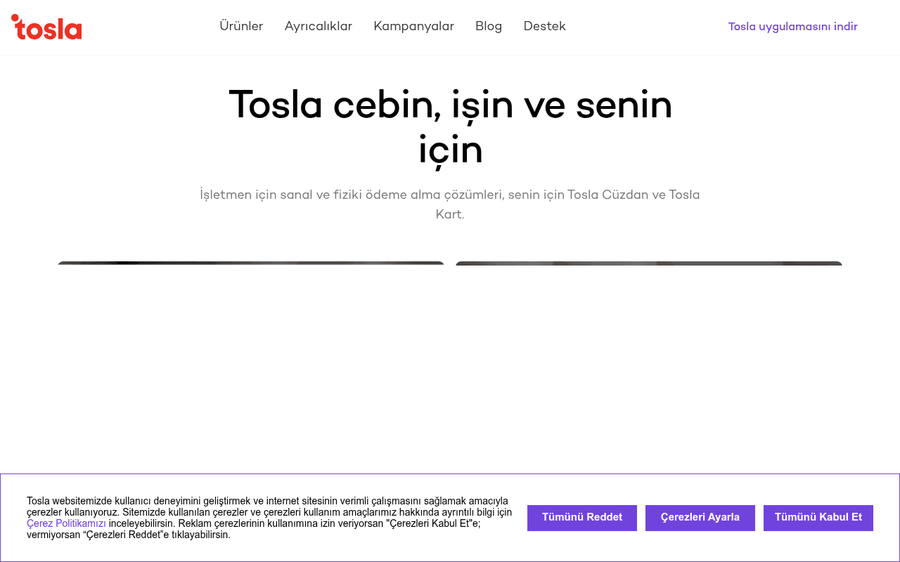
https://tosla.com
https://tosla.com
Screenshot of tosla.com
45of 100
D

The hero headline 'Tosla cebin, işin ve senin için' is poetic but vague — a first-time visitor cannot tell if this is a bank, a POS provider, or a loyalty app. The above-fold has no CTA button, no product visual clarity, and the cookie banner eats 25% of the viewport on load, burying whatever momentum the page had.

Your action plan

Ordered by conversion impact. Click any fix to see the before → after.

1
Add primary CTA button above the fold
High ImpactQuick WinHero section — currently has headline and subtext but zero CTA button visible at 1280px viewport
Currently
No button exists above the fold; first CTAs appear below the hero image
Recommended
Add two side-by-side buttons directly under the subheadline: 'Tosla İşim'e Başla' (red) and 'Tosla Kart'ı İndir' (purple), matching the brand palette already used below
Nielsen's F-pattern research shows users decide within 8 seconds; no above-fold CTA means zero conversion opportunity for bounce visitors

Copy rewrites

Ready to use

Drop-in replacements for your highest-leverage text. Each rewrite explains the conversion principle behind it.

Hero H1
Tosla cebin, işin ve senin için
İşletmene POS, kendine Dijital Kart — Tosla ile her şey cebinde
Specificity: names the actual products (POS, Dijital Kart) so visitors immediately understand the value proposition
Hero subheadline
İşletmen için sanal ve fiziki ödeme alma çözümleri, senin için Tosla Cüzdan ve Tosla Kart.
İşletmeler için sanal POS ve fiziki ödeme çözümleri. Bireyler için ücretsiz dijital cüzdan ve Tosla Kart.
Parallel structure and audience segmentation make it scannable; 'ücretsiz' adds a benefit hook
Tosla İşim section headline
Tosla İşim ile işletmene en uygun çözümü sunuyoruz.
Tosla İşim: Tek ekranda tüm ödemeler, anında raporlama, sıfır karmaşa.
Specificity and benefit-led copy replace a generic promise with three concrete outcomes
Business preference section
İşletmeler Tosla İşim'i neden tercih ediyor?
50.000+ işletme neden Tosla İşim'i seçti?
Social proof: embedding a real number transforms a generic question into a credibility signal
💡

The killer move

High Impact
Implement a two-path interactive hero with live product preview

Replace the static hero with a segmented entry: two large clickable cards — 'Ben bir işletmeyim' and 'Bireysel kullanıcıyım' — that dynamically reveal the relevant product visual and CTA below. This mirrors Stripe's audience-segmentation approach and eliminates the four-button paralysis while personalizing the funnel from the first click.

How visitors experience your page

Second-by-second walkthrough.

1 strong2 mixed2 weak
0-3 secondsWeak
0-3s First Impression: Large centered headline, sparse subtext, no hero image fully visible, no CTA, cookie banner consuming bottom 25% of viewport
Visitor cannot identify the product category or take action; the page reads as a brand statement not a conversion page — high bounce risk
3-8 secondsMixed
3-8s Orientation: Scrolls slightly to find CTA buttons and a woman holding a phone — first product context emerges
Four equal-weight buttons create confusion about which path to take; visitor may click randomly or abandon
8-15 secondsStrong
8-15s Evaluation: Tosla İşim section with three product cards (Sanal POS, Yazar Kasa POS, Kredi ile Ödeme Al) and feature bullets
Product clarity improves significantly here; SMB visitors will find relevant information and likely engage with detail links
15-30 secondsMixed
15-30s Trust Building: Business preference reasons section, Tosla Kart consumer section, partner logos strip (İş birlikleri)
Partner logos are present but tiny and unreadable at this zoom level; no testimonials or user reviews reduce trust-building effectiveness
30+ secondsWeak
30s+ Decision: Campaigns section, large footer with product links, app download prompt
No urgency, no final strong CTA, no testimonials — visitor who reached this point has no compelling reason to convert now rather than later

Health check

8 dimensions, weighted by conversion impact.

First impression & hero
20%
4/10
Poetic headline, no above-fold CTA, no visible product imagery, cookie banner kills momentum — fails the 8-second test
Copy & messaging
20%
5/10
Subheadline explains the dual audience but lacks specificity, benefit language, and quantified proof throughout
Call-to-action
15%
4/10
Four equal-weight CTAs below the fold create choice paralysis; zero CTAs above the fold is a critical conversion gap
Trust & social proof
15%
3/10
No testimonials, no user counts in metadata, partner logos present but illegible — fintech audience needs much stronger trust signals
Visual design & layout
10%
6/10
Clean brand palette, good use of red and purple to segment audiences, but hero whitespace is excessive and wastes premium real estate
Page structure & flow
8%
5/10
Logical B2B then B2C flow but no sticky CTA, no progress anchors, and the jump from hero to product cards is abrupt
Technical & SEO signals
7%
7/10
PageSpeed 95 with 1.1s FCP is excellent; however missing meta description and no H1/H2 tags in metadata signals SEO neglect
Differentiation & positioning
5%
4/10
No clear statement of why Tosla beats Iyzico, PayTR, or other Turkish fintech competitors — unique value proposition is absent

Page speed

Based on real Chrome user data
95/100
Overall score
Combined performance rating
1.8 s
Largest paint
Time until the main content is visible
0.01
Layout shift
How much the page moves while loading
1.1 s
First paint
Time until something first appears
41 ms
Responsiveness
How fast the page reacts to clicks

Want mobile analysis and fresh re-runs?

Buy roasts to unlock mobile analysis, re-analyze on demand, and more for tosla.com.

See roast packs →