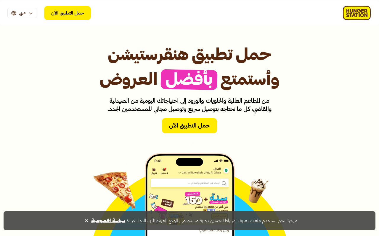
https://hungerstation.com
Screenshot of hungerstation.com
55of 100
C−

HungerStation has a technically flawless page (98 PageSpeed) but wastes its hero on a generic 'download for best offers' headline when it has 55,000+ stores and free delivery for new users — two killer hooks buried in the subtext. The CTA button appears four times yet never once tells users what platform they're downloading for, and there's zero social proof beyond an awards carousel.

Your action plan

Ordered by conversion impact. Click any fix to see the before → after.

1
Add App Store / Play Store split CTAs with store badges
High ImpactQuick WinHero CTA button 'حمل التطبيق الآن'
Currently
Single generic yellow button with no platform indication
Recommended
Replace with two side-by-side store badge buttons (App Store + Google Play) so users tap directly to their platform without an extra redirect step
App download pages with explicit store badges reduce friction by eliminating the intermediate store-selection step; industry data shows 15-25% lift in conversion when platform intent is matched at click

Copy rewrites

Ready to use

Drop-in replacements for your highest-leverage text. Each rewrite explains the conversion principle behind it.

H1 hero headline
حمل تطبيق هنقرستيشن وأستمتع بأفضل العروض
توصيل مجاني لأول طلب — اطلب من 55,000 متجر الآن
Specificity + loss aversion: leads with the free delivery incentive and the scale of choice, both proven conversion drivers for delivery apps
Hero subtext paragraph
من المطاعم العالمية والحلويات والورود إلى احتياجاتك اليومية من الصيدلية والمقاضي، كل ما تحتاجه بتوصيل سريع وتوصيل مجاني للمستخدمين الجدد.
مطاعم، بقالة، صيدلية، ورود — كل شيء يوصل لبابك خلال 20 دقيقة. توصيل مجاني لأول طلب.
Specificity and urgency: replaces a long list with scannable categories, adds the 20-minute delivery promise (already used in HMarket section) as a concrete speed signal
HungerStation Plus section header
هنقرستيشن بلس
هنقرستيشن بلس — توصيل مجاني غير محدود طوال الشهر
Benefit specificity: the header currently names the product only; adding the core benefit immediately communicates value without requiring users to read the subtext
App download mid-page CTA section headline
حمل تطبيق هنقرستيشن على جوالك واطلب بضغطة زر
حمّل التطبيق الآن واحصل على توصيل مجاني لأول طلب
Incentive-linked CTA: ties the download action directly to an immediate reward, converting a feature statement into a value proposition at the moment of decision
💡

The killer move

High Impact
Personalize the hero by detected city with live delivery time estimate

Use IP geolocation to display the visitor's city name and a real-time average delivery estimate in the hero — 'يوصل لك في الرياض خلال 22 دقيقة' — converting an abstract promise into a concrete, personal commitment that dramatically reduces the psychological distance between browsing and ordering.

How visitors experience your page

Second-by-second walkthrough.

1 strong2 mixed2 weak
0-3 secondsMixed
0-3s first impression: Large Arabic headline, pink-highlighted 'بأفضل العروض', yellow CTA button, HungerStation logo top-right, phone mockup partially visible
Brand is instantly recognizable to existing users; new users see a command to download without a clear reason why — the value proposition is not front-loaded, risking immediate bounce from undecided visitors
3-8 secondsMixed
3-8s value scan: Subtext mentioning restaurants, sweets, flowers, pharmacy, fast delivery, free delivery for new users; single CTA button
Free delivery for new users is a strong hook but it's buried in dense subtext; visitors who skim (most of them) will miss it entirely and not feel compelled to act
8-15 secondsStrong
8-15s category exploration: Category grid: Merchants, HMarket, Groceries, Self-pickup, Flowers, Pharmacy with 'اكتشف الان' links
The category section effectively communicates breadth of service; the 20-minute delivery promise in HMarket is a concrete differentiator that builds confidence in speed
15-30 secondsWeak
15-30s trust evaluation: Regions served list, HungerStation Plus and Rewards sections, mid-page app download banner with QR code
No user ratings, no download count, no testimonials — the QR code is a nice touch for desktop but the absence of social proof at this trust-evaluation stage leaves skeptical visitors without reassurance
30+ secondsWeak
30s+ decision and scroll-out: Award-winning restaurants carousel, partner/driver recruitment sections, footer with links
The awards carousel is brand-centric rather than user-centric; visitors who reached this point without converting needed a testimonial or rating nudge, not restaurant accolades — likely to exit without downloading

Health check

8 dimensions, weighted by conversion impact.

First impression & hero
20%
6/10
Strong brand presence and clean layout, but the headline leads with the action not the benefit, and free delivery — the strongest hook — is hidden in subtext
Copy & messaging
20%
5/10
Copy is functional and covers the category breadth well but lacks specificity, urgency, and quantified claims that would accelerate decision-making
Call-to-action
15%
5/10
CTA appears four times which is good frequency, but the generic label and absence of platform-specific store badges create unnecessary friction for the core conversion goal
Trust & social proof
15%
3/10
No app store ratings, no download numbers, no user testimonials anywhere on the page — the awards carousel is the only proof element and it is brand-facing, not user-facing
Visual design & layout
10%
7/10
Consistent brand colors, clean RTL layout, good use of food imagery and phone mockup; the yellow-on-cream palette is distinctive and on-brand
Page structure & flow
8%
7/10
Logical flow from hero to categories to savings to app download to awards; the mid-page QR code banner is a smart desktop-specific conversion touchpoint
Technical & SEO signals
7%
9/10
Exceptional PageSpeed score of 98, FCP under 1s, LCP 1.1s, CLS 0.02 — technically near-perfect; all images have alt text; canonical and OG tags properly set
Differentiation & positioning
5%
5/10
55,000+ stores and 20-minute delivery are genuine differentiators but are not prominently positioned; the page reads like a generic delivery app rather than a market leader

Page speed

Based on real Chrome user data
98/100
Overall score
Combined performance rating
1.1 s
Largest paint
Time until the main content is visible
0.02
Layout shift
How much the page moves while loading
996 ms
First paint
Time until something first appears
39 ms
Responsiveness
How fast the page reacts to clicks

Want mobile analysis and fresh re-runs?

Buy roasts to unlock mobile analysis, re-analyze on demand, and more for hungerstation.com.

See roast packs →