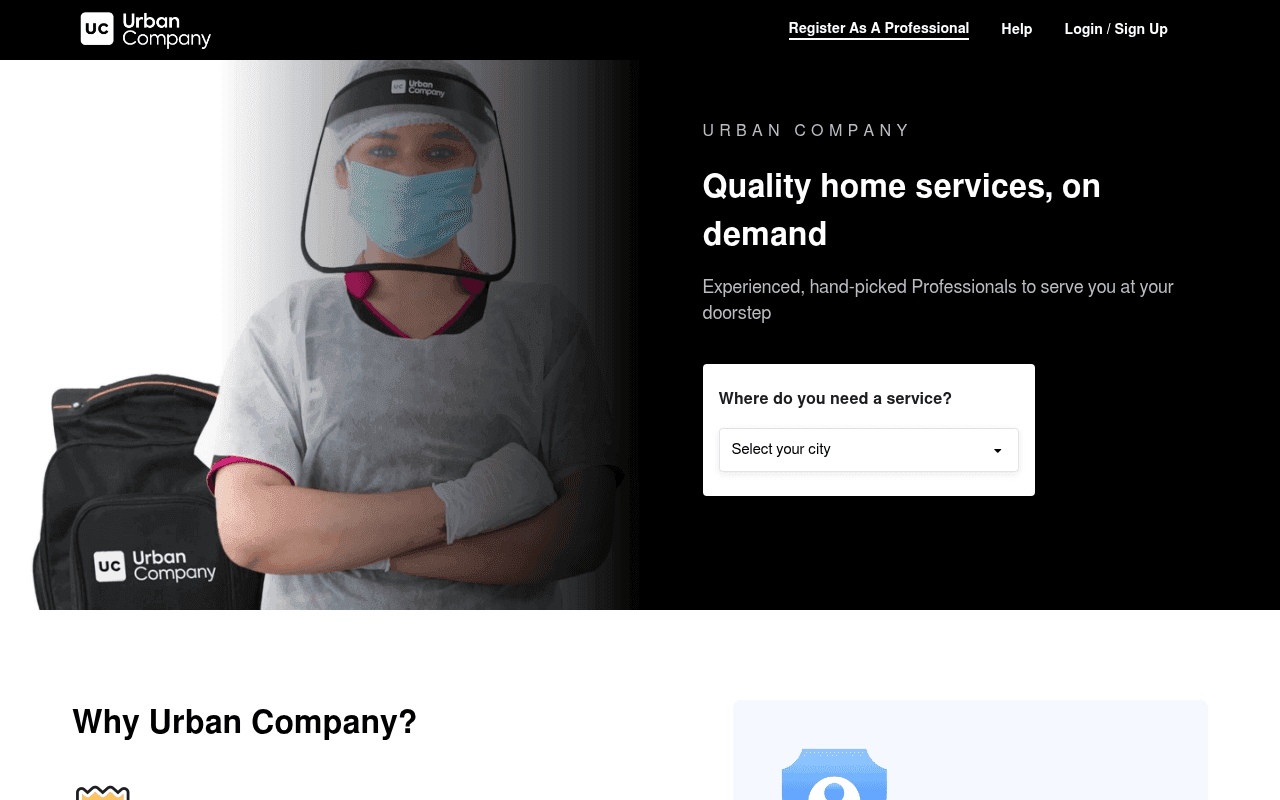
https://www.urbancompany.com
Screenshot of urbancompany.com
50of 100
D

The hero asks visitors to 'Select your city' with zero services shown above the fold — you're asking for commitment before showing value. The masked professional image communicates safety but not aspiration, and 128 images lack alt text on a page that lives and dies by SEO. The city dropdown is the entire conversion mechanism yet sits alone with no urgency, no service previews, and no social proof in sight.

Your action plan

Ordered by conversion impact. Click any fix to see the before → after.

1
Add service category icons above the city dropdown
High ImpactSome WorkHero section — city dropdown widget
Currently
Single 'Select your city' dropdown with no service context
Recommended
Show 6-8 top service icons (AC repair, cleaning, beauty, plumber) above the dropdown so users see what they can book before committing to location
Showing product before asking for input reduces friction — Fogg Behavior Model: motivation must precede prompt. Users need to see value before they act.

Copy rewrites

Ready to use

Drop-in replacements for your highest-leverage text. Each rewrite explains the conversion principle behind it.

H1 hero headline
Quality home services, on demand
Expert home services, booked in 60 seconds
Specificity and speed — quantifying ease of booking reduces perceived effort and increases conversion intent
Hero subheadline
Experienced, hand-picked Professionals to serve you at your doorstep
Vetted, background-checked professionals. Fixed prices. 100% satisfaction guarantee.
Addresses top 3 objections (trust, price surprise, quality risk) in one line — objection handling as subheadline is a proven conversion pattern
Why Urban Company — Quality Assured callout
100% Quality Assured — If you don't love our service, we will make it right.
100% Satisfaction Guarantee — Not happy? We re-do the job or refund. No questions asked.
Specificity of guarantee mechanics (redo or refund) is more credible and persuasive than vague assurance language
City dropdown label
Where do you need a service?
Find professionals near you — select your city
Action-oriented framing with benefit context reduces dropdown abandonment by clarifying what happens next
💡

The killer move

High Impact
Personalize the hero by geo-IP to show local services and real booking counts

Detect visitor location via IP and pre-populate the city while showing the top 3 most-booked services in that city with live booking counts (e.g. '2,847 AC repairs booked in Dubai this month'). This eliminates the dropdown friction entirely and injects hyper-local social proof at the exact moment of first impression — the single highest-leverage change available.

How visitors experience your page

Second-by-second walkthrough.

1 strong2 mixed2 weak
0-3 secondsMixed
0-3s first impression: Dark hero with masked professional, brand name, headline 'Quality home services, on demand', city dropdown
Brand is recognizable to returning users but new visitors see a masked worker and a dropdown — no immediate signal of what services exist or why to trust this platform over alternatives
3-8 secondsWeak
3-8s value scan: Subheadline, city dropdown, no service categories, no ratings or review counts
Visitor looks for 'what can I book' and finds only a location gate. No service previews means high-intent users with specific needs (AC repair, cleaning) cannot self-identify — likely to bounce or scroll
8-15 secondsMixed
8-15s trust evaluation: Why Urban Company section: transparent pricing, experts only, fully equipped, 100% quality assured
Trust signals exist but are below the fold and text-heavy. No customer ratings, review counts, or named testimonials. Visitor thinks 'these are claims, not proof' — credibility gap remains
15-30 secondsStrong
15-30s service discovery: Services Offered section with KSA, India, UAE, Singapore tabs — dense list of service links
Breadth of services is impressive and SEO-rich, but the visual density is overwhelming. High-intent users scanning for their specific service may find it, but the experience feels like a sitemap not a marketplace
30+ secondsWeak
30s+ decision or exit: App download section, footer with city links, no testimonials, no pricing previews, no urgency signals
No closing argument — no reviews, no 'book now' CTA reinforcement, no urgency. Users who scrolled this far are interested but get no final push to convert. App section is the only CTA and it asks for a phone number with no incentive

Health check

8 dimensions, weighted by conversion impact.

First impression & hero
20%
5/10
Clean layout but the city dropdown alone above the fold creates a commitment-before-value problem; no social proof or service previews visible
Copy & messaging
20%
5/10
Headline is generic, subheadline lists features not benefits, and trust copy below fold makes claims without evidence
Call-to-action
15%
4/10
City dropdown is the sole above-fold CTA with no supporting context, no button, and no secondary action for undecided visitors
Trust & social proof
15%
3/10
Zero ratings, reviews, or customer counts visible anywhere on the page despite being a marketplace where social proof is the primary purchase driver
Visual design & layout
10%
6/10
Clean dark hero with good typography hierarchy, but the services section devolves into an unstructured link dump that undermines the premium positioning
Page structure & flow
8%
5/10
Hero to why-us to services to app download is logical but the gap between hero and first service category is too large; no progressive disclosure
Technical & SEO signals
7%
7/10
Exceptional PageSpeed score of 96 with 878ms LCP; however 128 images missing alt text and zero accessibility score are significant gaps for an SEO-dependent marketplace
Differentiation & positioning
5%
5/10
Transparent pricing and hand-picked professionals are real differentiators but buried below fold as generic bullet points rather than hero-level proof points

Page speed

Based on real Chrome user data
96/100
Overall score
Combined performance rating
878 ms
Largest paint
Time until the main content is visible
0.00
Layout shift
How much the page moves while loading
882 ms
First paint
Time until something first appears
78 ms
Responsiveness
How fast the page reacts to clicks

Want mobile analysis and fresh re-runs?

Buy roasts to unlock mobile analysis, re-analyze on demand, and more for urbancompany.com.

See roast packs →