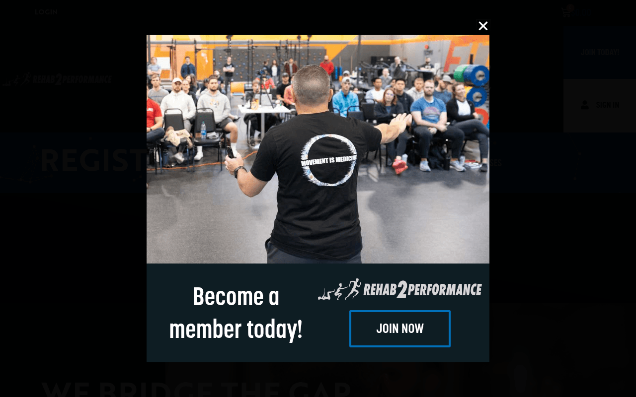
https://rehab2performance.com/
Screenshot of rehab2performance.com
35of 100
F

A popup immediately hijacks the hero — which itself is already buried under a nav with duplicate menus — asking visitors to 'Become a member today' before they've seen a single reason to care. The headline 'We Bridge the Gap' is conceptually sound but the page never converts that concept into a compelling reason to join, buy tickets, or do anything except scroll through dense mission-statement copy.

Your action plan

Ordered by conversion impact. Click any fix to see the before → after.

1
Kill the immediate membership popup
High ImpactQuick WinPopup modal: 'Become a member today! JOIN NOW'
Currently
Popup fires on page load before any value is communicated
Recommended
Trigger popup after 60 seconds or on exit-intent; add one concrete benefit line: 'Join 5,000+ rehab and performance professionals'
Popups on page load before value delivery increase bounce rate by 15-30% (Nielsen Norman Group); visitors need context before a commitment ask

Copy rewrites

Ready to use

Drop-in replacements for your highest-leverage text. Each rewrite explains the conversion principle behind it.

H2 hero headline
We Bridge the Gap
Where Rehab Meets Performance — Join the Community Advancing Both
Specificity and audience mirroring: names the exact professional identity and desired outcome, reducing cognitive load
Hero subheadline
From Rehab 2 Performance
Courses, community, and a framework trusted by 5,000+ clinicians to deliver better patient outcomes
Social proof + specificity: replaces a brand echo with a concrete value proposition that answers 'why should I care'
Popup CTA copy
Become a member today!
Get access to courses, a provider directory, and a network of forward-thinking clinicians — join free
Value-before-ask principle: listing three concrete benefits before the ask dramatically improves popup conversion rates
Meta description (currently null)
R2P is the professional community bridging rehab and performance. Join 5,000+ clinicians for courses, events, and evidence-based tools.
Missing meta description loses click-through from organic search; specificity and social proof in SERP snippets improve CTR by 5-15%
💡

The killer move

High Impact
Lead with the nonprofit and anti-camp identity as the hero differentiator

The fact that R2P is a federally recognized 501(c)(3) and explicitly positions as the 'anti-camp' in a field full of guru-driven certification mills is a powerful, rare differentiator — move this to the hero subheadline and pair it with a member count to instantly separate R2P from every competitor before the visitor scrolls an inch.

How visitors experience your page

Second-by-second walkthrough.

1 mixed4 weak
0-3 secondsWeak
0-3s first impression: A popup covering the hero with 'Become a member today!' and a gym seminar photo before any page content is visible
Visitor is asked to commit before receiving any value; most will dismiss the popup and feel interrupted, increasing bounce probability immediately
3-8 secondsMixed
3-8s hero scan: 'Register Today!' and 'We Bridge the Gap / From Rehab 2 Performance' with a 'Purchase Tickets Today!' button and a circular logo graphic
The tagline is intriguing but abstract; visitor doesn't yet know what they're registering for or what membership delivers — curiosity exists but intent is unclear
8-15 secondsWeak
8-15s value assessment: Dense paragraph copy about 501(c)(3) status, The Functional Approach, biopsychosocial context, and a list of professional types
Wall of mission-statement text with no scannable benefits, no pricing, no testimonials; clinicians are busy — they skim and this section loses them
15-30 secondsWeak
15-30s trust evaluation: Vision, Mission, Values text blocks; 'What We Do' section listing professional types; 'Learn More About R2P' button
No testimonials, no member count, no case studies, no logos — zero third-party validation for a membership org asking for money and professional affiliation
30+ secondsWeak
30s+ decision point: More 'We Are R2P' copy, Student Clubs mention, provider directory CTA, footer
Visitor who scrolled this far is genuinely interested but finds no pricing, no clear membership tiers, no urgency mechanism — likely exits to search for more info elsewhere

Health check

8 dimensions, weighted by conversion impact.

First impression & hero
20%
3/10
Popup fires before hero loads; hero headline is abstract and the primary CTA lacks context about what is being purchased
Copy & messaging
20%
4/10
Mission-statement prose dominates; no outcome-focused copy, no scannable benefit bullets, no voice-of-customer language
Call-to-action
15%
4/10
'Purchase Tickets Today!' and 'Join Now' compete without hierarchy; no pricing context or urgency near either CTA
Trust & social proof
15%
2/10
No testimonials, no member count, no partner logos, no reviews — critical absence for a professional membership organization asking for financial commitment
Visual design & layout
10%
5/10
Dark theme is on-brand for the space but the popup, duplicate navs, and text-heavy sections create visual clutter that undermines credibility
Page structure & flow
8%
4/10
Duplicate navigation renders four times; page jumps from registration CTA to dense mission copy without a logical conversion funnel
Technical & SEO signals
7%
3/10
No meta description, 9 images missing alt text, duplicate nav markup — basic SEO hygiene issues that hurt organic discovery for a community-growth-dependent org
Differentiation & positioning
5%
5/10
'Anti-camp' positioning is genuinely interesting but buried in paragraph 4; the 501(c)(3) nonprofit angle is a differentiator never leveraged in hero or CTAs

Want mobile analysis and fresh re-runs?

Buy roasts to unlock mobile analysis, re-analyze on demand, and more for rehab2performance.com.

See roast packs →