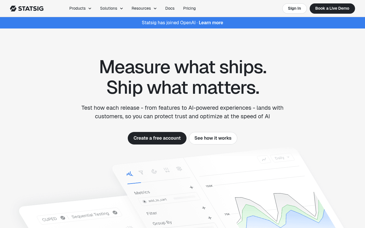
https://www.statsig.com
Screenshot of statsig.com
65of 100
C+

The headline 'Measure what ships.

Ship what matters.' is clever wordplay that sacrifices clarity — a first-time visitor still doesn't know this is an experimentation platform until the subhead. The OpenAI acquisition banner is the most conversion-relevant element on the page and it's styled like a cookie notice. The infrastructure stats (1+ Trillion events/day) are buried below the fold while logo social proof sits above it — the order is backwards.

Your action plan

Ordered by conversion impact. Click any fix to see the before → after.

1
Elevate the OpenAI acquisition banner into a hero trust signal
High ImpactSome WorkBlue announcement bar: 'Statsig has joined OpenAI · Learn more'
Currently
Thin blue banner styled identically to a cookie notice, 14px text, easy to dismiss
Recommended
Integrate into hero section as a credibility badge: 'Now part of OpenAI — trusted by the world's most advanced AI teams' with a distinct visual treatment (logo lockup, not a banner)
Association with OpenAI is the single strongest trust signal on the page. Treating it as an afterthought banner wastes a halo effect that competitors cannot replicate. Social proof from a marquee brand increases conversion rates by 15-30% when prominently placed.

Copy rewrites

Ready to use

Drop-in replacements for your highest-leverage text. Each rewrite explains the conversion principle behind it.

H1 hero headline
Measure what ships. Ship what matters.
The Experimentation Platform Built for AI-Speed Product Teams
Specificity — names the product category and target audience immediately, reducing cognitive load and bounce rate
Hero subheadline
Test how each release - from features to AI-powered experiences - lands with customers, so you can protect trust and optimize at the speed of AI
Run rigorous experiments on every feature and AI release. Get statistically valid results in your warehouse — and ship with confidence, not guesswork.
Specificity and outcome-focus — replaces vague 'protect trust' with concrete workflow benefit; 'not guesswork' creates contrast against the status quo
Section header for product features
There's a smarter way to build great products
One platform for flags, experiments, analytics, and replays — no duct tape required
Differentiation — directly addresses the 'point solution sprawl' pain point that the pricing section later calls out, creating narrative continuity
Announcement banner
Statsig has joined OpenAI · Learn more
Statsig is now part of OpenAI — powering experimentation for the world's leading AI teams. Learn more
Social proof amplification — adds context that makes the acquisition meaningful to prospects rather than just a corporate announcement
💡

The killer move

High Impact
Create an OpenAI-powered social proof flywheel in the hero

Since Statsig now owns the OpenAI relationship, add a live or near-live counter showing 'X experiments run by OpenAI teams this week' or a pull-quote from an OpenAI engineering leader directly in the hero section — this transforms the acquisition from a corporate footnote into a real-time proof point that no competitor can replicate and directly answers the enterprise buyer's question: 'who else trusts this at scale?'

How visitors experience your page

Second-by-second walkthrough.

2 strong3 mixed
0-3 secondsMixed
0-3s First impression: Large nav, OpenAI banner, oversized headline 'Measure what ships. Ship what matters.', two CTAs, partial product screenshot
Visitor registers a polished, modern SaaS page but cannot immediately identify the product category. The clever headline creates a half-second of cognitive work. ICP visitors who already know Statsig feel validated; cold traffic is uncertain and may bounce.
3-8 secondsMixed
3-8s Value scan: Subheadline mentioning 'features, AI-powered experiences, protect trust, optimize at speed of AI', two CTAs, product UI screenshot emerging from bottom
Subheadline adds context but 'protect trust' is vague. Visitor starts to understand this is an experimentation/testing tool but the AI angle feels bolted on. The product screenshot is partially visible — curiosity is created but not resolved above fold.
8-15 secondsStrong
8-15s Category confirmation: Logo bar (OpenAI, Brex, Microsoft, Atlassian), product grid with tabs (Experimentation, Feature Management, Product Analytics, Session Replay), feature descriptions
Logo bar with recognizable brands builds immediate credibility. The product tab grid efficiently communicates breadth. Visitor now understands this is a multi-product platform — the 'smarter way to build' section does its job here, just too far down.
15-30 secondsStrong
15-30s Proof evaluation: Infrastructure stats (1T events, 2.5B subjects, 99.99% uptime), Brex case study with 50% efficiency gain and 20% cost savings, pricing teaser section
Enterprise buyers get the scale validation they need. The Brex case study with specific percentages is highly credible. The pricing section headline 'Say goodbye to expensive point solutions' directly addresses consolidation ROI — strong for budget-conscious buyers.
30+ secondsMixed
30s+ Commitment decision: SDK framework grid, testimonials section labeled 'Loved by customers at every stage of growth', multiple CTA repetitions
SDK breadth reassures technical evaluators. Testimonials exist but appear small and dense in the full-page view — hard to scan. Multiple CTAs (free account vs. demo) create a decision but lack segmentation copy to guide the right visitor to the right action.

Health check

8 dimensions, weighted by conversion impact.

First impression & hero
20%
6/10
Polished design and strong CTAs, but the headline sacrifices clarity for cleverness and the OpenAI signal is wasted in a banner
Copy & messaging
20%
6/10
Subheadline and feature copy are competent but lean on vague phrases like 'protect trust' and 'speed of AI' instead of concrete outcomes
Call-to-action
15%
7/10
Two well-differentiated CTAs (free account vs. demo) with good visual hierarchy, but missing friction-reducing micro-copy beneath primary button
Trust & social proof
15%
7/10
Strong logo bar, credible infrastructure stats, and a specific Brex case study — but the OpenAI acquisition is dramatically underutilized as a trust signal
Visual design & layout
10%
8/10
Clean, modern, and consistent — product screenshots are well-integrated and the tab-based product grid efficiently communicates platform breadth
Page structure & flow
8%
6/10
Infrastructure stats are buried below feature descriptions when they should precede them to handle scale objections before feature evaluation
Technical & SEO signals
7%
9/10
Exceptional PageSpeed score of 98 with 587ms FCP and 803ms LCP — technically best-in-class, zero CLS, all images have alt text
Differentiation & positioning
5%
6/10
The platform consolidation angle is present but underdeveloped above the fold — the 'say goodbye to point solutions' message arrives too late in the scroll

Page speed

Based on real Chrome user data
98/100
Overall score
Combined performance rating
803 ms
Largest paint
Time until the main content is visible
0.00
Layout shift
How much the page moves while loading
587 ms
First paint
Time until something first appears
45 ms
Responsiveness
How fast the page reacts to clicks

Want mobile analysis and fresh re-runs?

Buy roasts to unlock mobile analysis, re-analyze on demand, and more for statsig.com.

See roast packs →