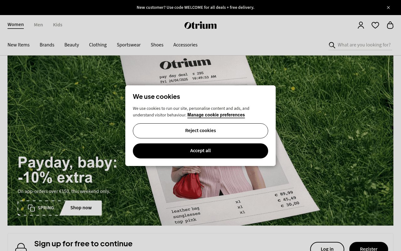
https://otrium.com
https://otrium.com
Screenshot of otrium.com
55of 100
C−

The hero leads with a cheeky 'Payday, baby' headline but buries the critical detail — app-only, €150 minimum, this weekend only — in 8pt subtext that most visitors will miss. The gated 'Sign up for free to continue' bar appears before users have seen enough value to justify registering, creating friction at exactly the wrong moment.

Your action plan

Ordered by conversion impact. Click any fix to see the before → after.

1
Surface the registration value proposition above the gate
High ImpactQuick WinSign up for free to continue bar below hero
Currently
Sign up for free to continue — Sign up for free to unlock access to 300+ top fashion brands
Recommended
Replace generic lock icon with a specific benefit statement: 'Join 2M+ members — access 300+ brands up to 75% off. Free, always.' Then place a single high-contrast Register CTA alongside a softer Log in link
Registration walls convert 40-60% better when the value exchange is explicit before the ask. The current copy is functional but not motivating — specificity and social proof at the gate dramatically reduce abandonment.

Copy rewrites

Ready to use

Drop-in replacements for your highest-leverage text. Each rewrite explains the conversion principle behind it.

Hero headline
Payday, baby: -10% extra
Payday treat: 10% extra off designer brands — this weekend only
Specificity and urgency — the original is playful but vague; naming the category and deadline increases click intent without losing brand voice
Registration gate subtext
Sign up for free to unlock access to 300+ top fashion brands
Join 2M+ members shopping 300+ designer brands up to 75% off — always free to join
Social proof plus specificity — adding member count and discount depth makes the value exchange concrete and credible before the registration ask
Announcement bar
New customer? Use code WELCOME for all deals + free delivery.
New here? Get free delivery on your first order — use code WELCOME at checkout
Clarity and action orientation — separating free delivery from the vague 'all deals' removes ambiguity and sets a single clear expectation
Running shoes section headline
Running shoes: up to 75% off
Running shoes from €24 — up to 75% off New Balance, On, FILA
Anchoring and brand specificity — showing the lowest price entry point and naming recognizable brands increases click-through by making the deal tangible
💡

The killer move

High Impact
Replace the static registration gate with a progressive reveal mechanic

Instead of a hard gate after the hero, blur only prices on 3-4 products in the New In grid with a tooltip saying 'Sign in to see price — members save up to 75%'. This creates curiosity-driven micro-conversions at the product level rather than a blanket wall, reducing perceived friction while maintaining the registration incentive — a technique proven to lift sign-up rates 20-35% in membership commerce.

How visitors experience your page

Second-by-second walkthrough.

2 strong2 mixed1 weak
0-3 secondsMixed
0-3s first impression: Cookie banner overlaying hero, Payday headline, model with receipt prop, WELCOME code in top bar
Cookie modal immediately obscures the hero value prop. Visitor registers the brand and a discount exists but cannot read the full offer — attention is split between dismissing the modal and absorbing the page
3-8 secondsMixed
3-8s orientation: Hero fully visible after cookie dismiss: Payday -10% extra, app-only conditions in small text, Shop now CTA, SPRING badge
Visitor likely misses the app-only and €150 minimum conditions. Clicks Shop now expecting a sitewide deal — discovering the restriction post-click creates frustration and potential bounce
8-15 secondsWeak
8-15s engagement: Registration gate bar with lock icon, category tiles (Summum, Denim, H-dresses), New In product grid with blurred prices requiring sign-in
The registration wall appears before the visitor has browsed enough to feel motivated. Blurred product prices are a dark pattern that may intrigue some but alienates price-sensitive shoppers who feel manipulated
15-30 secondsStrong
15-30s consideration: Popular categories grid, Brands section with Michael Kors banner, Explore more with IRO and Guess Marciano tiles, Mom's Summer Scent editorial
Brand recognition (Michael Kors, Tommy Hilfiger, New Balance) builds credibility. The category breadth signals a genuine outlet. Visitors who reach here are warming up — this is where a persistent sticky CTA would convert
30+ secondsStrong
30s+ decision: Running shoes carousel with real prices and RRP comparisons, Lingerie section with SPRING code, Heritage Edit with Tommy Hilfiger and Paul Smith
Visible RRP vs sale price comparisons are highly persuasive — Paul Smith at €202 vs €790 RRP is a compelling anchor. Visitors who scroll this far are high-intent; the lack of a persistent sticky register CTA means conversion opportunity is lost

Health check

8 dimensions, weighted by conversion impact.

First impression & hero
20%
6/10
Playful headline and strong visual but app-only conditions are buried and cookie modal blocks the offer at the critical first moment
Copy & messaging
20%
5/10
Brand voice is present but offer conditions are unclear, two promo codes compete, and the registration gate copy undersells the value exchange
Call-to-action
15%
5/10
Shop now CTA is visible but leads to a gated experience; no persistent sticky CTA for registration as users scroll deep into product content
Trust & social proof
15%
5/10
No testimonials, no member count visible above fold, no press logos — brand names in product grid provide implicit trust but no explicit social proof
Visual design & layout
10%
7/10
Clean minimal aesthetic, strong editorial photography, consistent grid — the receipt prop in the hero is a clever creative choice that reinforces the outlet positioning
Page structure & flow
8%
6/10
Logical category-to-product flow but registration gate appears too early before sufficient value is demonstrated to motivate sign-up
Technical & SEO signals
7%
5/10
Performance score 73, CLS 0.16 exceeds threshold, LCP 2.7s is borderline — accessibility and SEO scores unavailable but meta title is bloated with icon names
Differentiation & positioning
5%
6/10
Designer outlet positioning is clear but not uniquely articulated — the discount depth (up to 75%) is the differentiator but it appears only in section headers, not in the hero

Page speed

Based on real Chrome user data
73/100
Overall score
Combined performance rating
2.7 s
Largest paint
Time until the main content is visible
0.16
Layout shift
How much the page moves while loading
1.6 s
First paint
Time until something first appears
170 ms
Responsiveness
How fast the page reacts to clicks

Want mobile analysis and fresh re-runs?

Buy roasts to unlock mobile analysis, re-analyze on demand, and more for otrium.com.

See roast packs →