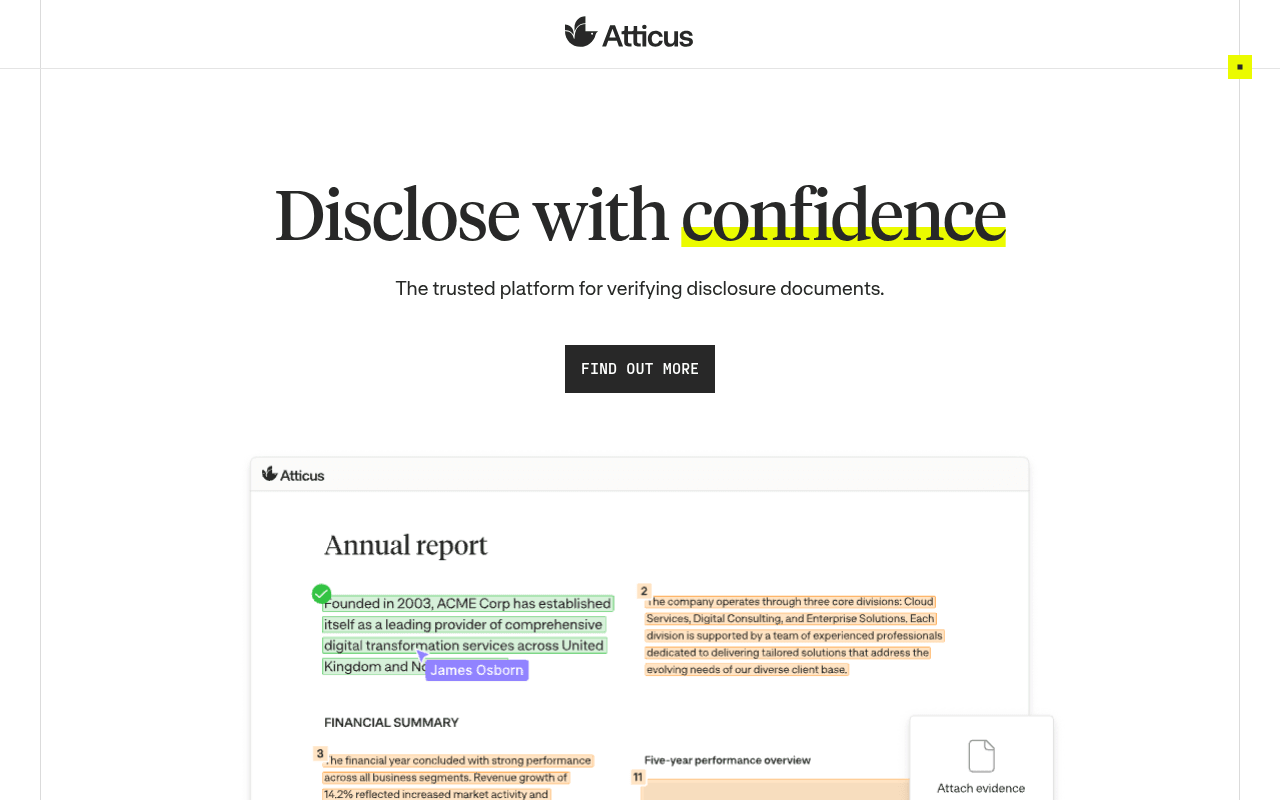
https://annualreport.atticus.tech/
Screenshot of annualreport.atticus.tech
65of 100
C+

The hero says 'Disclose with confidence' but the CTA says 'Find out more' — a classic case of strong positioning undermined by a commitment-phobic button. The product screenshot below the fold does real work, but the nav is a mega-menu maze that would make a McKinsey consultant weep before they ever hit 'Book a demo.'

Your action plan

Ordered by conversion impact. Click any fix to see the before → after.

1
Replace weak CTA with high-intent demo button
High ImpactQuick WinHero CTA button labeled 'Find out more'
Currently
Find out more
Recommended
Book a demo
'Find out more' signals browsing, not buying. 'Book a demo' matches the nav CTA already present and captures high-intent visitors. Replacing passive CTAs with action-specific ones typically lifts click-through 20-40% in B2B SaaS.

Copy rewrites

Ready to use

Drop-in replacements for your highest-leverage text. Each rewrite explains the conversion principle behind it.

Hero headline
Disclose with confidence
Verify every claim. Disclose with confidence.
Specificity — adds the mechanism (verify every claim) before the outcome, making the value proposition concrete rather than aspirational
Hero subheadline
The trusted platform for verifying disclosure documents.
Trusted by 75% of the UK's top 20 law firms to verify annual reports, prospectuses, and ESG disclosures.
Social proof + specificity — replaces a generic claim with a concrete stat and names the exact document types buyers care about
Section headline mid-page
Atticus is the final trust layer that sits on top of your existing tools.
Catch every error before it reaches regulators — without changing your existing workflow.
Loss aversion + benefit framing — regulatory risk is the primary fear driver for this audience; naming it converts better than abstract positioning language
Onboarding proof point
Most teams verify their first document within 24 hours.
Most teams are live and verifying their first document within 24 hours — no IT project required.
Objection handling — enterprise buyers fear long implementation; the addendum removes the biggest adoption barrier explicitly
💡

The killer move

High Impact
Add a ROI-anchored closing CTA section above the footer

Insert a final conversion block before the footer that leads with a specific time or cost saving — e.g. 'Teams using Atticus cut verification time by X hours per document' — followed by a single 'Book a demo' button. Enterprise buyers who scroll to the bottom are your highest-intent visitors and currently hit a dead end at security specs.

How visitors experience your page

Second-by-second walkthrough.

2 strong2 mixed1 weak
0-3 secondsMixed
0-3s first impression: Centered logo, large headline 'Disclose with confidence', subheadline, and a 'Find out more' button on white background
Headline is evocative but not immediately specific enough for a skeptical IR director. No social proof, no product visual, no urgency. Visitor understands the category but has no reason to stay yet.
3-8 secondsStrong
3-8s value scan: Product screenshot of annotated annual report with evidence-linking UI, beginning to enter viewport
The product UI is the page's strongest asset — it shows exactly what the tool does in a familiar context. Visitors who reach this feel the product is tangible and relevant. Problem: too many miss it by bouncing at the weak CTA.
8-15 secondsStrong
8-15s credibility check: Trust bar with Rolls-Royce, Legal & General, Ocado logos; 75% of top 20 law firms stat; three testimonial cards from M&G, Aston Martin, Linklaters
This section is genuinely excellent — named logos, named individuals, specific outcomes. Enterprise buyers validate peer adoption here. The Linklaters quote is particularly powerful for law firm prospects.
15-30 secondsMixed
15-30s feature evaluation: Three-column feature section: Catch every mistake, Build an audit trail, Collaborate with control; Haleon testimonial; Start simple section with deployment checklist
Feature copy is benefit-oriented but slightly generic. The Haleon quote adds credibility. The deployment checklist addresses adoption anxiety well. Visitor is building a case internally but no CTA appears until the 'Start simple' section.
30+ secondsWeak
30s+ decision point: Document type carousel, Built for market-leading teams section with industry verticals, security section, footer
By this point a qualified buyer has enough information to act but the page ends with security specs rather than a conversion moment. No final CTA block, no pricing anchor, no urgency mechanism. High-intent visitors have nowhere obvious to land.

Health check

8 dimensions, weighted by conversion impact.

First impression & hero
20%
6/10
Strong headline and clean design but passive CTA and no above-fold social proof or product visual leave conversion on the table
Copy & messaging
20%
7/10
Benefit-led, specific in places, but hero subheadline is generic and the best proof points are buried mid-page
Call-to-action
15%
4/10
'Find out more' is the primary CTA twice in the hero and mid-page — a passive phrase that signals browsing, not conversion
Trust & social proof
15%
8/10
Named logos, named individuals, specific stats, and multiple testimonials — genuinely strong for enterprise B2B
Visual design & layout
10%
7/10
Clean, professional typography and whitespace; product screenshots are clear; yellow highlight on key words is effective
Page structure & flow
8%
6/10
Logical progression but no closing conversion section — page ends on security specs rather than a final CTA moment
Technical & SEO signals
7%
5/10
All 55 images missing alt text is a significant accessibility and SEO liability; meta title has brand name repeated three times
Differentiation & positioning
5%
7/10
'Final trust layer on top of existing tools' is a sharp positioning line that addresses the integration objection directly

Want mobile analysis and fresh re-runs?

Buy roasts to unlock mobile analysis, re-analyze on demand, and more for annualreport.atticus.tech.

See roast packs →