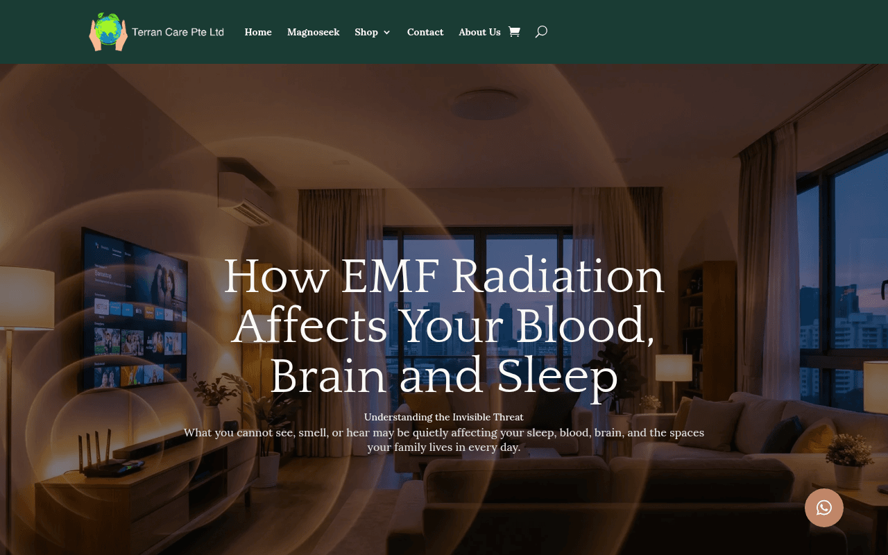
https://www.terrancare.com/emf-radiation-effects-health-singapore/
Screenshot of terrancare.com
55of 100
C−

The hero headline is genuinely compelling but the page commits the cardinal sin of having zero CTA above the fold — visitors read 'How EMF Radiation Affects Your Blood, Brain and Sleep' and then... nothing to do. The full-page screenshot reveals the entire page is essentially one long dark editorial with the CTA buried deep, and 11 of 12 images missing alt text signals a site that hasn't been optimized for trust or accessibility.

Your action plan

Ordered by conversion impact. Click any fix to see the before → after.

1
Add a CTA button directly in the hero section
High ImpactQuick WinHero section — currently contains only headline and subtext, no button
Currently
No CTA button visible above the fold; first CTA appears deep in the page near the blood demo section
Recommended
Add a high-contrast CTA button immediately below the subheadline: 'Book My Free Demo — Singapore Wellness Gallery' in a bright accent color (green or amber) against the dark background
Nielsen Norman Group: users decide within 8 seconds whether to engage. A page with no above-fold CTA loses visitors who are already primed by the fear-based headline — the highest-intent moment is wasted.

Copy rewrites

Ready to use

Drop-in replacements for your highest-leverage text. Each rewrite explains the conversion principle behind it.

Hero subheadline
What you cannot see, smell, or hear may be quietly affecting your sleep, blood, brain, and the spaces your family lives in every day.
Right now, invisible EMF radiation is affecting your blood cells, brain function, and sleep — in your home, office, and car. See the proof in your own blood.
Specificity and immediacy — shifts from passive 'may be' to active present tense, adds the live demo proof hook which is the page's strongest differentiator
WHO classification paragraph opening
Our goal is to inform and empower — not alarm.
The science is clear. Our goal is to show you what it means for your family — and what you can do about it today.
Action orientation — the original disclaimer weakens authority; this version maintains reassurance while pivoting toward solution and urgency
Book My Free Demo CTA button (appears near blood demo section)
Book My Free Demo
Book My Free Demo — See Your Blood Cells Live
Specificity principle — adding the unique value proposition to the button copy increases click-through by making the benefit of clicking explicit and memorable
Hero label above main headline
Understanding the Invisible Threat
Singapore Health Warning — What Your Doctor Hasn't Told You
Curiosity gap and geographic relevance — localizing the label and adding an authority challenge dramatically increases scroll engagement for the target Singapore audience
💡

The killer move

High Impact
Move the live blood demo proof to the hero as a video loop

The before/after blood microscopy demonstration is the single most compelling and unique asset on this page — a 15-second looping video of actual blood cells clumping then separating, placed directly in the hero section, would convert fear into fascination and make the free demo offer irresistible before the visitor reads a single word of body copy.

How visitors experience your page

Second-by-second walkthrough.

2 strong2 mixed1 weak
0-3 secondsMixed
0-3s First Impression: Dark atmospheric hero with living room background, large headline 'How EMF Radiation Affects Your Blood, Brain and Sleep', small subtext, no CTA button
Headline is strong and fear-activating for the target audience, but the absence of any CTA and the very dark overlay make the page feel like an article, not a conversion page — visitor is intrigued but has no next action
3-8 secondsWeak
3-8s Orientation: Stats bar with broken/missing percentage values, 'Understanding the Invisible Threat' label, subheadline copy
The broken stat percentages immediately undermine credibility at the exact moment the visitor is evaluating whether to trust the page — this is a critical trust failure during the highest-attention window
8-15 secondsStrong
8-15s Engagement: WHO/IARC Group 2B classification, '316,000 times stronger' EMF statistic, section on blood and rouleaux formation
The WHO citation and the specific 316,000x statistic are genuinely compelling proof points — visitors who reach here are being educated effectively and fear/curiosity is building toward the demo offer
15-30 secondsStrong
15-30s Consideration: Before/after blood microscopy description, 'Book My Free Demo' CTA, blood health effects list (heart, circulation, energy, headache)
The live blood demo is a powerful and unique differentiator — visitors who reach this section are likely high-intent, but the CTA button design and contrast need to be stronger to capture this momentum
30+ secondsMixed
30s+ Decision: Continued long-form content about brain function, children's health, EMF in vehicles, harmonization section — WhatsApp button bottom right
The page is very long with no persistent CTA — visitors who scroll this far are highly engaged but may experience decision fatigue; the WhatsApp button is a low-friction alternative but is easy to miss at bottom right

Health check

8 dimensions, weighted by conversion impact.

First impression & hero
20%
5/10
Compelling headline and atmospheric visuals but zero above-fold CTA and broken stats destroy the conversion opportunity at peak attention
Copy & messaging
20%
6/10
Strong fear-based narrative with good scientific anchoring, but passive hedging language and missing stat values undercut authority
Call-to-action
15%
4/10
No hero CTA, no sticky CTA, only two buttons buried mid-page — a demo-booking page needs persistent, visible conversion triggers throughout
Trust & social proof
15%
5/10
WHO citation and live blood demo concept are strong trust builders, but broken stats, missing image alt text, and no visible testimonials above fold weaken credibility
Visual design & layout
10%
5/10
Dark atmospheric aesthetic fits the invisible threat narrative but the full page is monotonously dark with insufficient visual hierarchy to guide the eye to CTAs
Page structure & flow
8%
5/10
Logical educational funnel from problem to proof to solution, but no sticky navigation CTA means conversion momentum built by good content is repeatedly lost
Technical & SEO signals
7%
7/10
PageSpeed 82 performance and perfect SEO score 100 are strong; accessibility at 77 and 11 missing alt texts are the primary technical gaps to address
Differentiation & positioning
5%
7/10
The live dark-field blood microscopy demo is a genuinely unique and powerful differentiator that most competitors cannot match — it just needs to be front-loaded in the hero

Page speed

Tested via Google Lighthouse
82/100
Overall score
Combined performance rating
1.9 s
Largest paint
Time until the main content is visible
0.012
Layout shift
How much the page moves while loading
0.6 s
First paint
Time until something first appears
1.9 s
Interactive
Time until the page is fully usable
Accessibility: 77SEO: 100Best Practices: 96

Want mobile analysis and fresh re-runs?

Buy roasts to unlock mobile analysis, re-analyze on demand, and more for terrancare.com.

See roast packs →