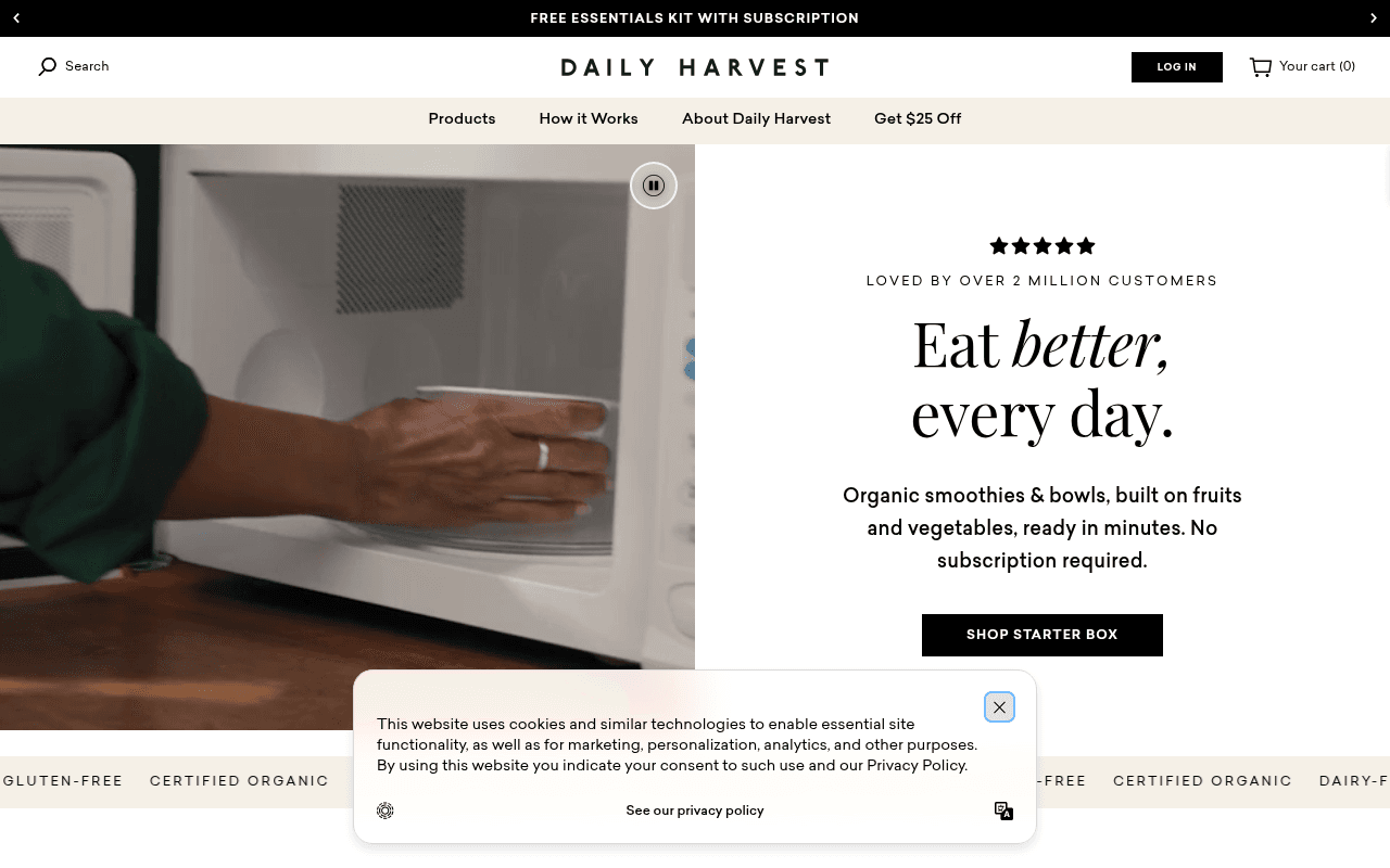
https://www.daily-harvest.com
Screenshot of daily-harvest.com
65of 100
C+

Daily Harvest has strong bones — 2M customer social proof, clean hero layout, and a clear CTA — but the announcement bar is a rotating circus of 6+ competing offers (HSA/FSA, $20 off, free kit, free shipping) that dilutes every single one. The hero subhead buries the lead by describing the product instead of selling the transformation.

Your action plan

Ordered by conversion impact. Click any fix to see the before → after.

1
Consolidate announcement bar to single rotating offer
High ImpactQuick WinTop announcement bar with 6+ rotating messages
Currently
6 competing messages: $20 off, HSA/FSA, free kit, free shipping, 10% off sub, etc.
Recommended
Show one offer at a time matched to traffic source — default to 'Get $25 Off Your First Box' with a single CTA link
Hick's Law: more choices reduce conversion. A single compelling offer in the bar increases click-through by reducing cognitive load and decision paralysis.

Copy rewrites

Ready to use

Drop-in replacements for your highest-leverage text. Each rewrite explains the conversion principle behind it.

Hero headline
Eat better, every day.
Eat like you actually planned ahead. Every day.
Specificity and relatability — speaks directly to the core pain point of the target audience (busy people who want to eat well but lack time)
Hero subhead
Organic smoothies & bowls, built on fruits and vegetables, ready in minutes. No subscription required.
Real food, frozen at peak nutrition, ready in 60 seconds. No subscription required — ever.
Specificity (60 seconds vs vague 'minutes') and reinforcing the no-commitment angle twice to reduce purchase anxiety
What Makes Our Food Different section header
WHAT MAKES OUR FOOD DIFFERENT
Why 2 Million People Switched to Daily Harvest
Social proof embedded in section header — transforms a generic differentiator claim into a credibility statement that answers the visitor's implicit question
94 Million Smoothies Sold stat
94 MILLION SMOOTHIES SOLD — Our community says it best.
94 Million Smoothies Sold — and counting. Here's what our customers actually say:
Momentum framing plus a direct bridge to testimonials creates narrative continuity and makes the stat feel alive rather than static
💡

The killer move

High Impact
Launch a personalized quiz funnel as the primary hero CTA

Replace or A/B test SHOP STARTER BOX with a 'Find Your Box' quiz CTA — 3 questions about health goals, dietary needs, and flavor preferences — that routes visitors to a curated starter box. Quiz funnels in DTC food consistently lift conversion 15-30% by creating personalization and commitment before the purchase decision.

How visitors experience your page

Second-by-second walkthrough.

2 strong2 mixed1 weak
0-3 secondsStrong
0-3s First Impression: Video hero of food being prepared, clean split layout, 'Eat better, every day.' headline, 5-star rating, 2M customers claim, SHOP STARTER BOX CTA
Brand registers as premium and credible immediately. The split layout works well on desktop. Visitor likely thinks 'this looks legit' and stays to learn more.
3-8 secondsMixed
3-8s Value Assessment: Subhead describing product features, SHOP STARTER BOX button, scrolling badge strip (gluten-free, certified organic, dairy-free)
Visitor understands what the product is but hasn't been sold on why it's for them. Feature-heavy subhead misses the emotional hook. Badge strip adds credibility but feels generic.
8-15 secondsStrong
8-15s Product Exploration: Shop Collections grid with smoothies, oat bowls, protein bowls; Shop Curated Bundles section with 6-pack and 12-pack options
Product variety is well-presented. Bundle options with pack sizes help visitors self-segment. Visitor likely starts mentally building their order — good momentum toward conversion.
15-30 secondsMixed
15-30s Consideration and Objection Handling: How It Works 3-step section, Flash Sale $20 off banner, Smoothie Sampler box with pricing and subscribe/save toggle, What Makes Our Food Different section
How It Works is clear and reassuring. But the Flash Sale and Sampler box create a second decision point that competes with the hero CTA. Visitor may feel uncertain which offer to take.
30+ secondsWeak
30s+ Trust and Commitment: HSA/FSA eligibility callout, Frozen For A Reason section, 94 Million Smoothies Sold stat, testimonials at very bottom of page
Critical trust elements — testimonials and the massive 94M stat — are buried at the very bottom. Visitors who needed this proof to convert have likely already bounced. Reorder urgently.

Health check

8 dimensions, weighted by conversion impact.

First impression & hero
20%
7/10
Clean split layout, strong social proof headline, and video content work well — but the subhead describes features instead of selling the transformation visitors actually want.
Copy & messaging
20%
6/10
Messaging is clear and benefit-oriented in places but leans heavily on product description over emotional outcome; the 94M smoothies stat is criminally buried.
Call-to-action
15%
6/10
SHOP STARTER BOX is clear and prominent but lacks adjacent social proof; competing offers in the announcement bar dilute the primary conversion path.
Trust & social proof
15%
5/10
2M customers and 94M smoothies are powerful claims but testimonials are absent per metadata and the big stats are placed at page bottom where most visitors never reach.
Visual design & layout
10%
8/10
Premium, consistent aesthetic with strong food photography, clean typography, and a well-structured desktop grid that communicates brand quality effectively.
Page structure & flow
8%
6/10
Logical top-to-bottom flow but trust elements and testimonials are inverted — placed where low-intent visitors scroll rather than where high-intent visitors need reassurance.
Technical & SEO signals
7%
7/10
Performance score of 84 with 1.9s LCP is solid; CLS of 0.09 is acceptable; 30 images missing alt text is a fixable accessibility and SEO gap.
Differentiation & positioning
5%
6/10
The no-subscription angle is a genuine differentiator but undersold; the What Makes Our Food Different section exists but competes with too many other page sections for attention.

Page speed

Based on real Chrome user data
84/100
Overall score
Combined performance rating
1.9 s
Largest paint
Time until the main content is visible
0.09
Layout shift
How much the page moves while loading
1.2 s
First paint
Time until something first appears
102 ms
Responsiveness
How fast the page reacts to clicks

Want mobile analysis and fresh re-runs?

Buy roasts to unlock mobile analysis, re-analyze on demand, and more for daily-harvest.com.

See roast packs →