https://jysk.com
https://jysk.com
Screenshot of jysk.com
45of 100
D

This is a corporate about-site masquerading as a homepage, and it barely commits to either role.

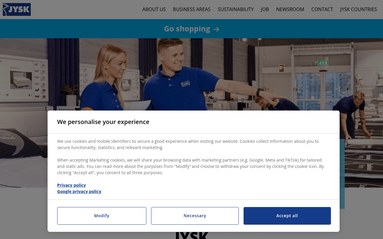
The hero image shows staff but carries zero headline copy above the fold — just a teal banner card partially obscured by a cookie modal. The stats (46.3B DKK, 34,000 employees) are the strongest trust signals on the page yet are buried mid-scroll with no narrative framing to make them land.

Your action plan

Ordered by conversion impact. Click any fix to see the before → after.

1
Add a hero headline above the fold
High ImpactSome WorkFull-width hero image of JYSK staff — currently has no H1 or value statement visible
Currently
Large staff photo with no overlaid headline; only a partially visible teal card reading 'A great Scandinavian offer for everyone within sleeping and living'
Recommended
Place a bold H1 overlay on the hero: 'JYSK: 3,600 Stores. 50 Countries. One Scandinavian Standard.' with two CTA buttons — Go Shopping and Explore Careers
Nielsen eye-tracking shows users decide page relevance in under 5 seconds; a blank hero wastes the highest-attention real estate on the page

Copy rewrites

Ready to use

Drop-in replacements for your highest-leverage text. Each rewrite explains the conversion principle behind it.

Hero teal card text
A great Scandinavian offer for everyone within sleeping and living
Scandinavian quality for every room — find your nearest JYSK store or shop online today
Specificity and action orientation — the original is a brand slogan, not a conversion prompt
About section body paragraph
JYSK is an international home furnishing retailer with Scandinavian roots that makes it easy to furnish every room in any home and garden.
JYSK has helped families furnish their homes since 1979 — now serving 50 countries with 3,600 stores and the same Scandinavian value promise.
Social proof and heritage framing — adds scale credibility and emotional continuity that the original lacks
WHO IS JYSK section subheading
Get to know more about JYSK in 2 minutes.
Two minutes. 45 years of growth. Here is the JYSK story.
Curiosity gap and specificity — gives the viewer a reason to invest 2 minutes rather than just stating the time cost
💡

The killer move

High Impact
Build audience-specific landing paths with a homepage intent selector

Replace the current one-size-fits-all scroll with a hero-level audience router — four cards (Shop, Work, Partner, Invest) each linking to a tailored sub-page; this single structural change can reduce bounce rate by 20-35% by immediately validating every visitor type's reason for arriving.

How visitors experience your page

Second-by-second walkthrough.

3 mixed2 weak
0-3 secondsWeak
0-3s First Impression: JYSK logo, flat nav, teal Go Shopping strip, large staff photo, cookie modal blocking most content
Visitor cannot determine if this is a shopping site or corporate hub; cookie modal immediately obscures the hero — first impression is administrative friction, not brand confidence
3-8 secondsMixed
3-8s Orientation: Teal card with brand tagline partially visible behind modal, staff in blue uniforms pointing at products
Consumer visitors may click Go Shopping and leave; corporate visitors have no clear signal they are in the right place — high bounce risk for both segments
8-15 secondsMixed
8-15s Engagement: JYSK about-text paragraph, three financial stat blocks (46.3B, 5.6B, 34,000), Read Annual Report link
Investor and press visitors find useful data here but it arrives without context; job seekers and franchise prospects are still not addressed — page starts to feel like an IR page
15-30 secondsMixed
15-30s Exploration: About Us section with store image, Sustainability section with outdoor furniture image, WHO IS JYSK video embed
Content is competent but generic; no differentiated messaging for any audience segment; the video is the most engaging element but requires active click — passive visitors disengage
30+ secondsWeak
30s+ Decision: Footer with full sitemap, contact details, country selector links, social media icon
Visitors who scroll to footer without converting are lost — there is no re-engagement CTA, no newsletter signup, no lead capture for B2B or franchise prospects, representing a significant missed conversion opportunity

Health check

8 dimensions, weighted by conversion impact.

First impression & hero
20%
3/10
No headline copy on the hero image; cookie modal blocks content; visitors cannot identify page purpose in under 3 seconds
Copy & messaging
20%
4/10
Body copy is accurate but generic corporate boilerplate with no audience segmentation or emotional hooks
Call-to-action
15%
4/10
Go Shopping strip is the only CTA above fold; no audience-specific CTAs for job seekers, investors, or franchise partners
Trust & social proof
15%
6/10
Strong financial stats (46.3B DKK turnover, 34K employees) and 45-year heritage are present but under-framed
Visual design & layout
10%
6/10
Clean Scandinavian aesthetic, consistent brand colors, but hero wastes full-width space with no typographic hierarchy
Page structure & flow
8%
4/10
Single-audience linear scroll does not serve the four distinct visitor types this corporate homepage must address
Technical & SEO signals
7%
7/10
PageSpeed 90 performance score, LCP 1.3s and CLS 0.01 are strong; missing meta description and accessibility score are gaps
Differentiation & positioning
5%
5/10
Scandinavian heritage is mentioned but not visually or emotionally differentiated from any other European home retailer

Page speed

Based on real Chrome user data
90/100
Overall score
Combined performance rating
1.3 s
Largest paint
Time until the main content is visible
0.01
Layout shift
How much the page moves while loading
878 ms
First paint
Time until something first appears
38 ms
Responsiveness
How fast the page reacts to clicks

Want mobile analysis and fresh re-runs?

Buy roasts to unlock mobile analysis, re-analyze on demand, and more for jysk.com.

See roast packs →