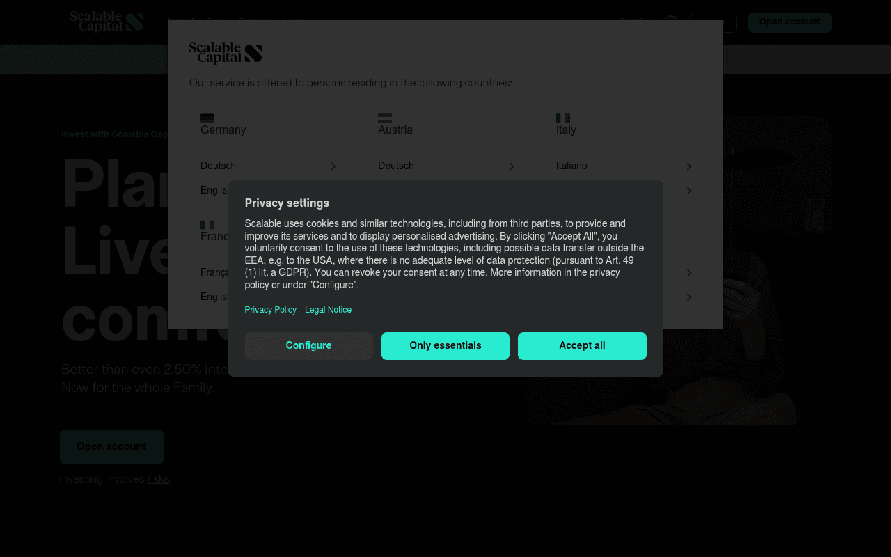
https://scalable.capital
Screenshot of scalable.capital
50of 100
D

The hero headline 'Plan...

Live... comf...' is literally unreadable behind two stacked modals — a country selector AND a privacy banner simultaneously blocking the value proposition. The 2.50% interest rate, which is the strongest hook on the page, is buried in subtext while the hero wastes prime real estate on a truncated tagline nobody can read.

Your action plan

Ordered by conversion impact. Click any fix to see the before → after.

1
Sequence modals — never stack two simultaneously
High ImpactSome WorkCountry selector modal + Privacy settings modal appearing simultaneously on load
Currently
Both modals fire at once, completely obscuring the hero headline and CTA
Recommended
Show country selector first; only trigger privacy modal after country selection is confirmed — one interruption, not two
Dual modal stacking creates cognitive overload and blocks the primary conversion trigger before the visitor sees any value proposition — violates the single-task-per-screen principle

Copy rewrites

Ready to use

Drop-in replacements for your highest-leverage text. Each rewrite explains the conversion principle behind it.

Hero headline (partially visible behind modals)
Investieren mit Scalable Capital
2,50 % Zinsen p.a. — unbegrenzt. Investieren, Sparen und Vorsorgen in einer App.
Specificity principle: leading with the concrete rate anchors value immediately; abstract brand names do not convert
Hero subtext: 'Besser als je zuvor: 2,50 % Zinsen p.a.*, Investieren und Finanzieren. Jetzt auch für die ganze Familie.'
Besser als je zuvor: 2,50 % Zinsen p.a.*, Investieren und Finanzieren. Jetzt auch für die ganze Familie.
Kein Limit auf Ihr Guthaben. Monatliche Auszahlung. Depot, Tagesgeld und Robo-Advisor — alles in einer App.
Benefit specificity: 'unlimited balance' and 'monthly payout' are concrete differentiators that reduce objections and increase perceived value
CTA button: 'Konto eröffnen'
Konto eröffnen
Kostenloses Konto eröffnen — in 5 Minuten
Friction reduction: stating zero cost and time commitment directly on the CTA removes the two most common hesitation points in fintech sign-up flows
Section heading: 'Investieren und Sparen - alles in einer App. Mit Scalable.'
Investieren und Sparen - alles in einer App. Mit Scalable.
Eine App. Broker, Robo-Advisor, Tagesgeld und Kinderdepot — alles ohne versteckte Kosten.
Clarity and specificity: naming the four product pillars explicitly reduces cognitive load and communicates breadth of offering more convincingly than a generic tagline
💡

The killer move

High Impact
Deploy a live rate comparison widget in the hero

Embed a real-time or static comparison table showing Scalable's 2.50% vs the big German banks (Deutsche Bank, Commerzbank, Sparkasse) at 0.01-0.5% — this single element transforms an abstract rate claim into visceral, competitive proof that makes switching feel financially irrational to refuse.

How visitors experience your page

Second-by-second walkthrough.

1 strong2 mixed2 weak
0-3 secondsWeak
0-3s First impression: Two overlapping modals (country selector + privacy banner) completely blocking the hero; Scalable Capital logo visible top-left; 'Open account' button in nav
Visitor's entire first impression is administrative friction — they cannot see the product, the value prop, or any reason to stay; high bounce risk before any content is consumed
3-8 secondsMixed
3-8s Orientation: After dismissing modals: partial hero headline, '2.50% interest' subtext, dark hero background with lifestyle imagery, 'Konto eröffnen' CTA button
The interest rate creates a hook but the headline is generic; visitor understands this is an investment platform but hasn't been given a compelling reason to choose Scalable over N26, Trade Republic, or DKB
8-15 secondsMixed
8-15s Evaluation: 2.50% interest feature section, Scalable Kids account section, three value pillars (Zugänglich, Selbstbestimmt, Intuitiv)
Product breadth becomes clearer but the three pillars use abstract language; 'Intuitiv' and 'Selbstbestimmt' are claims without evidence — no screenshots, no demo, no proof
15-30 secondsStrong
15-30s Consideration: Broker vs Wealth split section, 'Selbst investieren' and 'Automatisch investieren' options, feature descriptions
The two-path structure (DIY broker vs managed wealth) is a smart conversion architecture that helps visitors self-segment — reduces decision paralysis and routes to relevant CTAs
30+ secondsWeak
30s+ Decision: New global standard section, educational content links, lengthy legal disclaimers, footer
No testimonials, no customer count, no AUM figure, no press logos — the page ends without reinforcing trust; visitors who scrolled this far are most qualified and get the least persuasion

Health check

8 dimensions, weighted by conversion impact.

First impression & hero
20%
4/10
Dual modal stack on load makes the hero completely inaccessible; the strongest asset (2.50% rate) is invisible at first contact
Copy & messaging
20%
5/10
Rate specificity is good but headline is generic; value pillars use abstract language without evidence; German copy is grammatically sound but not persuasive
Call-to-action
15%
6/10
'Konto eröffnen' appears in both nav and hero but lacks friction-reducing qualifiers like cost or time commitment
Trust & social proof
15%
3/10
Zero testimonials, no customer count, no AUM, no press logos, no regulatory badges visible above fold — critical gap for a fintech asking for financial account access
Visual design & layout
10%
7/10
Dark theme is premium and on-brand; two-column product split is clean; modal design is functional if poorly sequenced
Page structure & flow
8%
6/10
Logical product hierarchy from savings rate to kids account to broker vs wealth; but no trust reinforcement at the bottom where qualified visitors land
Technical & SEO signals
7%
8/10
PageSpeed 90, FCP 0.7s, LCP 0.9s are excellent; accessibility score of 68 and 5 missing alt texts are the only meaningful gaps
Differentiation & positioning
5%
5/10
2.50% unlimited interest is a genuine differentiator but not hero-positioned; 'New global standard' claim in lower section is unsubstantiated

Page speed

Tested via Google Lighthouse
90/100
Overall score
Combined performance rating
0.9 s
Largest paint
Time until the main content is visible
0.002
Layout shift
How much the page moves while loading
0.7 s
First paint
Time until something first appears
2.8 s
Interactive
Time until the page is fully usable
Accessibility: 68SEO: 92Best Practices: 96

Want mobile analysis and fresh re-runs?

Buy roasts to unlock mobile analysis, re-analyze on demand, and more for scalable.capital.

See roast packs →