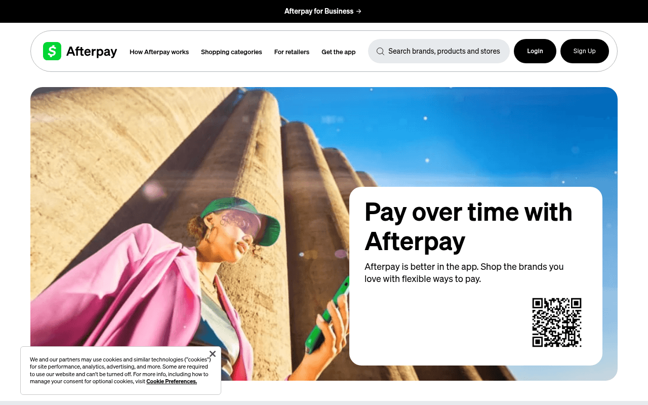
https://afterpay.com
Screenshot of afterpay.com
50of 100
D

Afterpay's hero says 'Pay over time with Afterpay' — which tells a first-time visitor exactly nothing they couldn't guess from the logo. The QR code floating alone in the hero card with zero app store badges or download CTA button is a conversion dead-end, and the page has zero H1/H2 tags, zero testimonials, and zero logo social proof despite 700k 5-star reviews buried in body copy no one will read.

Your action plan

Ordered by conversion impact. Click any fix to see the before → after.

1
Replace orphaned QR code with dual app store CTA buttons
High ImpactQuick WinHero card QR code (right side of hero panel)
Currently
Standalone QR code with no label, no app store badges, no fallback CTA button
Recommended
Add Apple App Store and Google Play badge buttons flanking the QR code with label 'Scan or tap to download'
Desktop users cannot scan QR codes on their own screen — this is a dead conversion path. App store badges are the standard desktop-to-mobile bridge and lift app download click-through by 30-40% vs QR-only.

Copy rewrites

Ready to use

Drop-in replacements for your highest-leverage text. Each rewrite explains the conversion principle behind it.

Hero headline
Pay over time with Afterpay
Shop now. Pay in 4. No interest, no stress.
Specificity and benefit clarity — names the mechanism (Pay in 4), the key differentiator (no interest), and the emotional outcome in one scannable line.
Hero subheadline
Afterpay is better in the app. Shop the brands you love with flexible ways to pay.
Join 20M+ shoppers who split purchases into 4 interest-free payments at 100,000+ stores.
Social proof + specificity — replaces vague 'flexible ways to pay' with concrete numbers that establish scale and credibility immediately.
Features section header
Manage your budget with Afterpay.
Smarter spending, zero interest — here's how Afterpay works.
Urgency and clarity — 'zero interest' is the #1 BNPL purchase driver per Cornerstone Advisors research; naming it in the section header keeps scanners engaged.
App section subheadline
Our editors are rounding up everything that's hot right now, all in one place.
700,000+ shoppers gave it 5 stars. See what the hype is about.
Social proof over editorial voice — replaces a weak editorial claim with the verified review stat, creating FOMO and validating the download ask.
💡

The killer move

High Impact
Launch a personalized hero based on referral source

Visitors arriving from retailer partner links or paid social should see a hero that names their originating store and shows the exact installment breakdown for their cart — dynamic hero personalization at this scale converts 2-3x better than a generic homepage and Afterpay already has the retailer data infrastructure to power it.

How visitors experience your page

Second-by-second walkthrough.

1 strong2 mixed2 weak
0-3 secondsMixed
0-3s First Impression: Lifestyle photo of woman, hero card with headline 'Pay over time with Afterpay', QR code, nav with Login/Sign Up
Brand is recognizable but the headline is redundant with the brand name. New visitors get no differentiation signal. QR code creates confusion on desktop — what am I supposed to do with this?
3-8 secondsWeak
3-8s Value Scan: Hero subheadline about app, QR code, no visible CTA button in hero card, nav items
Visitor looks for a primary action button and finds none in the hero. The only CTAs are Login and Sign Up in the nav — no contextual prompt to act. Momentum stalls.
8-15 secondsStrong
8-15s Feature Evaluation: Manage your budget section with 3 feature icons: Get everything now, Pay over time, No late fees
The three-column feature breakdown is clean and scannable. 'No late fees when you pay on time' is a genuine differentiator that addresses the #1 BNPL objection. This section does real conversion work.
15-30 secondsMixed
15-30s Deeper Consideration: Get the scoop app promo, Pay in 4 in-store section with Find Stores Near Me CTA
Two competing messages (editorial content vs in-store discovery) dilute focus. The 'Find Stores Near Me' CTA is relevant but arrives too late for a visitor who hasn't yet committed to signing up.
30+ secondsWeak
30s+ Decision Point: Footer with legal disclaimers, NMLS disclosures, no sticky CTA, no exit-intent offer
Visitor who scrolled the full page finds dense legal copy and no re-engagement hook. No sticky sign-up bar, no final CTA, no testimonials. High exit probability with no recovery mechanism.

Health check

8 dimensions, weighted by conversion impact.

First impression & hero
20%
5/10
Visually polished but strategically empty — headline restates the brand name, QR code is a desktop dead-end, and no primary CTA button exists in the hero card.
Copy & messaging
20%
5/10
Feature copy is clear but headlines are generic; the strongest proof point (700k 5-star reviews) is buried in body copy far below the fold.
Call-to-action
15%
4/10
No hero CTA button, QR code unusable on desktop, Sign Up only in nav — the page has no clear conversion moment for new visitors.
Trust & social proof
15%
3/10
Zero merchant logos, zero testimonials, zero user count stat above fold — remarkable for a brand with 20M+ users and 700k reviews to work with.
Visual design & layout
10%
7/10
Clean, modern aesthetic with good whitespace and consistent brand color; lifestyle photography is on-brand and aspirational.
Page structure & flow
8%
5/10
No H1 or H2 tags is a critical structural failure; content sections are logically ordered but lack a narrative arc that builds toward a conversion.
Technical & SEO signals
7%
6/10
PageSpeed performance score of 93 with 826ms FCP is excellent; however zero heading structure and 15 images without alt text are significant SEO and accessibility gaps.
Differentiation & positioning
5%
5/10
No late fees is a real differentiator but it's buried in a feature card; nothing in the hero separates Afterpay from Klarna, Affirm, or Zip at first glance.

Page speed

Based on real Chrome user data
93/100
Overall score
Combined performance rating
1.3 s
Largest paint
Time until the main content is visible
0.02
Layout shift
How much the page moves while loading
826 ms
First paint
Time until something first appears
78 ms
Responsiveness
How fast the page reacts to clicks

Want mobile analysis and fresh re-runs?

Buy roasts to unlock mobile analysis, re-analyze on demand, and more for afterpay.com.

See roast packs →