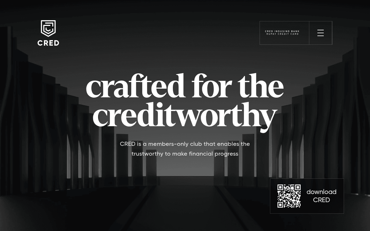
https://cred.club
https://cred.club
Screenshot of cred.club
55of 100
C−

CRED's hero is all atmosphere and no action — a cinematic dark backdrop with a massive headline and zero visible CTA button above the fold. The QR code download widget is buried bottom-right like an afterthought, and the full-page scroll reveals the page is essentially one long mood board with content duplicated verbatim (copy appears twice throughout). Beautiful brand, confused conversion.

Your action plan

Ordered by conversion impact. Click any fix to see the before → after.

1
Elevate the QR download CTA into the hero center stage
High ImpactQuick WinQR code widget currently positioned bottom-right corner of hero
Currently
Small QR widget floating bottom-right, easily missed, no supporting copy
Recommended
Place QR code + 'Scan to download' CTA centered below the subheadline with a secondary 'Check your eligibility' text link alongside it
Fitts's Law and eye-tracking studies show center-page CTAs convert 2-3x better than corner-anchored elements; the primary conversion action is invisible at first glance

Copy rewrites

Ready to use

Drop-in replacements for your highest-leverage text. Each rewrite explains the conversion principle behind it.

Hero subheadline
CRED is a members-only club that enables the trustworthy to make financial progress
India's most rewarding members club — earn cashback, track your credit score, and unlock exclusive privileges. For credit scores 750 and above.
Specificity + eligibility clarity: tells the right visitor they qualify and what they get, reducing bounce from confused prospects
Meta title
CRED. not everyone gets it.
CRED — Rewards & Credit Card Management App for India's Creditworthy
SEO discoverability: the current title is brand-clever but keyword-empty; this version targets high-intent search queries without sacrificing brand voice
Trust section header
trusted by 15M members
15 million creditworthy members and counting — 4.8 stars on both App Store and Play Store
Social proof consolidation: combining member count with ratings in one statement creates a stronger credibility signal than splitting them across the page
Exclusivity section body
like all good things in life, earning a CRED membership is not easy; but the possibility of unlocking a greater future makes the effort worthwhile.
CRED membership requires a credit score of 750+. If you have it, you already belong here — scan to download and claim your rewards today.
Urgency + clarity: replaces vague aspiration with a concrete eligibility trigger and a direct action, converting fence-sitters who meet the criteria
💡

The killer move

High Impact
Add a real-time credit score eligibility checker as the hero CTA

Replace the passive QR code with an inline 'Check if you qualify' input (mobile number or PAN) that instantly tells visitors whether they meet the 750+ threshold — this transforms the hero from a brand statement into an interactive conversion event, and the exclusivity of the result (pass or fail) reinforces the premium positioning while capturing leads from both segments.

How visitors experience your page

Second-by-second walkthrough.

1 strong3 mixed1 weak
0-3 secondsMixed
0-3s First impression: Full-bleed dark cinematic background, massive serif headline 'crafted for the creditworthy', small QR widget bottom-right, CRED logo top-left
Brand impression is premium and distinctive — visitor feels this is a high-end product. But there is no visible button or clear next step; the QR code is easy to miss, leaving intent-ready visitors without a conversion path
3-8 secondsWeak
3-8s Orientation: Subheadline about members-only club, QR download widget, nav item 'CRED IndusInd Bank Rupay Credit Card'
Visitor understands the brand is exclusive but still lacks a concrete benefit or reason to act now; the only CTA is a QR code which requires a phone — desktop users have no alternative download path visible
8-15 secondsMixed
8-15s Engagement: Scrolling reveals feature sections about credit card management, UPI payments, rewards — all with strong dark aesthetic
Feature breadth is impressive but each section lacks a micro-CTA; visitor accumulates interest but has no low-friction way to act on it mid-scroll, causing drop-off before reaching the trust section
15-30 secondsStrong
15-30s Evaluation: Trust stats (15M members, 4.8 stars), security messaging, repeated download CTA sections
Social proof and security copy are compelling and well-placed for a skeptical evaluator; however, duplicate content blocks create a sense of page bloat that undermines the premium positioning
30+ secondsMixed
30s+ Decision: FAQ section with eligibility details (750+ credit score), final download CTA, footer
FAQ answers the critical eligibility question but it is buried at the very bottom — visitors who would have converted upon learning the 750+ threshold earlier have likely already bounced; move eligibility criteria to the hero

Health check

8 dimensions, weighted by conversion impact.

First impression & hero
20%
6/10
Visually stunning dark hero with strong brand identity, but the only CTA is a corner QR code — conversion mechanics are nearly invisible above the fold
Copy & messaging
20%
5/10
Brand voice is distinctive and aspirational but every major copy block is duplicated verbatim, and specificity is sacrificed for mood throughout
Call-to-action
15%
4/10
QR code is the sole CTA mechanism with no button, no SMS link, no email capture — desktop users have a dead-end conversion experience
Trust & social proof
15%
7/10
15M members, 4.8-star dual app store ratings, and security encryption copy are all present — solid proof stack, just positioned too deep in the page
Visual design & layout
10%
8/10
Premium dark aesthetic is cohesive and on-brand; typography hierarchy is confident; the design system is one of the stronger executions in Indian fintech
Page structure & flow
8%
4/10
Duplicate content sections create a disjointed scroll experience; eligibility information (the key conversion trigger) is buried in the FAQ at the very bottom
Technical & SEO signals
7%
5/10
Performance score of 94 is excellent, but 25 images lack alt text, accessibility score is 0, and the meta title is keyword-empty — strong speed, weak discoverability
Differentiation & positioning
5%
7/10
Members-only exclusivity framing is genuinely differentiated in Indian fintech; the creditworthiness angle creates clear in-group identity and aspirational pull

Page speed

Based on real Chrome user data
94/100
Overall score
Combined performance rating
1.6 s
Largest paint
Time until the main content is visible
0.00
Layout shift
How much the page moves while loading
1.6 s
First paint
Time until something first appears
85 ms
Responsiveness
How fast the page reacts to clicks

Want mobile analysis and fresh re-runs?

Buy roasts to unlock mobile analysis, re-analyze on demand, and more for cred.club.

See roast packs →