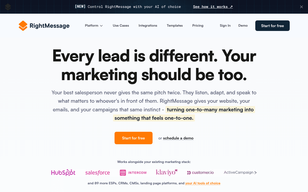
https://rightmessage.com/
Screenshot of rightmessage.com
65of 100
C+

The headline 'Every lead is different.

Your marketing should be too.' is conceptually strong but functionally vague — it tells visitors what RightMessage believes, not what it does. The hero subtext buries the actual product capability in a salesperson metaphor, and the integration logos do more heavy lifting than the CTA copy. A $99/mo personalization platform deserves a hero that shows personalization in action, not just describes it philosophically.

Your action plan

Ordered by conversion impact. Click any fix to see the before → after.

1
Add outcome-anchored subheadline beneath hero H1
High ImpactQuick WinHero subtext paragraph starting 'Your best salesperson never gives the same pitch twice'
Currently
Three-sentence metaphor paragraph ending in 'turning one-to-many marketing into something that feels one-to-one'
Recommended
Add a single bolded line above the paragraph: 'RightMessage personalizes your website, emails, and campaigns — automatically, based on who each visitor is.' Then keep the metaphor as supporting copy.
Nielsen Norman research shows visitors scan for what a product does before why it matters. The current hero leads with philosophy; a functional descriptor reduces bounce from confused visitors.

Copy rewrites

Ready to use

Drop-in replacements for your highest-leverage text. Each rewrite explains the conversion principle behind it.

Hero H1
Every lead is different. Your marketing should be too.
Personalize your website and emails for every visitor — automatically.
Specificity principle: replaces a philosophical statement with a functional product description that answers 'what does this do?' in under 10 words
Hero subtext highlighted phrase
turning one-to-many marketing into something that feels one-to-one.
turning one-to-many marketing into personalized experiences that convert — without rebuilding your stack.
Adds a concrete outcome (convert) and removes a key objection (complexity) in the same phrase — addressing both desire and fear simultaneously
Bottom CTA section headline
Ready to personalize your marketing?
Start personalizing in minutes — free until you publish.
Urgency plus specificity: replaces a question with a statement that communicates low friction (minutes) and reinforces the free tier benefit visible in the card below
Integration section headline
Works with your existing stack.
Plugs into HubSpot, Klaviyo, Salesforce, and 89 more tools you already use.
Specificity principle: naming the top logos (already visible) in the headline itself makes the claim scannable and credible without requiring visitors to read the logo row
💡

The killer move

High Impact
Make the hero itself a live personalization demo

Since RightMessage's core product is website personalization, the hero should demonstrate it in real-time: detect whether the visitor came from an email, ad, or organic search and show a subtly different headline or subtext. A visitor arriving from a HubSpot integration page should see 'Personalize your HubSpot contacts' website experience' — this turns the hero into a product proof point that no competitor can replicate on their own landing page.

How visitors experience your page

Second-by-second walkthrough.

2 strong3 mixed
0-3 secondsMixed
0-3s First Impression: Large headline, orange CTA, integration logos, announcement bar about AI feature
Visitor registers 'marketing personalization tool' but the headline is conceptual, not functional. They don't immediately know what the product does mechanically — curiosity is piqued but clarity is delayed.
3-8 secondsStrong
3-8s Value Scan: Subtext paragraph, 'Start for free' CTA, integration logos with HubSpot/Salesforce/Klaviyo
Integration logos do significant trust work here — recognizable brands signal legitimacy and compatibility. The salesperson metaphor in subtext is engaging but still delays the 'what exactly does it do' answer.
8-15 secondsMixed
8-15s Proof Seeking: Product UI screenshot with persona tabs, funnel amplification section with 6 testimonial cards
The product screenshot is promising but small and hard to parse at a glance. Testimonial cards are truncated — visitor sees social proof exists but can't absorb it quickly enough to build conviction.
15-30 secondsStrong
15-30s Evaluation: Personalization quiz widget, feature list, video testimonial embed, stats (11.4M+, 19M+, 9.1M+)
The interactive 'What would you like to personalize first?' widget is genuinely clever — it demonstrates the product's core capability while qualifying the visitor. Stats provide scale credibility. Visitor is likely engaged.
30+ secondsMixed
30s+ Decision: Full integration grid, bottom CTA split between free trial and demo, FAQ section
The two-column bottom CTA (free vs demo) is smart for dual audiences but the copy is weak. Visitors who scrolled this far are warm — the CTA should be more assertive. FAQ presence is good for objection handling but not visible in the screenshot.

Health check

8 dimensions, weighted by conversion impact.

First impression & hero
20%
6/10
Conceptually compelling headline but functionally vague — no above-fold metric, no product screenshot, CTA is generic
Copy & messaging
20%
7/10
Salesperson metaphor is memorable and the highlighted phrase works, but the page leans on analogy over specificity throughout
Call-to-action
15%
5/10
'Start for free' appears three times identically — no outcome language, no friction reduction, no urgency differentiation
Trust & social proof
15%
7/10
Strong integration logos, real stats, and testimonials present — but testimonials are truncated and the best stat is buried below the fold
Visual design & layout
10%
7/10
Clean, professional, good use of orange accent — product UI screenshot undersells the platform's visual sophistication
Page structure & flow
8%
7/10
Logical funnel from hero to proof to features to CTA — the interactive quiz widget mid-page is a smart engagement break
Technical & SEO signals
7%
9/10
PageSpeed 96 with 1.4s FCP/LCP and 0.03 CLS is exceptional — 13 images missing alt text is the only meaningful gap
Differentiation & positioning
5%
6/10
AI angle in announcement bar is timely but underdeveloped — the core differentiation (bi-directional CRM sync, adaptive not just static) is not prominent enough in hero

Page speed

Based on real Chrome user data
96/100
Overall score
Combined performance rating
1.4 s
Largest paint
Time until the main content is visible
0.03
Layout shift
How much the page moves while loading
1.4 s
First paint
Time until something first appears
69 ms
Responsiveness
How fast the page reacts to clicks

Want mobile analysis and fresh re-runs?

Buy roasts to unlock mobile analysis, re-analyze on demand, and more for rightmessage.com.

See roast packs →