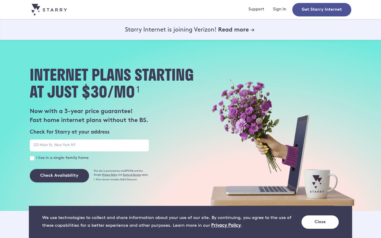
https://starry.com/plans/high-speed-internet-plans?utm_source=google&utm_medium=ppc&utm_campaign=all-usa-brand-b2c&utm_term=starry&trial_code=DEAL26&gad_source=1&gad_campaignid=1914255587&gbraid=0AAAAADezMTg1NKAvPLp2ro_KbQqb7Er7S&gclid=EAIaIQobChMItqOp9uSLlAMVD11HAR0pGwKaEAAYASAAEgJWe_D_BwE
Screenshot of starry.com
60of 100
C

The hero does the heavy lifting with a clear price anchor and address form, but the Verizon acquisition banner is a conversion grenade — visitors searching 'Starry' see 'joining Verizon' and immediately question whether to bother signing up. The 'without the BS' tagline is undercut by a footnote-laden $30 price that actually starts at $40, eroding the trust it was trying to build.

Your action plan

Ordered by conversion impact. Click any fix to see the before → after.

1
Neutralize or reframe the Verizon acquisition banner
High ImpactQuick WinTop announcement bar: 'Starry Internet is joining Verizon! Read more →'
Currently
Starry Internet is joining Verizon! Read more →
Recommended
Starry is growing — same great service, now backed by Verizon. Your plan and price stay the same. Learn more →
Acquisition announcements trigger churn anxiety. Visitors on a brand PPC campaign are already customers or high-intent prospects — uncertainty about company continuity is the #1 reason they'll bounce without converting. Reframing as stability removes the objection at the top of the funnel.

Copy rewrites

Ready to use

Drop-in replacements for your highest-leverage text. Each rewrite explains the conversion principle behind it.

Hero subheadline
Fast home internet plans without the BS.
No bundles. No contracts. No surprise price hikes — guaranteed for 3 years.
Specificity over attitude — naming the exact pain points (bundles, contracts, price hikes) converts better than a vague anti-establishment claim. Mirrors the objections cable customers actually have.
Mid-page section headline
Switch to starry to get high speed internet, without forcing you into a bundle!
Everything you need. Nothing you don't. High-speed internet, standalone.
Concision and positive framing — leading with the benefit rather than the competitor behavior. Shorter headline scans faster on desktop multi-column layouts.
30-day trial section
Join the many who've switched to fast, reliable Home internet.
Try Starry free for 30 days. We'll cover up to $200 of your current provider's cancellation fees.
Urgency and specificity — the $200 ETF reimbursement is a powerful switching incentive buried in body copy. Making it the headline transforms a generic social proof statement into a concrete risk-reversal offer.
OG description (meta)
Starry delivers lightning-fast, incredibly reliable, awesome internet service with no gimmicks. Just high speed Internet for only $50 a month. All in.
Starry Internet: plans from $30/mo, 3-year price guarantee, no bundles. Available in LA, Denver, Boston, NYC and DC. Check your address now.
The OG description still shows $50/mo — inconsistent with current pricing and visible to anyone sharing the link. Updated copy aligns with current offer and adds city specificity for relevance signals.
💡

The killer move

High Impact
Add a real-time availability confidence signal to the address form

Integrate a city-detection script that pre-populates or confirms the visitor's metro area before they type, showing 'We serve your area' with a green indicator — this single change reduces form abandonment by removing the fear of wasted effort, which is the primary reason high-intent visitors don't complete the address check.

How visitors experience your page

Second-by-second walkthrough.

2 strong2 mixed1 weak
0-3 secondsMixed
0-3s First Impression: Starry logo, Verizon acquisition banner, teal hero with large $30/mo headline and address form
Price is immediately visible which is strong, but the acquisition banner creates instant uncertainty — brand PPC visitors may question whether signing up is worthwhile if the company is being absorbed.
3-8 secondsMixed
3-8s Value Assessment: 3-year price guarantee subhead, 'without the BS' tagline, address input field, single-family home checkbox
The guarantee is compelling but the footnote superscript on $30 triggers skepticism. Visitor starts to wonder what the real price is before they've even typed their address — micro-friction that slows form engagement.
8-15 secondsStrong
8-15s Plan Evaluation: Bundle-free pitch section, Starry 500 plan card at $40/mo with 500 Mbps, free installation, router included
The plan card is clean and well-structured. The $40 price with debit discount is credible and the inclusions (installation, router) address common ISP objections. Visitor likely recalibrates expectations positively here.
15-30 secondsStrong
15-30s Trust Verification: 30-day trial offer with $200 ETF reimbursement, Trustpilot 4.9/5 badge, 2,200+ reviews, individual review cards
This section is genuinely persuasive — the ETF reimbursement removes the biggest switching barrier and the Trustpilot score is excellent. Problem is most visitors won't reach it. The page buries its best conversion arguments.
30+ secondsWeak
30s+ Decision: FAQ accordion, second address form, footer with city availability list
FAQ questions are generic and don't address the Verizon acquisition concern that's likely top of mind. The second address form is a good recovery CTA but the page ends without reinforcing the core value proposition or creating urgency to act now.

Health check

8 dimensions, weighted by conversion impact.

First impression & hero
20%
6/10
Price anchor and form are above fold but the acquisition banner and footnote-qualified $30 price undermine immediate trust.
Copy & messaging
20%
5/10
Tagline has personality but specificity is missing; the strongest offer (ETF reimbursement, 30-day trial) is buried below fold.
Call-to-action
15%
7/10
Check Availability CTA is prominent and repeated appropriately; button contrast is solid against the teal background.
Trust & social proof
15%
6/10
Trustpilot 4.9/5 with 2,200+ reviews is strong but placed too far down; acquisition banner actively erodes trust at the top.
Visual design & layout
10%
7/10
Clean, modern aesthetic with good use of color blocking; the flower-from-laptop hero image is memorable and on-brand.
Page structure & flow
8%
6/10
Logical top-to-bottom flow but the best conversion arguments (trial, ETF reimbursement) appear after the primary CTA zone.
Technical & SEO signals
7%
8/10
PageSpeed 93 with 1.3s FCP and 1.6s LCP is excellent; 3 images missing alt text and OG description has stale $50 pricing.
Differentiation & positioning
5%
6/10
No-bundle, price-lock positioning is genuinely differentiated but undersold; the Verizon news makes the independence angle feel temporary.

Page speed

Based on real Chrome user data
93/100
Overall score
Combined performance rating
1.6 s
Largest paint
Time until the main content is visible
0.05
Layout shift
How much the page moves while loading
1.3 s
First paint
Time until something first appears
64 ms
Responsiveness
How fast the page reacts to clicks

Want mobile analysis and fresh re-runs?

Buy roasts to unlock mobile analysis, re-analyze on demand, and more for starry.com.

See roast packs →