https://foresyn.ai
https://foresyn.ai
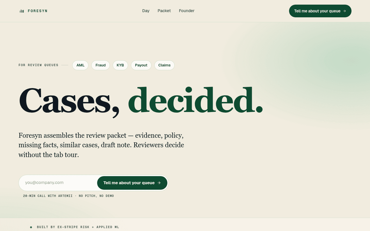
Screenshot of foresyn.ai
65of 100
C+

'Cases, decided.' is genuinely sharp positioning, and the founder-led, no-pitch framing is refreshingly honest for B2B SaaS. But the page is pre-revenue with zero social proof, no logos, no testimonials, and a CTA that asks visitors to describe their own pain before Foresyn has proven it can solve it — that's a lot of trust to earn with one product screenshot and a founder bio.

Your action plan

Ordered by conversion impact. Click any fix to see the before → after.

1
Add quantified outcome claim above the fold
High ImpactQuick WinHero subheadline: 'Foresyn assembles the review packet — evidence, policy, missing facts, similar cases, draft note. Reviewers decide without the tab tour.'
Currently
Describes the mechanism but offers no time/cost outcome
Recommended
Add a specific metric line beneath: 'Hard cases that eat a morning now take a coffee break. Same reviewer, same decision.' — or pull the morning/coffee-break line from below the fold up here
Above-fold copy must answer 'so what?' — outcome-first messaging increases conversion by communicating value before mechanism (Flint McGlaughlin, MECLABS)

Copy rewrites

Ready to use

Drop-in replacements for your highest-leverage text. Each rewrite explains the conversion principle behind it.

Hero subheadline
Foresyn assembles the review packet — evidence, policy, missing facts, similar cases, draft note. Reviewers decide without the tab tour.
Foresyn assembles every case into one packet — evidence, policy, gaps, similar decisions, draft note. Your reviewer reads once and decides. No tab tour, no morning lost.
Outcome specificity + pain agitation: names the time cost ('morning lost') and the relief ('reads once'), making the value concrete before the visitor scrolls
Section header
Every case becomes a tour through your stack. Per case. Hundreds of times a week.
Right now, every case is a manual tour through six tools. Per case. Hundreds of times a week. Foresyn does the tour so your reviewer just decides.
Problem-agitation-solution structure: naming the six tools (visible in the grid below) makes the pain visceral and the solution immediate
Founder section intro
I'm talking to operators of review queues. Your queue is the next conversation.
I'm talking to the people who actually run AML, fraud, KYB, payout, and claims queues. If that's you, your queue is the next conversation.
Audience specificity: naming the exact roles increases relevance and self-identification, reducing bounce from the right ICP
Bottom CTA section header
Spend twenty minutes with me.
Twenty minutes. I'll map Foresyn to your queue — you decide if it fits.
Reciprocity + low commitment framing: shifts from asking for the visitor's time to offering a deliverable (the mapping), which reduces perceived risk of booking
💡

The killer move

High Impact
Add a live queue-type selector that personalizes the page

Replace the static category pills (AML, Fraud, KYB, Payout, Claims) with clickable selectors that dynamically swap the hero subhead, product screenshot example, and CTA micro-copy to match the visitor's queue type — a KYB operator sees KYB-specific pain language and a KYB packet example, not a generic payout mockup. This single personalization move would dramatically increase relevance-to-ICP and reduce the cognitive load of 'does this apply to me?'

How visitors experience your page

Second-by-second walkthrough.

2 strong3 mixed
0-3 secondsStrong
0-3s first impression: Large serif headline 'Cases, decided.' in dark green, category pills (AML, Fraud, KYB, Payout, Claims), email input with CTA button, cream background with subtle gradient
Visitor immediately understands the domain (compliance review) and the promise (decisions made). The category pills are smart — they trigger instant self-identification. Risk: 'Cases, decided.' is evocative but not self-explanatory without the subhead.
3-8 secondsMixed
3-8s value scan: Subheadline explaining the packet concept, 'Built by ex-Stripe Risk + Applied ML' credential, '20-MIN CALL WITH ARTEMII · NO PITCH, NO DEMO' reassurance line
The mechanism is clear but the outcome is still implicit. The Stripe credential is strong but buried. Visitor likely thinks 'interesting, but is this real?' — no logos or quotes to confirm others have validated this.
8-15 secondsStrong
8-15s problem validation: 'Every case becomes a tour through your stack' section with 6-step grid (KYB/KYC, Ledger, Disputes, Policy, Similar cases, Draft + escalate)
This is the page's best section — the six-step grid names the exact pain in the visitor's daily workflow. A compliance ops lead will feel seen here. High scroll-continuation probability.
15-30 secondsMixed
15-30s proof and product: 'One case. One packet.' section with UI mockup of Acme Goods held payout, founder photo and bio, Stanford/Nooks/Stripe logos
The product mockup is compelling but under-annotated — visitors must read surrounding copy to understand what Foresyn generated vs. what existed. Founder bio is credible but the 'pre-pilot, by choice' disclosure may introduce doubt about maturity.
30+ secondsMixed
30s+ decision: 'Spend twenty minutes with me.' CTA section with email input, calendar/48h/founder-led reassurance badges, footer with privacy/terms
The low-pressure framing ('no pitch, no demo') is differentiated and honest, but the CTA still asks the visitor to do the work ('tell me about your queue'). Visitors who reached this point are warm — a stronger outcome promise here would convert more of them.

Health check

8 dimensions, weighted by conversion impact.

First impression & hero
20%
7/10
Sharp headline and smart category pills create instant ICP recognition, but outcome proof is absent above the fold
Copy & messaging
20%
7/10
Voice is distinctive and pain-aware; the morning/coffee-break analogy is excellent but lives below the fold where it belongs above
Call-to-action
15%
5/10
Two identical CTAs, effort-framed label, and no secondary option (e.g., see an example) leave conversion on the table
Trust & social proof
15%
3/10
Zero testimonials, zero logos, zero pilot count — Stripe credential is real but a single bullet cannot carry the trust load for a pre-revenue AI tool
Visual design & layout
10%
8/10
Restrained, editorial aesthetic with strong typographic hierarchy; cream-and-green palette signals premium without trying too hard
Page structure & flow
8%
7/10
Problem → mechanism → product → founder → CTA is logical; the founder section placement before the final CTA is smart for a founder-led sale
Technical & SEO signals
7%
9/10
PageSpeed 98, FCP 0.9s, CLS 0, SEO 100 — technically flawless; meta description mirrors hero copy well
Differentiation & positioning
5%
8/10
'One packet, one read, one decision' is a genuinely differentiated frame in a space full of workflow-automation generalists

Page speed

Tested via Google Lighthouse
98/100
Overall score
Combined performance rating
0.9 s
Largest paint
Time until the main content is visible
0
Layout shift
How much the page moves while loading
0.9 s
First paint
Time until something first appears
1.4 s
Interactive
Time until the page is fully usable
Accessibility: 96SEO: 100Best Practices: 96

Want mobile analysis and fresh re-runs?

Buy roasts to unlock mobile analysis, re-analyze on demand, and more for foresyn.ai.

See roast packs →