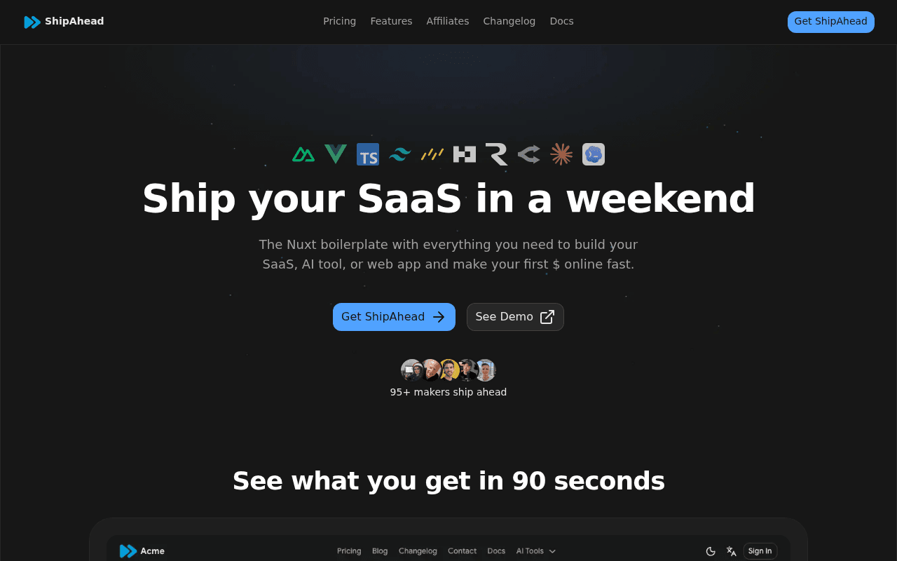
https://shipahe.ad/
https://shipahe.ad/
Screenshot of shipahe.ad
60of 100
C

The hero nails the promise — 'Ship your SaaS in a weekend' is punchy and the tech stack icons add instant credibility with the target audience. But 95+ makers is a dangerously low social proof number that signals early-stage risk, and the pricing section buries the $50 discount urgency below a wall of feature tiles that reads like a spec sheet, not a sales page.

Your action plan

Ordered by conversion impact. Click any fix to see the before → after.

1
Replace weak social proof number with stronger signal
High ImpactSome Work'95+ makers ship ahead' below hero CTAs
Currently
95+ makers ship ahead
Recommended
Show revenue generated by users or a specific outcome stat (e.g., '$2M+ earned by ShipAhead founders') — if unavailable, remove the number and use named testimonial quotes in the hero instead
95 is a low number that signals product immaturity. Cialdini's social proof principle requires the number to feel impressive — sub-100 triggers skepticism, not confidence. Outcome-based proof converts 2-3x better than headcount.

Copy rewrites

Ready to use

Drop-in replacements for your highest-leverage text. Each rewrite explains the conversion principle behind it.

Hero subheadline
The Nuxt boilerplate with everything you need to build your SaaS, AI tool, or web app and make your first $ online fast.
Stop rebuilding auth, payments, and emails from scratch. ShipAhead gives you a production-ready Nuxt foundation — launch in a weekend, not months.
Pain-first framing: addresses the specific frustration (rebuilding boilerplate) before presenting the solution. More specific and outcome-oriented than the generic 'everything you need' phrasing.
Features section headline
All the boring stuff, already done
Every feature your SaaS needs on day one — already built and wired together
Specificity principle: 'boring stuff' undersells the value. Emphasizing 'day one' reinforces the speed promise and 'wired together' addresses the integration pain point developers actually fear.
Pricing section subheadline
Stop wasting weeks on setup. Pay once, save 100+ hours, start shipping today.
One payment. No subscriptions. Ship your first SaaS this weekend and keep 100% of the revenue.
Anchoring and ownership: 'keep 100% of revenue' is a powerful differentiator vs. subscription tools that take a cut. Removes the subscription anxiety that plagues SaaS tool purchases.
Social proof label below hero avatars
95+ makers ship ahead
Join 95+ indie founders already shipping with ShipAhead
Identity-based framing: 'indie founders' speaks directly to the target persona and creates in-group belonging. 'Already shipping' reinforces the core promise with present-tense social validation.
💡

The killer move

High Impact
Add a live revenue counter or founder wall showing what users have built

The single biggest conversion lever for a boilerplate product is proof that it produces real outcomes. A live feed or static showcase of 'SaaS products built with ShipAhead' with revenue figures or user counts transforms the purchase from a tool buy into a proven path — and makes the 95+ number feel like an exclusive club rather than a small sample.

How visitors experience your page

Second-by-second walkthrough.

1 strong3 mixed1 weak
0-3 secondsStrong
0-3s First Impression: Dark hero with tech stack icons, large headline 'Ship your SaaS in a weekend', two CTAs, and 95+ makers social proof
The headline is immediately clear and benefit-driven. Tech stack icons (Nuxt, Vue, TypeScript, Tailwind) instantly qualify the audience — developers recognize their stack and feel at home. High likelihood of continued engagement from the right visitor.
3-8 secondsMixed
3-8s Value Assessment: Subheadline explaining Nuxt boilerplate, 'See Demo' secondary CTA, and the beginning of '90 seconds' demo section
The subheadline is functional but generic. The 90-second demo section is a smart trust-builder but requires scrolling to reach. Visitors who don't scroll miss the product preview entirely — the demo should be more prominent or teased in the hero.
8-15 secondsMixed
8-15s Feature Exploration: Massive grid of 20+ feature tiles covering Authentication, Payments, AI, Database, Style, etc.
The breadth of features is impressive but the presentation is overwhelming. Developers will scan for their specific pain points (auth, payments) and find them quickly, but non-technical founders may feel lost. The grid risks conveying complexity rather than ease.
15-30 secondsMixed
15-30s Purchase Consideration: Pricing section with $149 lifetime access, $50 discount callout, feature checklist, and 'Get Lifetime Access' CTA
The price is reasonable and the lifetime model is compelling, but the section lacks urgency mechanics beyond the $50 discount. No countdown timer, no seats remaining, no money-back guarantee visible. Visitors on the fence have no reason to act now.
30+ secondsWeak
30s+ Trust Validation: Testimonials section 'What makers say after using ShipAhead' and 'Trusted by the best' logo section
Testimonials appear to be present but at small scale in the full-page view. The 'Trusted by the best' section with platform logos is a credibility signal but placement at the very bottom means most visitors never reach it. These trust elements should be distributed throughout the page, not concentrated at the end.

Health check

8 dimensions, weighted by conversion impact.

First impression & hero
20%
7/10
Strong headline and tech stack icons qualify the audience instantly, but social proof number (95+) undermines confidence and the hero lacks a visible product screenshot.
Copy & messaging
20%
6/10
Headline is punchy and clear, but subheadline is generic and feature descriptions are technical rather than outcome-focused throughout.
Call-to-action
15%
6/10
CTAs are visible and consistently labeled, but lack price transparency, urgency signals, and the $50 discount is buried below the fold.
Trust & social proof
15%
5/10
Testimonials exist and avatars add human touch, but 95+ users is a low number, testimonials are bottom-loaded, and no money-back guarantee is visible.
Visual design & layout
10%
7/10
Dark theme with consistent branding looks professional and developer-appropriate; feature grid is clean but dense and could benefit from visual hierarchy improvements.
Page structure & flow
8%
6/10
Logical hero-to-features-to-pricing flow, but the 20+ feature tiles create a long middle section that delays the purchase decision without building sufficient desire.
Technical & SEO signals
7%
7/10
Schema markup present, canonical set, OG image configured, all images have alt text — solid technical foundation with no PageSpeed data available to assess performance.
Differentiation & positioning
5%
6/10
Nuxt-specific positioning is a genuine differentiator in the boilerplate market, but the page doesn't explicitly contrast against competitors like ShipFast or SaaSRock.

Want mobile analysis and fresh re-runs?

Buy roasts to unlock mobile analysis, re-analyze on demand, and more for shipahe.ad.

See roast packs →