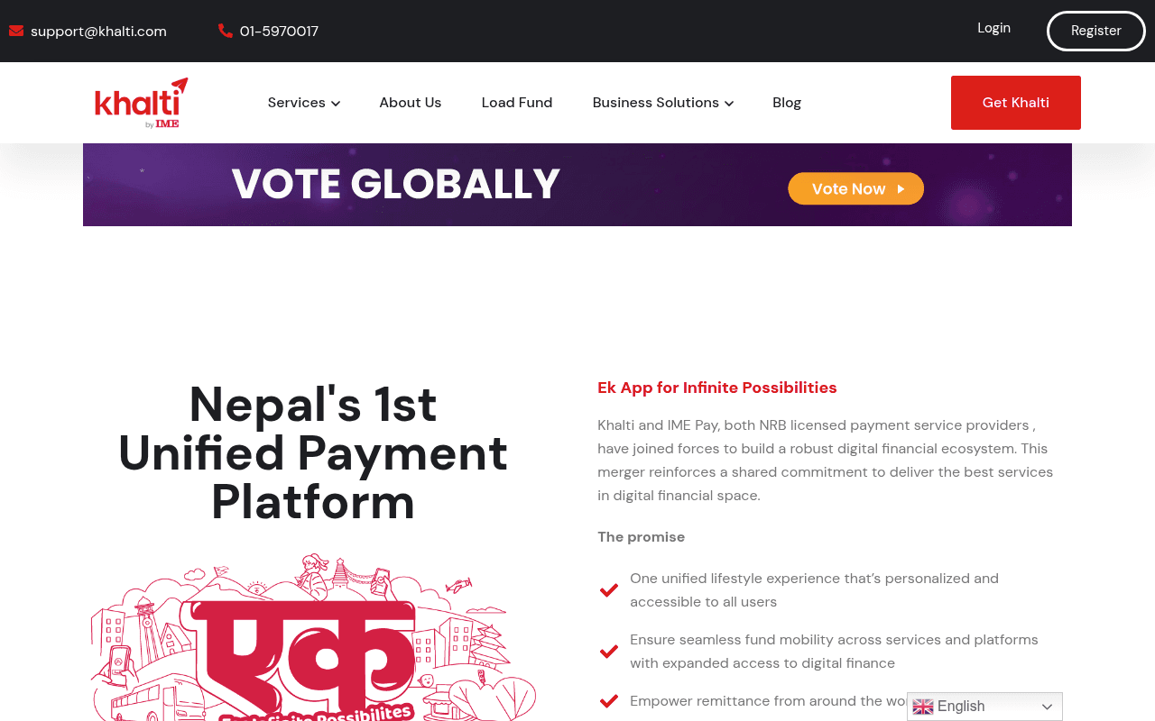
https://khalti.com
https://khalti.com
Screenshot of khalti.com
50of 100
D

The hero is a blurry, dark stock photo with tiny white text — Nepal's 1st Unified Payment Platform deserves better than a background that looks like a CCTV screenshot. The 'VOTE GLOBALLY' banner hijacks prime real estate above the fold, and the actual value proposition is buried below a promotional distraction. 139 logos and 166 images suggest feature sprawl over conversion focus.

Your action plan

Ordered by conversion impact. Click any fix to see the before → after.

1
Replace blurry hero background with crisp, on-brand visual
High ImpactSome WorkHero section full-page background image (Image 2 — dark, blurred photo)
Currently
Dark, heavily overlaid blurry photo of people; text barely legible at small size
Recommended
Use a clean illustrated or product-screenshot hero (app UI mockup on phone) with high contrast background — purple/white brand colors, no overlay needed
Nielsen Norman Group: users leave within 10-20 seconds if visual hierarchy fails. Illegible hero text kills first-impression trust instantly.

Copy rewrites

Ready to use

Drop-in replacements for your highest-leverage text. Each rewrite explains the conversion principle behind it.

Hero H1
Khalti Digital Wallet and Payment Gateway
Nepal's Fastest Way to Pay Bills, Send Money & Recharge — All in One App
Specificity and benefit-led framing: names concrete actions users care about rather than product category labels
Hero subheadline
Pay bills, Send money and Accept payments online instantly from anywhere in Nepal using your phone.
Join 5M+ Nepalis paying bills, topping up, and sending money in seconds. NRB licensed. Always secure.
Social proof + regulatory trust + speed specificity — three conversion levers in one line
Right-column tagline
Ek App for Infinite Possibilities
One App. Every Payment. Anywhere in Nepal.
Clarity over cleverness — 'Infinite Possibilities' is vague; concrete scope (every payment, anywhere) is scannable and credible
Nav CTA button
Get Khalti
Download Free App
Action specificity: 'Get Khalti' assumes brand familiarity; 'Download Free App' removes friction by clarifying the action and cost (free)
💡

The killer move

High Impact
Bring 10 merchant logos and a live transaction counter into the hero

Display a real-time or daily-updated transaction count ('3.2M transactions today') alongside 10 recognizable merchant logos directly in the hero section — this transforms an abstract payment promise into visceral social proof, the single highest-leverage trust signal for financial app adoption in emerging markets.

How visitors experience your page

Second-by-second walkthrough.

1 strong3 mixed1 weak
0-3 secondsWeak
0-3s First Glance: Blurry dark hero image, VOTE GLOBALLY banner, Khalti logo, nav with many items, tiny Sign Up button
Visitor cannot immediately parse what Khalti does or why they should care — the voting banner creates confusion about the site's purpose, increasing bounce risk
3-8 secondsMixed
3-8s Orientation: Nepal's 1st Unified Payment Platform headline, Ek App tagline, merger explanation paragraph, The Promise bullet points
Headline is strong but positioned below fold on desktop; merger backstory is corporate-speak that delays the user's core question: what can I do with this app?
8-15 secondsStrong
8-15s Evaluation: Services grid with icons (Landline, Internet, Topup, Movie, Insurance, Khanepani, DTH, Events, Ride, Flight, Electricity)
Service breadth is impressive and builds confidence — this is the page's strongest conversion asset, but it arrives too late in the scroll journey
15-30 secondsMixed
15-30s Consideration: How Khalti Works section, How to Load Funds, app download section
Process explanation is useful for new users but lacks urgency or incentive to act now — no limited-time offer, cashback highlight, or social proof milestone to trigger decision
30+ secondsMixed
30s+ Decision: Mission section, footer with extensive link list, 139 partner/merchant logos
The 139 merchant logos are powerful trust signals buried at the bottom — moving even a sample of 10-15 logos to the hero area would dramatically improve above-fold credibility and conversion

Health check

8 dimensions, weighted by conversion impact.

First impression & hero
20%
4/10
Blurry hero image, a voting banner hijacking prime real estate, and a tiny CTA combine to waste Nepal's strongest fintech brand's above-fold moment
Copy & messaging
20%
5/10
Nepal's 1st Unified Payment Platform is a credible claim but arrives below fold; body copy is functional but corporate and benefit-light
Call-to-action
15%
4/10
Single small Sign Up button with no urgency, no dual-audience segmentation, and competing Vote Now CTA dilutes conversion intent
Trust & social proof
15%
5/10
NRB licensing and IME merger are strong trust signals but buried in body copy; 139 merchant logos exist but are invisible above fold
Visual design & layout
10%
4/10
Brand colors are consistent but the hero background actively undermines readability; two-column hero layout below fold is cleaner
Page structure & flow
8%
5/10
Services grid and how-it-works sections follow logical order but the promotional banner disrupts the intended conversion funnel at entry
Technical & SEO signals
7%
8/10
PageSpeed 92 with 1.2s FCP and 2.2s LCP is excellent; CLS 0.00 is perfect; 9 images missing alt text is a minor accessibility gap
Differentiation & positioning
5%
6/10
Nepal's 1st Unified Payment Platform plus NRB licensing plus IME merger is a genuinely strong differentiator — it just needs to lead, not hide

Page speed

Based on real Chrome user data
92/100
Overall score
Combined performance rating
2.2 s
Largest paint
Time until the main content is visible
0.00
Layout shift
How much the page moves while loading
1.2 s
First paint
Time until something first appears
26 ms
Responsiveness
How fast the page reacts to clicks

Want mobile analysis and fresh re-runs?

Buy roasts to unlock mobile analysis, re-analyze on demand, and more for khalti.com.

See roast packs →