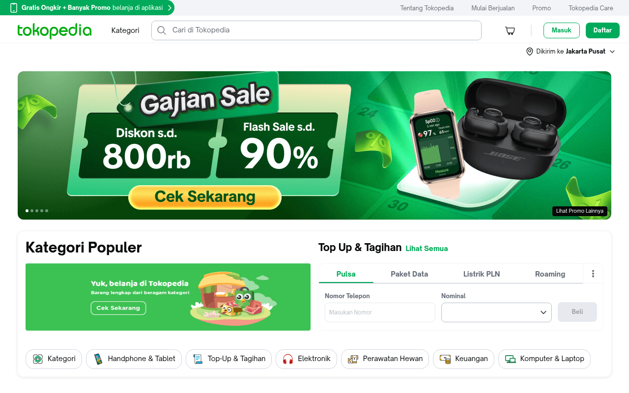
https://tokopedia.com
Screenshot of tokopedia.com
60of 100
C

Tokopedia's hero banner leads with a compelling 'Gajian Sale' promotion with clear discount numbers, but the page metadata is completely empty — no meta title, no H1, no H2 — which is an SEO catastrophe for Indonesia's largest marketplace. The CLS score of 0.12 and dense below-fold SEO text wall suggest technical debt that undermines an otherwise competent homepage.

Your action plan

Ordered by conversion impact. Click any fix to see the before → after.

1
Fix critical missing metadata immediately
High ImpactQuick WinPage meta title, meta description, H1, H2 — all null per metadata scan
Currently
No meta title, no meta description, no H1 or H2 headings present
Recommended
Add meta title 'Tokopedia - Belanja Online Terlengkap & Terpercaya di Indonesia', meta description with key categories, and H1 on hero section
Missing meta title and description directly tanks organic CTR in SERPs; Google uses these for ranking signals and snippet generation — this is table-stakes SEO for a marketplace at this scale

Copy rewrites

Ready to use

Drop-in replacements for your highest-leverage text. Each rewrite explains the conversion principle behind it.

Top announcement bar
Gratis Ongkir + Banyak Promo belanja di aplikasi
Gratis Ongkir + Promo Eksklusif — Download Aplikasi Sekarang
Specificity and action-orientation: adding 'Eksklusif' increases perceived value, 'Sekarang' adds urgency
Hero banner CTA button
Cek Sekarang
Lihat Semua Promo Gajian
Specificity principle: tells users exactly what they get on click, reducing hesitation and increasing CTR vs generic 'check now'
Kategori Populer section banner
Yuk, belanja di Tokopedia — Barang lengkap dari beragam kategori
Jutaan Produk, Harga Terbaik — Temukan Kategori Favoritmu
Social proof via scale ('Jutaan Produk') combined with personalization ('Favoritmu') increases engagement over generic brand tagline
💡

The killer move

High Impact
Implement personalized above-fold social proof counter

Display a real-time or daily-updated counter in the hero area showing transactions completed today (e.g., '2.3 juta transaksi hari ini') — this single element converts brand familiarity into active trust and creates FOMO-driven urgency without requiring a sale event.

How visitors experience your page

Second-by-second walkthrough.

2 strong2 mixed1 weak
0-3 secondsStrong
0-3s first impression: Tokopedia logo, search bar, Masuk/Daftar buttons, and large Gajian Sale hero banner with 800rb discount and 90% flash sale claims
Brand is immediately recognizable; discount numbers are large and legible; visitor likely feels this is a deal-oriented session and is primed to explore — strong opening
3-8 secondsStrong
3-8s orientation: Kategori Populer section, Top Up & Tagihan widget with phone number input, category pill navigation bar
Two high-utility widgets (categories + top-up) serve different intent types simultaneously; visitor with bill-pay intent can act immediately without scrolling — excellent utility design
8-15 secondsMixed
8-15s engagement: Product recommendation grid with prices, ratings, seller names, and 'For You' personalization tab
Product grid is dense and functional but lacks visual hierarchy — all products compete equally for attention; visitor may feel overwhelmed without a clear 'best pick' signal
15-30 secondsMixed
15-30s consideration: More product rows, category shortcuts, promotional banner inviting sellers to join
Seller recruitment banner interrupts buyer flow mid-page; a shopper in consideration mode is pulled into a different conversion funnel — creates cognitive dissonance
30+ secondsWeak
30s+ decision: Footer navigation with extensive category links, massive SEO text blocks, newsletter signup
Visitor who scrolls this far encounters a wall of SEO text that signals low editorial quality; trust erodes and bounce probability increases — this section actively works against conversion

Health check

8 dimensions, weighted by conversion impact.

First impression & hero
20%
7/10
Gajian Sale banner is visually bold with clear discount numbers but lacks urgency mechanism like a countdown timer
Copy & messaging
20%
6/10
Functional Indonesian copy communicates deals clearly but relies on generic phrases; no unique brand voice or specificity beyond numbers
Call-to-action
15%
6/10
Cek Sekarang and Daftar CTAs are visible and properly colored but generic — no value proposition attached to the action
Trust & social proof
15%
6/10
No testimonials, no visible seller count or buyer stats in hero; product ratings visible in grid but no macro trust signals above fold
Visual design & layout
10%
7/10
Clean green brand palette, good use of whitespace in nav; hero banner is professionally designed with strong visual hierarchy
Page structure & flow
8%
6/10
Logical top-to-bottom flow disrupted by mid-page seller recruitment banner and bottom SEO text wall
Technical & SEO signals
7%
3/10
Performance score 74 is acceptable but CLS 0.12 fails Core Web Vitals, and completely missing meta title, description, H1, H2 is an SEO emergency
Differentiation & positioning
5%
5/10
No visible messaging differentiating Tokopedia from Shopee or Lazada — relies entirely on brand recognition rather than stated unique value

Page speed

Based on real Chrome user data
74/100
Overall score
Combined performance rating
2.8 s
Largest paint
Time until the main content is visible
0.12
Layout shift
How much the page moves while loading
1.3 s
First paint
Time until something first appears
132 ms
Responsiveness
How fast the page reacts to clicks

Want mobile analysis and fresh re-runs?

Buy roasts to unlock mobile analysis, re-analyze on demand, and more for tokopedia.com.

See roast packs →