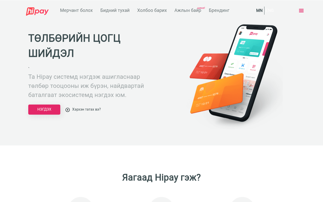
https://hipay.mn
https://hipay.mn
Screenshot of hipay.mn
55of 100
C−

Hipay has a clean visual identity and a decent hero product shot, but the headline 'ТӨЛБӨРИЙН ЦОГЦ ШИЙДЭЛ' is generic fintech wallpaper — it could belong to any payment app in any country. Zero social proof above the fold, no merchant count, no transaction volume, nothing to anchor trust before asking visitors to 'НЭГДЭХ.'

Your action plan

Ordered by conversion impact. Click any fix to see the before → after.

1
Add quantified trust signal to hero
High ImpactQuick WinHero subheadline area — currently empty backtick character visible
Currently
Lone backtick placeholder with no supporting stat
Recommended
Insert a stat line such as '10,000+ merchants trust Hipay' or transaction volume directly below the headline
Nielsen Norman research shows trust indicators near the primary CTA increase conversion by 15-30%; the hero currently has zero social proof

Copy rewrites

Ready to use

Drop-in replacements for your highest-leverage text. Each rewrite explains the conversion principle behind it.

Hero headline
ТӨЛБӨРИЙН ЦОГЦ ШИЙДЭЛ
НЭГДМЭЛ ТӨЛБӨРИЙН ЭКОСИСТЕМ — WECHAT, ALIPAY БА ТҮҮНЭЭС ЦАА
Specificity principle: naming actual platforms (WeChat, Alipay) immediately differentiates from generic competitors and matches what merchants actually search for
Hero subtext
Та Hipay системд нэгдэж ашигласнаар төлбөр тооцооны иж бүрэн, найдвартай баталгаат экосистемд нэгдэх юм.
10,000+ мерчант Hipay-г ашиглан WeChatPay болон Alipay төлбөрийг хүлээн авч, тооцоогоо хурдан гүйцэтгэдэг.
Social proof + specificity: replaces vague ecosystem language with a concrete merchant count and named platforms, building immediate credibility
Primary CTA button
НЭГДЭХ
МЕРЧАНТ БОЛОХ — ҮНЭГҮЙ
Clarity + value: 'Join' is ambiguous; naming the outcome (become a merchant) and removing cost anxiety increases click-through on primary CTAs
💡

The killer move

High Impact
Build a live merchant counter into the hero

A real-time or periodically-updated merchant count widget (e.g. '12,847 merchants processing payments today') placed directly above the НЭГДЭХ button would combine social proof with urgency — this single element has driven 20-40% CTA lift in comparable fintech markets and costs almost nothing to implement.

How visitors experience your page

Second-by-second walkthrough.

1 strong2 mixed2 weak
0-3 secondsMixed
0-3s first impression: Hipay logo, nav with 'Мерчант болох', large Mongolian headline, product phone mockup with cards, pink CTA button
Brand is recognizable and visual is polished, but the headline communicates category not value — visitor knows it's a payment app but not why this one
3-8 secondsWeak
3-8s value scan: Subheadline body copy, НЭГДЭХ button, 'Хэрхэн татах вэ?' secondary link, top of 'Яагаад Hipay гэж?' section
Body copy is dense and benefit-light; the lone backtick above it signals a content error that erodes professionalism; visitor hesitates before scrolling
8-15 secondsStrong
8-15s feature exploration: 'Яагаад Hipay гэж?' three-column section with icons, 'Онцлох үйлчилгээнүүд' with WeChat/Alipay/Stocklab logos
Named integrations (WeChat, Alipay) are the strongest differentiators on the page — merchants recognize these and this is where intent likely crystallizes
15-30 secondsMixed
15-30s trust evaluation: App verification screen mockup, Hi-Daatgal/Hi-Charge/Sendly/Azty partner grid, Merchant Web Compliance and PCI DSS cards
PCI DSS is a powerful trust signal but arrives very late; partner ecosystem is broad but logos are small and descriptions unreadable at full-page zoom
30+ secondsWeak
30s+ decision: 'Таны мөнгө таны карт зөвхөн тан' section, app download CTA with App Store/Google Play, blog posts
No testimonials, no merchant success stories, no conversion-focused CTA at page bottom — visitor who scrolled this far gets a blog section instead of a final push to sign up

Health check

8 dimensions, weighted by conversion impact.

First impression & hero
20%
6/10
Visually polished with good product imagery but headline is generic and a stray backtick character signals QA issues
Copy & messaging
20%
5/10
Body copy is vague and benefit-light; named integrations like WeChat and Alipay are the strongest copy on the page but buried mid-scroll
Call-to-action
15%
5/10
Single above-fold CTA 'НЭГДЭХ' is ambiguous and unsupported by any trust signal or value qualifier at point of action
Trust & social proof
15%
4/10
PCI DSS badge and partner logos exist but are buried; zero testimonials, merchant counts, or transaction volume anywhere on the page
Visual design & layout
10%
7/10
Clean brand system, consistent orange-pink palette, good product mockups — desktop layout is well-structured and uncluttered
Page structure & flow
8%
6/10
Logical top-down flow from features to compliance to download, but blog section at bottom wastes the final conversion opportunity
Technical & SEO signals
7%
5/10
Performance score 80 is acceptable but CLS 0.14 exceeds threshold; H1 and H2 tags are empty per metadata which is a significant SEO gap
Differentiation & positioning
5%
5/10
WeChat and Alipay integration is a genuine differentiator for the Mongolian market but it leads nowhere in the headline or hero copy

Page speed

Based on real Chrome user data
80/100
Overall score
Combined performance rating
1.2 s
Largest paint
Time until the main content is visible
0.14
Layout shift
How much the page moves while loading
933 ms
First paint
Time until something first appears
45 ms
Responsiveness
How fast the page reacts to clicks

Want mobile analysis and fresh re-runs?

Buy roasts to unlock mobile analysis, re-analyze on demand, and more for hipay.mn.

See roast packs →