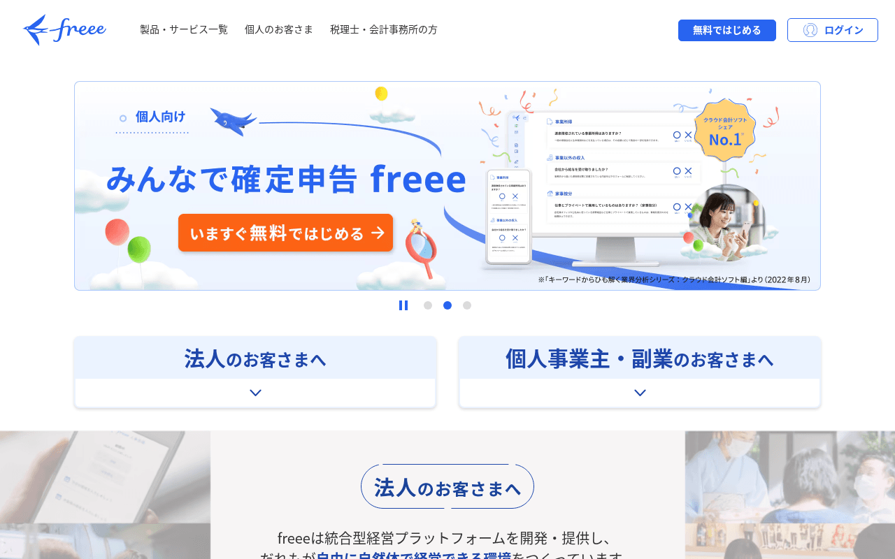
https://www.freee.co.jp
Screenshot of freee.co.jp
55of 100
C−

freee leads with a rotating hero carousel — the single biggest conversion killer in SaaS — while burying the No.1 cloud accounting share badge in a corner footnote. The homepage tries to serve corporations, freelancers, and sole proprietors simultaneously with accordion segments, creating a choose-your-own-adventure that converts none of them optimally. The CTA hierarchy is solid but the value proposition never answers 'why freee over competitors' above the fold.

Your action plan

Ordered by conversion impact. Click any fix to see the before → after.

1
Replace carousel hero with static, audience-segmented split hero
High ImpactSome WorkHero carousel showing 個人向け slide with rotating dots
Currently
Auto-rotating carousel with 3 slides, primary CTA buried inside image
Recommended
Static two-column hero: left for 法人, right for 個人事業主, each with distinct headline, benefit bullet, and CTA — no rotation
Nielsen Norman Group data shows carousels reduce CTA click-through by up to 89% vs static heroes; rotating content is ignored as banner blindness kicks in within 3 seconds

Copy rewrites

Ready to use

Drop-in replacements for your highest-leverage text. Each rewrite explains the conversion principle behind it.

Hero headline (法人向け section)
自動化・可視化を実現する統合型クラウド会計ソフト
経理時間を大幅削減。シェアNo.1のクラウド会計ソフトで、法人の会計・労務を一気通貫管理。
Specificity + social proof: leads with outcome (time saved), anchors with market leadership, clarifies scope — three conversion principles in one headline
Individual section headline
好きなことをする時間を大切にして欲しいから。
確定申告、最短1日で完了。freeeで経理の手間をゼロにして、本業に集中しよう。
Specificity over sentiment: replaces emotional platitude with a concrete time-based outcome that directly addresses the freelancer's core pain point
Platform description paragraph
freeeは統合型経営プラットフォームを開発・提供し、だれもが自由に自然体で経営できる環境をつくっています。
freeeは150万社以上が選ぶ統合型経営プラットフォーム。会計・労務・販売をひとつにつなぎ、バックオフィス業務を自動化します。
Social proof + specificity: replaces mission-statement language with user scale data and concrete feature benefits — what visitors need to decide, not what the company believes
Free trial CTA button
無料ではじめる
30日間無料で試す — カード不要
Risk reversal + specificity: the page already mentions 30-day trial in a popup but not on the primary CTA; combining duration and no-card-required removes the two biggest trial signup objections
💡

The killer move

High Impact
Build a dedicated landing page per audience segment and use the homepage only for brand/navigation

freee's homepage is doing the job of three separate landing pages simultaneously — corporate, freelancer, and sole proprietor — which dilutes conversion for all three. A/B test routing nav traffic to segment-specific pages (freee.co.jp/hojin, freee.co.jp/kojin) with tailored hero, proof, and CTA; the homepage becomes a brand hub with a single segmentation choice, not a conversion page trying to serve everyone.

How visitors experience your page

Second-by-second walkthrough.

1 strong2 mixed2 weak
0-3 secondsMixed
0-3s first impression: freee logo, nav with 製品・サービス一覧, hero carousel on 個人向け slide with みんなで確定申告 freee headline and No.1 badge, two accordion segments below
Brand is recognizable but the carousel immediately signals 'this page is for everyone' which means it feels like it's for no one; visitor scans for their segment and finds the accordion — adds friction before value is communicated
3-8 secondsMixed
3-8s orientation: Two accordion panels: 法人のお客さまへ and 個人事業主・副業のお客さまへ with chevron expand icons, partial view of 法人のお客さまへ section beginning below fold
Segmentation is logical but accordion UX on desktop is suboptimal — it hides content that should be visible; corporate visitors expect to see product proof immediately, not click to reveal it
8-15 secondsStrong
8-15s value assessment: 法人 section with freee会計 and freee人事労務 product cards, CTAs for 無料で始める and 資料ダウンロード, product icon grid showing 6 additional products
Product breadth is well-communicated; dual CTA strategy (trial + download) captures both high and low intent visitors — this section does the heavy lifting the hero should have done
15-30 secondsWeak
15-30s trust evaluation: Individual business section with lifestyle photography, single testimonial from 宿泊・旅行サービス業 藤井様, freee会計 and freee開業 product CTAs
One testimonial with no photo, no company size, no specific metric is insufficient social proof for a purchase decision; competitor differentiation is completely absent throughout the page
30+ secondsWeak
30s+ decision: お知らせ news section with 5 update items, footer with full product directory, App Store and Google Play badges
Page ends on a news feed — the lowest-conversion possible closing element; no final CTA, no urgency mechanism, no comparison table; visitors who scrolled this far are high-intent and get abandoned at the finish line

Health check

8 dimensions, weighted by conversion impact.

First impression & hero
20%
5/10
Carousel hero wastes the No.1 market share claim and forces visitors to self-segment before seeing any value proposition
Copy & messaging
20%
6/10
Product descriptions are clear but rely on features over outcomes; emotional copy for freelancers lacks specificity; no competitive differentiation anywhere
Call-to-action
15%
7/10
Consistent 無料ではじめる CTAs with クレジットカード不要 reassurance are solid; 30-day trial buried in popup rather than primary CTA is a missed opportunity
Trust & social proof
15%
4/10
No.1 badge is hidden in carousel; only one named testimonial with no metrics; 150万社 user count not prominently displayed; zero competitor comparison
Visual design & layout
10%
7/10
Clean blue-and-white brand system, good product screenshot usage, lifestyle photography humanizes the freelancer section — professional and on-brand
Page structure & flow
8%
5/10
Accordion segmentation on desktop creates unnecessary clicks; page ends on news feed instead of a conversion-focused closing section
Technical & SEO signals
7%
8/10
PageSpeed 92 with 883ms FCP and 1.1s LCP is excellent; 67 missing alt texts and zero accessibility score reported are the only meaningful technical gaps
Differentiation & positioning
5%
4/10
No.1 share claim exists but is not leveraged; page never explains why freee beats competitors like MFクラウド or弥生; positioning is category-generic

Page speed

Based on real Chrome user data
92/100
Overall score
Combined performance rating
1.1 s
Largest paint
Time until the main content is visible
0.00
Layout shift
How much the page moves while loading
883 ms
First paint
Time until something first appears
149 ms
Responsiveness
How fast the page reacts to clicks

Want mobile analysis and fresh re-runs?

Buy roasts to unlock mobile analysis, re-analyze on demand, and more for freee.co.jp.

See roast packs →