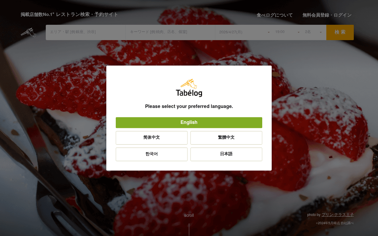
https://tabelog.com
https://tabelog.com
Screenshot of tabelog.com
65of 100
C+

Tabelog is Japan's dominant restaurant platform, but the first thing visitors see is a language-selection modal blocking a beautiful hero image and a fully functional search bar — friction before value. The page below the fold is a content-rich directory that works hard, but the above-fold experience buries the No.1 claim behind a popup that should have been solved with browser detection years ago.

Your action plan

Ordered by conversion impact. Click any fix to see the before → after.

1
Auto-detect language via browser headers instead of modal
High ImpactSome WorkLanguage selection modal (Tabelog logo + 5 language buttons)
Currently
Full-screen blocking modal forces every visitor to manually select a language before seeing any content
Recommended
Use Accept-Language HTTP header or navigator.language to auto-redirect; show a small non-blocking language switcher in the nav for overrides
Blocking interstitials increase bounce rate by 10-25% (Nielsen Norman Group). Every visitor hits this wall before engaging with the core search product.

Copy rewrites

Ready to use

Drop-in replacements for your highest-leverage text. Each rewrite explains the conversion principle behind it.

Meta title
食べログ【掲載店舗数No.1】グルメ・レストラン予約サイト
食べログ|897,204店舗から探すグルメ・レストラン予約サイト No.1
Specificity: exact restaurant count is more compelling than a generic No.1 claim; also improves CTR from SERPs
Header tagline
掲載店舗数No.1※レストラン検索・予約サイト
897,204店舗・口コミ6,082万件 — 日本最大のレストラン予約サイト
Social proof + specificity: two concrete numbers replace a vague superlative, building immediate credibility
Language modal prompt
Please select your preferred language.
Welcome — choose your language to find the perfect restaurant in Japan
Benefit framing: tells the visitor WHY they're choosing a language, connecting the friction to the value proposition
💡

The killer move

High Impact
Replace the language modal with a personalized intent-detection entry point

Instead of a language modal, use browser signals to auto-set language and show a single smart prompt — 'Planning dinner tonight?' with pre-filled date/time — turning the first interaction from administrative friction into a conversion moment that captures high-intent visitors before they bounce.

How visitors experience your page

Second-by-second walkthrough.

3 strong2 mixed
0-3 secondsMixed
0-3s first impression: Appetizing strawberry dessert hero image, Tabelog logo, search bar with date/time/party fields, and a blocking language-selection modal
The food photography creates appetite appeal instantly, but the modal immediately interrupts — visitor's first action is administrative, not exploratory. Risk of bounce for impatient users.
3-8 secondsStrong
3-8s orientation: After dismissing modal: full search bar with area, keyword, date, time, party-size fields and orange search button
The search interface is comprehensive and familiar — experienced diners will immediately understand the product and begin inputting. The No.1 claim in the header adds quick credibility.
8-15 secondsStrong
8-15s exploration: エリアから探す (Search by area) section with Tokyo, Kanagawa, Aichi, Osaka, Kyoto, Fukuoka tiles with restaurant counts
Regional browsing with specific counts (東京138,568件) is highly reassuring — visitor sees depth of inventory and can self-select their path. Strong for undecided browsers.
15-30 secondsStrong
15-30s consideration: 料理ジャンルから探す (by cuisine), 特集 (featured collections), 利用シーンから探す (by occasion), こだわり条件から探す (by preference)
Multiple discovery pathways reduce dead ends — visitors with different intent models (cuisine-first, occasion-first, location-first) all find a relevant entry point. Excellent UX architecture.
30+ secondsMixed
30s+ decision: Tabelog Award 2026 section, 百名店 (100 best restaurants), user reviews, course browsing, genre rankings, restaurant registration CTA at bottom
The page is extremely long with high content density. Award and best-restaurant sections build authority, but there is no persistent reservation CTA or sticky search bar to capture intent at scroll depth — conversion opportunity lost.

Health check

8 dimensions, weighted by conversion impact.

First impression & hero
20%
6/10
Beautiful food imagery undermined by a blocking language modal that adds friction before any value is delivered
Copy & messaging
20%
6/10
No.1 claim is present but vague; specific numbers (897,204 restaurants, 60.82M reviews) exist in metadata but are underused in visible hero copy
Call-to-action
15%
6/10
Search button is visible and prominent but generically labeled; no secondary CTA for registration above fold; no urgency signals
Trust & social proof
15%
8/10
Restaurant counts per region, Tabelog Awards, 百名店 designation, and user review counts provide strong layered credibility throughout the page
Visual design & layout
10%
7/10
Clean grid-based layout with good food photography; modal design is functional but the overlay pattern is dated for a market leader
Page structure & flow
8%
7/10
Multiple discovery pathways (area, cuisine, occasion, preference) are well-organized; page is very long without a sticky search or persistent CTA at depth
Technical & SEO signals
7%
8/10
PageSpeed 86, FCP 1.6s, LCP 2.8s, CLS 0.00 — solid performance; schema markup present; canonical set correctly; 1 image missing alt text
Differentiation & positioning
5%
6/10
No.1 by listing count is stated but not dramatized; competitors like Gurunavi and HotPepper are not addressed; the award and review ecosystem are genuine differentiators that deserve more hero prominence

Page speed

Based on real Chrome user data
86/100
Overall score
Combined performance rating
2.8 s
Largest paint
Time until the main content is visible
0.00
Layout shift
How much the page moves while loading
1.6 s
First paint
Time until something first appears
96 ms
Responsiveness
How fast the page reacts to clicks

Want mobile analysis and fresh re-runs?

Buy roasts to unlock mobile analysis, re-analyze on demand, and more for tabelog.com.

See roast packs →