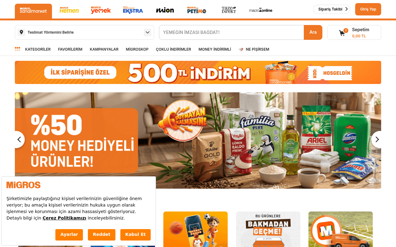
https://www.migros.com.tr
Screenshot of migros.com.tr
50of 100
D

The 500 TL first-order discount banner is the strongest conversion asset on the page, yet it's buried under a multi-brand nav bar with 9 logos competing for attention before a single product is shown. The hero carousel leads with a loyalty-points promotion (%50 Money Hediyeli) that requires existing program knowledge — a cold visitor sees jargon, not value. No H1, zero testimonials, and a CLS of 0.18 mean this page is leaking both trust and SEO equity simultaneously.

Your action plan

Ordered by conversion impact. Click any fix to see the before → after.

1
Elevate the 500 TL welcome offer into the hero
High ImpactSome WorkOrange banner 'İLK SİPARİŞİNE ÖZEL 500 TL İNDİRİM' below nav
Currently
Thin promotional strip below the 9-logo nav bar, easily skipped
Recommended
Move this offer into a full-width hero section with a prominent CTA button 'Hemen Alışverişe Başla' and countdown timer to create urgency
First-order incentives reduce acquisition friction; anchoring the discount in the hero increases perceived value and drives immediate action per loss-aversion principles

Copy rewrites

Ready to use

Drop-in replacements for your highest-leverage text. Each rewrite explains the conversion principle behind it.

Hero carousel headline
%50 MONEY HEDİYELİ ÜRÜNLER!
Seçili Ürünlerde %50 Money Kazan — Bugün Sipariş Ver, Yarın Harca!
Specificity and urgency: original assumes loyalty program knowledge; rewrite explains the benefit and adds a time-based nudge
Search bar placeholder
YEMEĞİN İMZASI BAĞDAT!
Ne aramak istersiniz? Meyve, süt, deterjan...
Clarity over cleverness: branded tagline in a search field confuses new users; descriptive placeholder reduces cognitive load and increases search engagement
Value prop section
Özenle Seçilmiş, Paketlenmiş Ürünler — Senin İçin Tüm Siparişlerini Özenle Hazırlıyoruz
Her Ürün Kontrol Edilir, Özenle Paketlenir — Taze Garantisiyle Kapınıza Gelir
Social proof and specificity: adds 'taze garantisi' as a concrete trust anchor, replacing vague repetition of 'özenle' with a tangible promise
First-order discount banner
İLK SİPARİŞİNE ÖZEL 500 TL İNDİRİM — KOD: HOSGELDİN
İlk Siparişinde 500 TL Kazan — HOSGELDİN Kodunu Kullan, Hemen Başla
Action orientation: reframes passive discount as active earning, adds imperative CTA verb to drive click-through from banner
💡

The killer move

High Impact
Deploy a delivery-time promise as the hero headline

Test a hero that leads with a specific, bold delivery commitment — '2 Saatte Kapınızda' or 'Bugün Sipariş Ver, Bugün Teslim' — above the product carousel; delivery speed is the primary purchase driver in online grocery and no competitor claim is visible anywhere on this page, making it an uncontested differentiator that would immediately separate Migros from generic e-commerce.

How visitors experience your page

Second-by-second walkthrough.

1 strong3 mixed1 weak
0-3 secondsMixed
0-3s First Impression: 9-brand logo nav bar, delivery method selector, search bar with branded tagline, category nav, then the 500 TL discount strip
Brand recognition is strong for existing Migros users but the multi-brand header creates confusion for new visitors who cannot immediately identify the primary service; the discount offer is visible but not prominent enough to anchor attention
3-8 secondsMixed
3-8s Value Assessment: Hero carousel showing %50 Money Hediyeli Ürünler campaign with product imagery; carousel navigation arrows
Existing loyalty members understand Money rewards; new visitors see jargon and product photos without a clear reason to choose Migros over competitors — no delivery time promise or price guarantee is visible
8-15 secondsStrong
8-15s Exploration: Four promotional tiles (Sofia Havlu, Çekiliş, Oyna Kazan, Bölgeye Özel), Ne Pişirsem section, İlgini Çekebilecek Ürünler product grid
Product grid with prices and discount badges is compelling; the recipe suggestion feature adds differentiation; visitors with purchase intent will begin scanning products and may add to cart
15-30 secondsMixed
15-30s Consideration: Migros'u Keşfet category grid with 20+ category icons, brand-specific banners (Finish promotion), FİDE and FALIM branded product rows
Category depth is impressive but the page becomes visually overwhelming; no persistent sticky CTA or cart reminder keeps conversion intent alive as users scroll deep; risk of decision paralysis
30+ secondsWeak
30s+ Decision: Value proposition icons (Esnek Ödeme, İstediğin Saatte Teslimat, Özenle Seçilmiş, Kazan Moneyleri), footer with extensive links, Migros privacy banner
Value props appear too late in the journey — delivery speed and payment flexibility should anchor the hero, not the footer area; visitors who scroll this far without converting are unlikely to be re-engaged by generic benefit icons

Health check

8 dimensions, weighted by conversion impact.

First impression & hero
20%
5/10
Strong brand recognition but hero carousel leads with loyalty jargon; the best conversion asset (500 TL offer) is demoted to a thin strip
Copy & messaging
20%
5/10
Turkish copy is functional but relies on campaign shorthand and loyalty program familiarity; no clear value proposition for first-time visitors
Call-to-action
15%
4/10
No primary CTA button in the hero; 'Ara' search button and cart icon are utilities, not conversion drivers; discount banner lacks a clickable CTA
Trust & social proof
15%
4/10
Zero testimonials, no delivery time guarantee visible above fold, no review counts on products; Migros brand equity carries the page alone
Visual design & layout
10%
7/10
Consistent orange brand palette, clean product imagery, professional grid layout; slightly cluttered above fold due to competing nav elements
Page structure & flow
8%
5/10
Value propositions appear near the footer rather than anchoring the hero; category exploration is strong mid-page but conversion momentum is lost
Technical & SEO signals
7%
5/10
Performance score 72, CLS 0.18 exceeds good threshold, LCP 2.6s is borderline, no H1 tag, 11 images missing alt text — meaningful SEO and UX gaps
Differentiation & positioning
5%
5/10
No explicit competitive differentiator stated; 'largest Turkish online grocery' positioning is implied by brand scale but never articulated on page

Page speed

Based on real Chrome user data
72/100
Overall score
Combined performance rating
2.6 s
Largest paint
Time until the main content is visible
0.18
Layout shift
How much the page moves while loading
801 ms
First paint
Time until something first appears
153 ms
Responsiveness
How fast the page reacts to clicks

Want mobile analysis and fresh re-runs?

Buy roasts to unlock mobile analysis, re-analyze on demand, and more for migros.com.tr.

See roast packs →