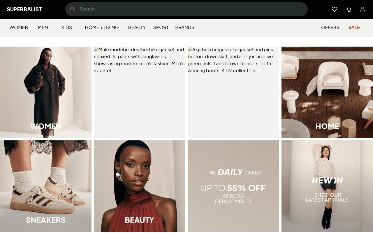
https://superbalist.com
Screenshot of superbalist.com
45of 100
D

Superbalist's homepage skips a hero entirely — visitors land on a raw category grid with broken alt-text rendering as visible placeholder sentences on two of four panels. The 55% off Daily Offer is buried in row two with no CTA button, and there's zero value proposition above the fold to differentiate from Takealot or Zando.

Your action plan

Ordered by conversion impact. Click any fix to see the before → after.

1
Fix broken image alt-text rendering as visible body text
High ImpactQuick WinMEN and KIDS category panels showing raw alt-text strings as paragraph text
Currently
Male model in a leather biker jacket... Men's apparel. / A girl in a beige puffer jacket...
Recommended
Ensure images load correctly and alt attributes are hidden from visual rendering; audit CDN/lazy-load configuration
Visible alt-text destroys credibility instantly — Nielsen research shows users form trust judgments in 50ms; broken images signal an unreliable site

Copy rewrites

Ready to use

Drop-in replacements for your highest-leverage text. Each rewrite explains the conversion principle behind it.

Daily Offer tile headline
THE DAILY OFFER UP TO 55% OFF ACROSS DEPARTMENTS
Today Only: Up to 55% Off Fashion, Beauty & More — New Deals Every Day
Specificity and urgency — naming categories and reinforcing daily refresh increases perceived value and click motivation
NEW IN tile
NEW IN SHOP OUR LATEST ARRIVALS
Just Landed: Shop New Arrivals This Week
Recency specificity — 'this week' signals freshness and creates FOMO vs generic 'latest'
WOMEN category tile label
WOMEN
Shop Women
Action-oriented microcopy converts passive labels into CTAs, reducing cognitive friction at the point of click decision
💡

The killer move

High Impact
Implement a personalized hero with geo-aware seasonal messaging

South Africa has distinct regional climates and a strong local fashion identity — a dynamic hero that surfaces seasonally relevant categories (e.g. summer dresses in Cape Town vs transitional layers in Joburg) with a clear tagline like South Africa's Fashion Home would immediately differentiate Superbalist from generic global competitors and lift engagement from first-time visitors.

How visitors experience your page

Second-by-second walkthrough.

1 strong2 mixed2 weak
0-3 secondsWeak
0-3s first impression: Dark nav bar, search field, category nav, then four image tiles — two with visible alt-text strings as body paragraphs
Visitor sees a broken page on two of four hero tiles; trust is immediately undermined before any product is considered
3-8 secondsMixed
3-8s orientation: WOMEN tile with model, broken MEN and KIDS tiles, HOME tile, then SNEAKERS, BEAUTY, Daily Offer 55% off, NEW IN
Category structure is clear but the broken images and absence of a value proposition leave the visitor without a reason to stay over competitors
8-15 secondsStrong
8-15s engagement: OUR BRANDS strip (Mango, Nike, H&M, Cotton On, Levi's, Adidas visible), BROWSE CATEGORIES horizontal scroll bar
Brand logos provide credibility signal; category browse bar is useful for intent-driven visitors who know what they want
15-30 secondsWeak
15-30s consideration: Long SEO text blocks — Welcome to Superbalist, Fashion for Women, Fashion for Men, Dressing for the Seasons, etc.
Wall of keyword-stuffed SEO copy feels like a content farm, not a premium retailer — erodes brand perception for anyone who scrolls this far
30+ secondsMixed
30s+ decision: Footer with account links, client concierge, company info, app download badges, social icons, payment method logos
Payment logos (Visa, Mastercard, etc.) and app store badges add trust, but the journey to this point has been fragmented — conversion likely driven by direct intent rather than page persuasion

Health check

8 dimensions, weighted by conversion impact.

First impression & hero
20%
3/10
No hero, two visually broken category tiles with raw alt-text, zero value proposition above fold
Copy & messaging
20%
4/10
Category labels are clear but SEO text walls dominate lower page and no brand voice is established
Call-to-action
15%
4/10
No CTA buttons anywhere above fold; promotional tile has no button; navigation links do all the work
Trust & social proof
15%
6/10
Brand logos strip and payment icons provide solid trust signals but no reviews, ratings, or social proof metrics
Visual design & layout
10%
6/10
Clean grid aesthetic and good photography where images load; broken alt-text rendering is a critical visual defect
Page structure & flow
8%
5/10
Category grid logic is sound but no narrative arc — jumps from broken tiles to offers to SEO copy with no conversion funnel
Technical & SEO signals
7%
5/10
PageSpeed 85 and LCP 2.3s are solid but null meta title and description are a significant SEO gap
Differentiation & positioning
5%
3/10
Nothing on the page explains why Superbalist over Zando or Takealot — no USP, no tagline, no unique angle visible

Page speed

Based on real Chrome user data
85/100
Overall score
Combined performance rating
2.3 s
Largest paint
Time until the main content is visible
0.00
Layout shift
How much the page moves while loading
1.1 s
First paint
Time until something first appears
67 ms
Responsiveness
How fast the page reacts to clicks

Want mobile analysis and fresh re-runs?

Buy roasts to unlock mobile analysis, re-analyze on demand, and more for superbalist.com.

See roast packs →