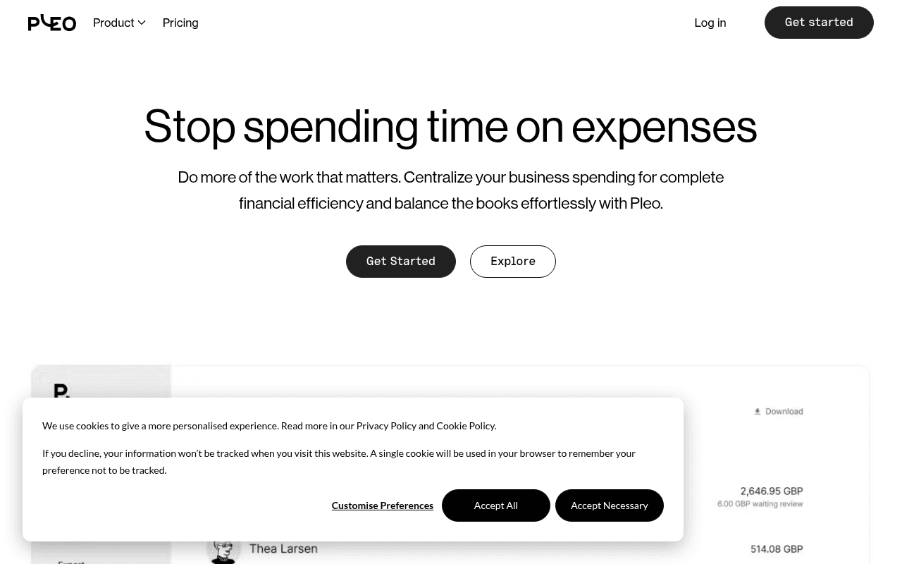
https://pleo.io\
https://pleo.io\
Screenshot of pleo.io
50of 100
D

Pleo's hero headline 'Stop spending time on expenses' is punchy, but the page stops there — two feature sections and a footer is not a landing page, it's a brochure stub. Zero social proof, zero customer logos, zero pricing anchors, and a product screenshot that's half-buried under a cookie banner. For a fintech asking businesses to hand over their company cards, this trust vacuum is a conversion killer.

Your action plan

Ordered by conversion impact. Click any fix to see the before → after.

1
Add customer logo bar and quantified social proof immediately below hero
High ImpactQuick WinHero section — empty whitespace between CTAs and product screenshot
Currently
No logos, no testimonials, no user count visible anywhere on page
Recommended
Insert a 6-logo trust bar ('Trusted by 30,000+ companies') with a single pull-quote testimonial from a recognizable brand directly below the CTA buttons
Nielsen Norman research shows trust signals in the hero increase conversion rates by 15-30% for financial products where perceived risk is high; meta description mentions 'thousands of companies' but this proof never appears on the page

Copy rewrites

Ready to use

Drop-in replacements for your highest-leverage text. Each rewrite explains the conversion principle behind it.

Hero headline
Stop spending time on expenses
Stop wasting hours on expense reports
Specificity — 'hours' makes the pain tangible and quantified; 'wasting' adds emotional charge that 'spending time' lacks
Hero subheadline
Do more of the work that matters. Centralize your business spending for complete financial efficiency and balance the books effortlessly with Pleo.
Give your team smart company cards with spending limits. Pleo captures receipts, syncs with your accounting software, and closes the books automatically.
Specificity and feature tangibility — names concrete product behaviors instead of abstract outcomes like 'financial efficiency'
Feature section headline
All of your expenses, covered
Smart cards. Automatic receipts. Zero manual entry.
Parallel structure and specificity — three concrete deliverables outperform a vague umbrella claim for B2B buyers scanning for fit
Real-time overview section body
Admins get the details they need on every purchase. Something doesn't look right? Just tap a button to flag it or if you need, freeze your business expense card.
Every purchase is visible the moment it happens. Flag suspicious charges or freeze a card instantly — no calls to the bank, no waiting.
Loss aversion and urgency — 'no calls to the bank, no waiting' directly addresses the painful alternative and makes the benefit feel immediate
💡

The killer move

High Impact
Deploy a persona-switching hero with role-based proof

Add a toggle or tab in the hero — 'I am a: Finance Manager / CFO / Employee' — that swaps the subheadline, product screenshot, and testimonial to match each buyer's specific pain. This single change addresses the multi-stakeholder B2B buying dynamic and has driven 20-40% conversion lifts for comparable fintech products by making every visitor feel the page was built for them.

How visitors experience your page

Second-by-second walkthrough.

2 mixed3 weak
0-3 secondsMixed
0–3s First impression: Clean dark nav with Pleo logo, large headline 'Stop spending time on expenses', two CTAs, partial product UI screenshot
Headline lands the pain point clearly but the cookie banner immediately obscures the product screenshot — the visual proof of the product is hidden at the critical first-impression moment
3-8 secondsWeak
3–8s Value scan: Subheadline with generic benefit language, 'Get Started' and 'Explore' buttons, beginning of product dashboard UI
Visitor looks for 'why Pleo over competitors' and finds nothing — no logos, no numbers, no differentiation. High-intent buyers start questioning whether this is a real, established product
8-15 secondsMixed
8–15s Feature evaluation: 'All of your expenses, covered' section with product image and man holding phone; 'Real-time overview' section
Features are shown but not proven — no customer quotes, no metrics, no case study snippets. The stock-photo-style image of a man with a phone adds little credibility for a finance tool
15-30 secondsWeak
15–30s Trust check: Footer with legal links, Mastercard partnership disclosure, Nashville address — no testimonials, no G2/Capterra badges, no customer count
The page ends without resolving the core trust question for a financial product. Visitors who scrolled looking for social proof find only legal boilerplate — a significant drop-off trigger
30+ secondsWeak
30s+ Decision point: No additional content — page has ended; visitor must either click 'Get Started' on faith or leave
With no pricing anchor, no testimonials, and no FAQ, the visitor has insufficient information to commit. Most B2B buyers will bounce to a competitor page that answers their remaining objections

Health check

8 dimensions, weighted by conversion impact.

First impression & hero
20%
6/10
Headline is clean and pain-focused but the page immediately loses momentum with no social proof and a cookie banner blocking the product UI
Copy & messaging
20%
4/10
Headline works; everything below it is generic benefit language with zero specificity, numbers, or proof — critically thin for a financial product
Call-to-action
15%
5/10
'Get Started' is visible and repeated in nav, but lacks friction-reducing microcopy and the secondary 'Explore' CTA dilutes focus
Trust & social proof
15%
2/10
Zero customer logos, zero testimonials, zero review badges, zero user count on the page — a fatal gap for a fintech asking for company card access
Visual design & layout
10%
7/10
Clean, modern aesthetic with good typography hierarchy; product UI screenshots are relevant but the page feels sparse rather than confident
Page structure & flow
8%
3/10
Two feature sections and a footer is not a conversion page — missing pricing anchor, social proof layer, FAQ, and comparison section
Technical & SEO signals
7%
9/10
PageSpeed 96 with 729ms FCP and 1.0s LCP is exceptional; 5 images missing alt text is the only notable technical issue
Differentiation & positioning
5%
4/10
Nothing on this page explains why Pleo beats Expensify, Brex, or Ramp — the positioning is entirely generic expense management language

Page speed

Based on real Chrome user data
96/100
Overall score
Combined performance rating
1.0 s
Largest paint
Time until the main content is visible
0.02
Layout shift
How much the page moves while loading
729 ms
First paint
Time until something first appears
64 ms
Responsiveness
How fast the page reacts to clicks

Want mobile analysis and fresh re-runs?

Buy roasts to unlock mobile analysis, re-analyze on demand, and more for pleo.io.

See roast packs →