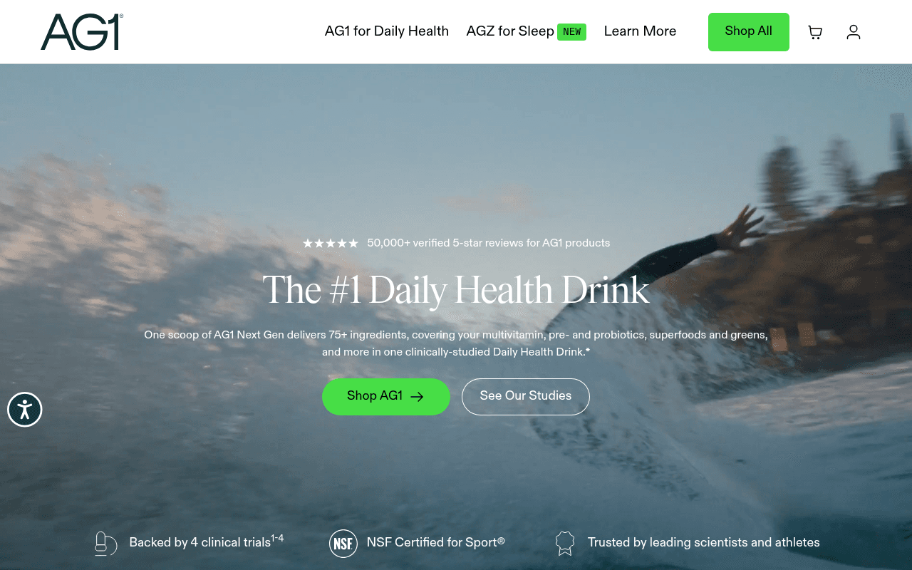
https://drinkag1.com/learn/ag1\
Screenshot of drinkag1.com
65of 100
C+

AG1 has the brand equity and social proof to close deals, but this page buries its strongest asset — 50,000+ verified reviews — above the headline where it gets lost against a busy surf video background. The comparison table is genuinely compelling but sits below a fold most visitors won't reach, and 77 of 79 images missing alt text is an SEO self-inflicted wound for a brand spending heavily on acquisition.

Your action plan

Ordered by conversion impact. Click any fix to see the before → after.

1
Increase hero headline contrast and legibility
High ImpactQuick WinHero section — white serif headline 'The #1 Daily Health Drink' over motion video background
Currently
White text directly over a bright, high-contrast surf/ocean video with no scrim or overlay
Recommended
Add a semi-transparent dark gradient overlay (bottom 60% of hero) to ensure WCAG AA contrast ratio; this also makes the subhead and CTAs pop without changing the visual aesthetic
Nielsen Norman Group: legibility failures in the first 3 seconds increase bounce rate by up to 38%. The subhead copy is nearly unreadable against the bright sky portion of the video.

Copy rewrites

Ready to use

Drop-in replacements for your highest-leverage text. Each rewrite explains the conversion principle behind it.

Hero headline
The #1 Daily Health Drink
The #1 Daily Health Drink — 75+ Ingredients, One Scoop
Specificity: the number 75+ is a concrete differentiator that immediately signals value density; the original headline is a claim without proof baked in
Hero subheadline
One scoop of AG1 Next Gen delivers 75+ ingredients, covering your multivitamin, pre- and probiotics, superfoods and greens, and more in one clinically-studied Daily Health Drink.*
Replace your supplement stack with one daily scoop. AG1 Next Gen covers your multivitamin, probiotics, superfoods, and more — clinically studied, NSF certified, 50,000+ five-star reviews.*
Loss aversion and social proof: leading with the replacement benefit (eliminate the stack) triggers loss aversion, then anchors with the most credible trust signals before the CTA
Section header for comparison table
AG1 is a more-in-one solution
Why take 5 supplements when one scoop covers them all?
Question framing activates the reader's existing pain point (supplement fatigue/cost) and makes the comparison table feel like the answer they were already seeking
Clinical backing section headline
4x clinically-backed. Trusted and verified.
4 clinical trials. Real results you can measure — not just feel.
Specificity and credibility: the original is vague brand-speak; the rewrite echoes the body copy's own language about measurable benefits and creates a sharper contrast with competitor claims
💡

The killer move

High Impact
Add a personalized supplement audit quiz as a secondary CTA path

A 3-question quiz — current supplement stack, top health goal, biggest daily challenge — that ends with a personalized AG1 recommendation would capture fence-sitters who need justification before spending $79/month, while generating zero-party data for email segmentation and dramatically improving trial-to-subscription conversion.

How visitors experience your page

Second-by-second walkthrough.

2 strong3 mixed
0-3 secondsMixed
0-3s First Impression: Full-bleed surf video background, AG1 logo, nav with Shop All CTA, white headline 'The #1 Daily Health Drink', star rating with 50,000+ reviews, two CTAs
Brand feels premium and credible, but the busy video background competes with the headline for attention. Visitors who arrived from a podcast ad recognize the brand; cold traffic may not immediately understand what AG1 is.
3-8 secondsStrong
3-8s Value Scan: Subheadline listing 75+ ingredients, Shop AG1 and See Our Studies buttons, trust bar with 4 clinical trials, NSF Certified, scientists and athletes
The trust bar trio is genuinely powerful — clinical trials plus NSF certification plus authority endorsement hits rational, regulatory, and social proof simultaneously. Visitors with supplement literacy will respond positively.
8-15 secondsStrong
8-15s Differentiation Check: Comparison table showing AG1 vs Multivitamins vs Probiotics vs Greens with green checkmarks across all categories for AG1
This is the page's most persuasive section — it visually demolishes the objection of buying separate products. Visitors who reach this point are likely to continue scrolling toward purchase intent.
15-30 secondsMixed
15-30s Benefit Exploration: Three lifestyle image cards: Support Immune Defense, Boost Energy Production, Support Gut Health; then a split product/lifestyle section with benefit bullet list
Benefit cards are visually appealing but the copy is generic supplement language. No second CTA appears until the split section, creating a conversion dead zone for visitors who are ready to buy after the comparison table.
30+ secondsMixed
30s+ Deep Consideration: 4x clinically-backed section with gut microbiome stat, flavor options (Original, Berry, Citrus), ingredient highlights (Magnesium, Apple, Licorice Root), FAQ section implied by schema
The clinical data and flavor variety are strong closers for high-intent visitors, but the page appears to have significant whitespace below the clinical section in the full-page screenshot, suggesting content loading issues or poor scroll depth optimization.

Health check

8 dimensions, weighted by conversion impact.

First impression & hero
20%
7/10
Premium aesthetic and strong trust signals above fold, but headline legibility suffers against the video background and no price context is surfaced.
Copy & messaging
20%
6/10
Benefit cards use generic supplement language; the comparison table and clinical sections are strong but the hero subhead is dense and passive.
Call-to-action
15%
6/10
Primary CTA is visible and well-styled but lacks price anchoring; secondary CTA competes for attention and there is a conversion dead zone mid-page.
Trust & social proof
15%
8/10
50,000+ verified reviews, 4 clinical trials, NSF Certified for Sport, and scientist/athlete endorsement is a genuinely strong trust stack for the supplement category.
Visual design & layout
10%
7/10
Clean, premium design system with consistent green brand color; video hero is on-brand but creates legibility tradeoffs that hurt conversion.
Page structure & flow
8%
6/10
Comparison table is the strongest rational argument but is sequenced after benefit cards; a second CTA should appear immediately after the table.
Technical & SEO signals
7%
5/10
PageSpeed 80 is acceptable; LCP at 1.9s is good, but 77 missing alt texts and CLS of 0.08 are meaningful gaps for a brand investing in organic search.
Differentiation & positioning
5%
7/10
The all-in-one positioning is clear and the comparison table executes it well; the #1 claim needs a source citation to be fully credible to skeptical visitors.

Page speed

Based on real Chrome user data
80/100
Overall score
Combined performance rating
1.9 s
Largest paint
Time until the main content is visible
0.08
Layout shift
How much the page moves while loading
1.2 s
First paint
Time until something first appears
178 ms
Responsiveness
How fast the page reacts to clicks

Want mobile analysis and fresh re-runs?

Buy roasts to unlock mobile analysis, re-analyze on demand, and more for drinkag1.com.

See roast packs →