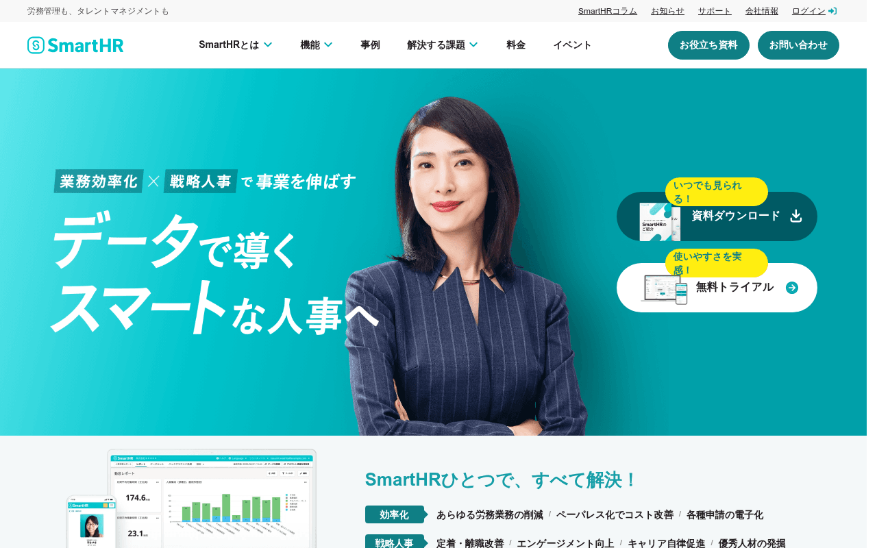
https://smarthr.jp
https://smarthr.jp
Screenshot of smarthr.jp
60of 100
C

SmartHR has strong brand equity and a clean visual system, but the hero headline 'データで導くスマートな人事へ' is aspirational fluff when your meta title already has the killer proof point — 7-year consecutive share No.1. The dual CTA layout (resource download vs. free trial) splits attention right where you need commitment, and 70,000 registered companies buried below the fold is a trust signal wasted on scrollers.

Your action plan

Ordered by conversion impact. Click any fix to see the before → after.

1
Elevate the No.1 share proof point into the hero
High ImpactQuick WinHero headline area — currently shows only aspirational tagline with no quantified credibility
Currently
業務効率化 × 戦略人事 で事業を伸ばす / データで導くスマートな人事へ
Recommended
Add a badge or sub-headline directly under the main headline: '労務管理クラウド7年連続シェアNo.1 — 70,000社以上が選ぶ人事労務ソフト'
Social proof in the hero increases conversion by 15-30% (Nielsen Norman). The No.1 claim exists only in meta description — invisible to visitors.

Copy rewrites

Ready to use

Drop-in replacements for your highest-leverage text. Each rewrite explains the conversion principle behind it.

Hero sub-tagline
業務効率化 × 戦略人事 で事業を伸ばす
労務管理クラウド7年連続シェアNo.1 — 70,000社以上の企業が選ぶ理由
Specificity and social proof: replaces abstract benefit framing with a concrete, verifiable market leadership claim that builds immediate credibility
Free trial CTA label
使いやすさを実感! 無料トライアル
今すぐ無料トライアルを始める — 最短1日で導入可能
Urgency and friction reduction: adds immediacy and removes the implicit fear of long setup time, a top SaaS objection
Section headline below hero
SmartHRひとつで、すべて解決!
人事・労務の工数を最大88%削減。SmartHRひとつで完結。
Specificity: the 88% reduction stat is buried in body copy — surfacing it in the section headline makes the value proposition scannable and credible at a glance
💡

The killer move

High Impact
Deploy an intent-based hero CTA split test using company size segmentation

Add a single qualifying question in the hero — a company size selector (e.g. 1-100名 / 101-500名 / 500名以上) — that routes visitors to tailored landing pages with size-specific case studies and ROI calculators. Enterprise HR buyers have fundamentally different objections than SME buyers; personalized paths have shown 40-60% lift in qualified lead conversion for SaaS products in this category.

How visitors experience your page

Second-by-second walkthrough.

2 strong3 mixed
0-3 secondsStrong
0-3s First Impression: Teal hero with professional woman, large Japanese headline, dual CTAs on right, SmartHR logo and nav
Brand feels premium and trustworthy. Visitor immediately understands this is an HR software product. However, no instant proof of market leadership — the strongest trust signal is invisible.
3-8 secondsMixed
3-8s Value Scan: Hero tagline, dual CTA buttons, sub-section starting with SmartHRひとつで、すべて解決 with efficiency/strategy/data pillars
Visitor scans the three benefit pillars (効率化, 戦略人事, データ活用) — directionally useful but generic. No specific outcome numbers visible yet, reducing urgency to act.
8-15 secondsStrong
8-15s Credibility Check: Logo strip with 70,000 company count, No.1 badges for labor management cloud and talent management
The 70,000 social proof number and dual No.1 awards are compelling. Visitor confidence rises. However, this section is below the fold — many visitors never reach it.
15-30 secondsMixed
15-30s Solution Exploration: Problem-solution grid (課題を解決するならSmartHR), service breakdown with 88% workload reduction stat, product screenshots
Content is comprehensive but dense. The 88% reduction claim appears in fine print rather than as a headline. Visitor may feel overwhelmed by feature breadth without a clear next step.
30+ secondsMixed
30s+ Decision Point: Case studies (Pixiv, Tokyo Ink), resource download section, event listings, sticky bottom CTA bar
Case studies are relevant and industry-tagged — good for late-stage visitors. But the page ends with events rather than a strong conversion close. A final CTA section with trial offer is missing.

Health check

8 dimensions, weighted by conversion impact.

First impression & hero
20%
7/10
Visually polished and on-brand, but the hero sacrifices its strongest proof point (7-year No.1) for aspirational copy
Copy & messaging
20%
6/10
Benefit pillars are clear but generic; the 88% reduction stat is buried and the No.1 claim never appears above the fold
Call-to-action
15%
5/10
Dual hero CTAs split attention at the critical decision moment; no strong conversion close at page bottom
Trust & social proof
15%
6/10
70,000 companies and No.1 badges are present but below fold; zero testimonials (confirmed by metadata) is a significant gap
Visual design & layout
10%
8/10
Clean, consistent teal brand system with professional photography and well-structured content sections
Page structure & flow
8%
6/10
Logical top-down flow but ends weakly with events; missing a final CTA section to capture late-stage decision-makers
Technical & SEO signals
7%
5/10
PageSpeed 97 is excellent, but missing H1 tag and 62 images without alt text are serious SEO and accessibility failures
Differentiation & positioning
5%
6/10
No.1 positioning exists but is underutilized in hero; competitors could claim similar efficiency and data-driven messaging

Page speed

Based on real Chrome user data
97/100
Overall score
Combined performance rating
1.4 s
Largest paint
Time until the main content is visible
0.00
Layout shift
How much the page moves while loading
1.4 s
First paint
Time until something first appears
96 ms
Responsiveness
How fast the page reacts to clicks

Want mobile analysis and fresh re-runs?

Buy roasts to unlock mobile analysis, re-analyze on demand, and more for smarthr.jp.

See roast packs →