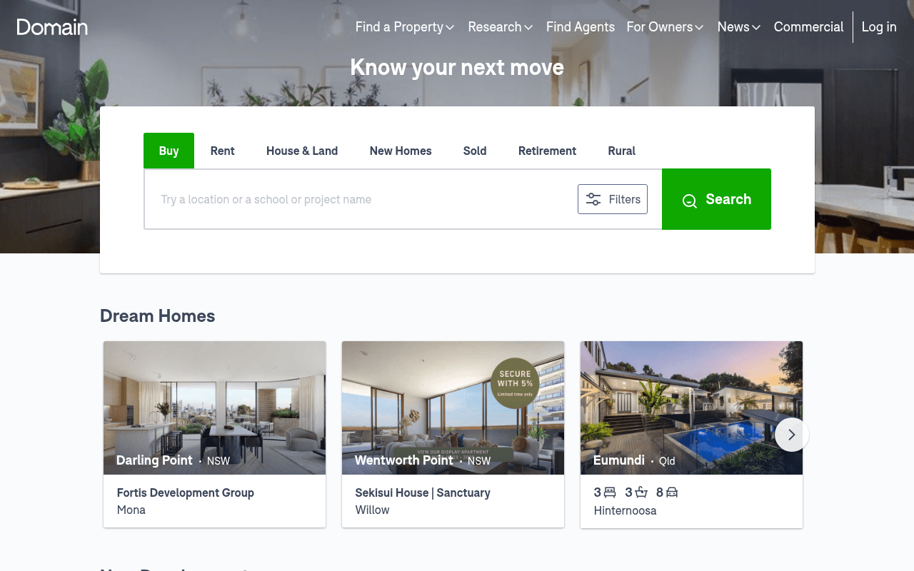
https://domain.com.au
Screenshot of domain.com.au
60of 100
C

Domain's hero does the basics right — prominent search bar, clear tab taxonomy — but 'Know your next move' is aspirational wallpaper that wastes the most valuable real estate on the page. Below the fold, the page becomes a content buffet with no hierarchy: Dream Homes, New Developments, news articles, and an app CTA all compete equally, leaving users to self-navigate rather than being guided toward conversion.

Your action plan

Ordered by conversion impact. Click any fix to see the before → after.

1
Replace hero headline with search-intent copy
High ImpactQuick WinH1 headline: 'Know your next move'
Currently
Know your next move
Recommended
Find your next home — search 300,000+ Australian properties
Aspirational taglines reduce clarity. Nielsen Norman research shows task-oriented headlines increase search initiation by reducing cognitive load on intent-driven visitors.

Copy rewrites

Ready to use

Drop-in replacements for your highest-leverage text. Each rewrite explains the conversion principle behind it.

H1 hero headline
Know your next move
Find your next home — 300,000+ properties across Australia
Specificity and utility over aspiration; communicates inventory scale immediately
Search input placeholder
Try a location or a school or project name
Search 300,000+ properties — enter suburb, school or project
Specificity principle: quantified inventory signals credibility and reduces abandonment
App section headline
Download the property app that lets you hunt together.
Never miss a listing — get instant alerts on the Domain app
Urgency and loss aversion outperform feature descriptions for app install CTAs
💡

The killer move

High Impact
Add a personalised suburb price pulse widget to the hero

Insert a secondary input below the search bar — 'See what homes sell for in your suburb' — that delivers an instant median price estimate. This captures seller and researcher intent that the current search bar misses, increases session depth, and creates a data hook that differentiates Domain from REA on the homepage itself.

How visitors experience your page

Second-by-second walkthrough.

2 strong2 mixed1 weak
0-3 secondsStrong
0-3s first impression: Domain logo, nav bar, hero image of modern interior, 'Know your next move' headline, search widget with Buy tab active
Brand is immediately recognisable; search widget is prominent. Visitor understands this is a property portal and knows what to do next — strong orientation.
3-8 secondsStrong
3-8s intent evaluation: Tab options (Buy/Rent/House & Land/New Homes/Sold/Retirement/Rural), search input, Filters button, green Search CTA
Tab taxonomy covers all major intent types cleanly. Visitor with clear intent (buy or rent) will engage the search bar immediately. Rural and Retirement tabs signal breadth.
8-15 secondsMixed
8-15s below-fold exploration: Dream Homes carousel with aspirational property cards (Darling Point, Wentworth Point, Eumundi), New Developments grid
Dream Homes is visually appealing but may alienate budget-conscious visitors. No price anchoring visible on cards creates uncertainty about relevance.
15-30 secondsMixed
15-30s content scanning: While you're here icon grid (home value, sell, affordability, auctions), Latest News article thumbnails
Four utility links are useful but icon-only with small labels — easy to miss. News section dilutes conversion focus; visitor may drift into content consumption rather than search.
30+ secondsWeak
30s+ decision or exit: App download section with phone mockup, App Store and Google Play badges, then massive footer
App CTA arrives too late for most visitors. Footer is extremely long with duplicated columns — signals poor information architecture and may erode trust for first-time visitors.

Health check

8 dimensions, weighted by conversion impact.

First impression & hero
20%
7/10
Search widget is functional and prominent but headline is generic aspiration with no inventory signal or urgency.
Copy & messaging
20%
5/10
Placeholder text and section labels are descriptive but no copy communicates scale, trust, or competitive differentiation.
Call-to-action
15%
6/10
Search CTA is clear and green, but no secondary CTA hierarchy guides non-search visitors toward a next step.
Trust & social proof
15%
4/10
Zero testimonials, no listing counts, no user numbers — a portal of this scale should be leading with social proof, not hiding it.
Visual design & layout
10%
7/10
Clean, modern aesthetic with consistent green brand colour; card grid is well-structured but hero image is generic stock-feeling.
Page structure & flow
8%
5/10
Content sections lack priority weighting — Dream Homes, News, and app CTA all receive equal visual treatment with no conversion funnel logic.
Technical & SEO signals
7%
8/10
PageSpeed 87, FCP 1.1s, LCP 1.7s, CLS 0.02 — technically solid; meta description is keyword-rich and well-structured.
Differentiation & positioning
5%
4/10
Nothing on the page explains why Domain over REA Group — no unique data claim, no exclusive feature, no differentiated value proposition.

Page speed

Based on real Chrome user data
87/100
Overall score
Combined performance rating
1.7 s
Largest paint
Time until the main content is visible
0.02
Layout shift
How much the page moves while loading
1.1 s
First paint
Time until something first appears
168 ms
Responsiveness
How fast the page reacts to clicks

Want mobile analysis and fresh re-runs?

Buy roasts to unlock mobile analysis, re-analyze on demand, and more for domain.com.au.

See roast packs →