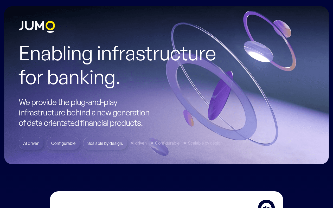
https://jumo.world
https://jumo.world
Screenshot of jumo.world
50of 100
D

JUMO has a stunning visual identity but zero CTA above the fold — a fintech infrastructure play targeting C-suite banking executives with no navigation, no contact button, and no social proof until you scroll past a full-screen abstract 3D animation. The 76% stat is genuinely compelling but buried below a hero that gives visitors nothing actionable to do.

Your action plan

Ordered by conversion impact. Click any fix to see the before → after.

1
Add a primary CTA button to the hero
High ImpactQuick WinHero section — currently shows only pill-shaped feature tags (AI driven, Configurable, Scalable by design)
Currently
Three decorative pill tags with no clickable CTA button anywhere above the fold
Recommended
Add a high-contrast yellow CTA button: 'Request a Demo' or 'Talk to Our Team' positioned directly below the subheadline
Zero CTAs above the fold is a critical conversion failure. Nielsen Norman Group data shows users decide within 10 seconds whether to engage — no action path means no conversion.

Copy rewrites

Ready to use

Drop-in replacements for your highest-leverage text. Each rewrite explains the conversion principle behind it.

Hero headline
Enabling infrastructure for banking.
The Banking Infrastructure Powering Africa's Top Financial Institutions.
Specificity and social proof — names the geography and audience, signals market leadership rather than generic capability
Hero subheadline
We provide the plug-and-play infrastructure behind a new generation of data orientated financial products.
76% of Africa's leading banks and payments companies run on JUMO's plug-and-play data infrastructure. Join them.
Social proof and specificity — leads with the most credible stat on the page and adds a soft CTA directive
Section label below hero
What JUMO can do for you?
How Africa's Top Banks Use JUMO
Authority framing — shifts from a question (uncertainty) to a statement of proven adoption, reducing friction for enterprise evaluators
💡

The killer move

High Impact
Build an interactive ROI or coverage map for enterprise buyers

Replace the abstract 3D animation with an interactive map showing JUMO's active banking partnerships across Africa — enterprise buyers respond to geographic proof of scale, and a visual network map would make the 76% claim visceral and shareable in boardroom presentations.

How visitors experience your page

Second-by-second walkthrough.

1 strong2 mixed2 weak
0-3 secondsMixed
0-3s First Impression: Full-bleed dark purple hero with abstract 3D rings, JUMO logo, large headline 'Enabling infrastructure for banking.' and three pill tags
Visually striking and premium-feeling, but no CTA and no nav creates a dead end. Visitor registers brand quality but has nowhere to go.
3-8 secondsWeak
3-8s Orientation: Subheadline about plug-and-play infrastructure, pill tags repeating AI driven / Configurable / Scalable by design
Visitor seeks 'what do I do next' — finds nothing. The duplicate pill tags (solid and ghost versions) look like a UI bug, eroding polish perception.
8-15 secondsStrong
8-15s Exploration: Scrolls past hero into a white card with JUMO logo, then the 76% Africa stat card, then partner logos (NTN, Orange Money, Absa, Ecobank, Letshego, Standard Bank)
The 76% stat and recognizable bank logos are highly credible for enterprise buyers — this is where trust is built, but most visitors won't reach it.
15-30 secondsMixed
15-30s Consideration: 'What JUMO can do for you?' section beginning, 'We build technology so that...' copy starting
Visitor is now engaged but still has no CTA. Enterprise buyers at this stage want a contact path or demo option — continued absence increases drop-off risk.
30+ secondsWeak
30s+ Decision: Remainder of page content below the fold — product details, further copy
Without a persistent sticky CTA or nav, motivated buyers must scroll back to top or hunt for contact info. Friction at decision moment kills conversions.

Health check

8 dimensions, weighted by conversion impact.

First impression & hero
20%
5/10
Visually premium but functionally broken — no CTA, no nav, no immediate trust signal above the fold.
Copy & messaging
20%
5/10
Headline is generic; the best proof point (76% stat) is buried; subheadline uses passive infrastructure jargon.
Call-to-action
15%
2/10
No CTA button exists anywhere visible in the hero or navigation — a critical failure for an enterprise lead-gen page.
Trust & social proof
15%
6/10
76% stat and recognizable African bank logos are strong, but placement below the fold wastes their persuasive power.
Visual design & layout
10%
8/10
Dark navy palette, 3D animation, and yellow accent create a distinctive premium fintech aesthetic that stands out.
Page structure & flow
8%
4/10
No navigation, no sticky header, no CTA anchors — the page structure doesn't guide enterprise visitors toward conversion.
Technical & SEO signals
7%
3/10
Performance score 85 is solid, but null meta title, null meta description, and zero H1/H2 tags are SEO-critical failures.
Differentiation & positioning
5%
6/10
Africa-focused banking infrastructure with 76% market penetration is genuinely differentiated — but the page undersells it.

Page speed

Based on real Chrome user data
85/100
Overall score
Combined performance rating
2.6 s
Largest paint
Time until the main content is visible
0.04
Layout shift
How much the page moves while loading
2.2 s
First paint
Time until something first appears
87 ms
Responsiveness
How fast the page reacts to clicks

Want mobile analysis and fresh re-runs?

Buy roasts to unlock mobile analysis, re-analyze on demand, and more for jumo.world.

See roast packs →