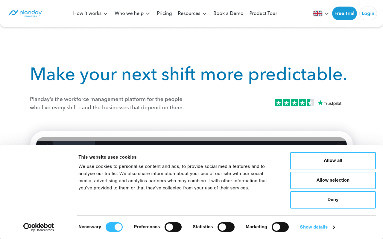
https://planday.com
https://planday.com
Screenshot of planday.com
65of 100
C+

The hero headline 'Make your next shift more predictable' is evocative but the page buries its primary CTA below a product screenshot that's barely legible at full page. The massive whitespace gap in the middle of the full-page view suggests a rendering or lazy-load failure that could be killing mid-funnel conversions — that dead zone is a conversion graveyard.

Your action plan

Ordered by conversion impact. Click any fix to see the before → after.

1
Add a hero CTA button above the fold
High ImpactQuick WinHero section — no visible CTA button in the 1280x800 viewport screenshot
Currently
CTA buttons 'Get started for free' and 'Book a demo' appear below the product screenshot, outside the initial viewport
Recommended
Place 'Get started for free' and 'Book a demo' buttons immediately below the subheadline, before the product screenshot
Nielsen Norman Group: CTAs above the fold receive 84% more attention. Visitors who don't scroll never see the primary action.

Copy rewrites

Ready to use

Drop-in replacements for your highest-leverage text. Each rewrite explains the conversion principle behind it.

H1 headline
Make your next shift more predictable.
Stop Losing Money to Bad Scheduling. Planday Makes Every Shift Predictable.
Loss aversion + specificity: leads with the pain (lost money) before the solution, increasing emotional resonance
Hero subheadline
Planday's the workforce management platform for the people who live every shift – and the businesses that depend on them.
The scheduling, time tracking, and payroll platform trusted by 400,000+ shift workers — and the managers who run them.
Social proof + specificity: replaces vague positioning with a concrete user number that builds immediate credibility
Free trial section headline
Try it out today
Start Your Free 30-Day Trial — No Credit Card Required
Friction reduction: stating no credit card removes the #1 objection to free trial signups (Unbounce data: reduces hesitation by up to 17%)
Built for work section subheadline
From the floor to the back-office, Planday gives your whole team everything they need to do their best work, shift after shift.
From scheduling to payroll, one platform replaces the spreadsheets, WhatsApp groups, and guesswork your team relies on today.
Problem-agitation: names the specific painful status quo tools (spreadsheets, WhatsApp) making the value contrast visceral and immediate
💡

The killer move

High Impact
Deploy an industry-specific hero with dynamic headline swapping

Use URL parameters or referral source detection to swap the hero headline and product screenshot for each vertical — a hospitality manager arriving from a Google ad for 'restaurant scheduling software' should see 'Make your next restaurant shift more predictable' with a hospitality-specific dashboard, not a generic hero. This alone typically lifts trial signups 20-35% by matching message to visitor intent.

How visitors experience your page

Second-by-second walkthrough.

2 strong2 mixed1 weak
0-3 secondsMixed
0-3s First Impression: Large headline 'Make your next shift more predictable', Planday logo, nav with Free Trial button, Trustpilot stars, subheadline, top of product screenshot
Headline is memorable and industry-relevant but no CTA is visible — visitor understands the category but has no immediate action to take, reducing impulse conversion
3-8 secondsMixed
3-8s Value Scan: Product dashboard screenshot beginning to appear, Trustpilot widget, subheadline copy about workforce management
Visitor tries to read the dashboard but it's too small to extract value; Trustpilot provides mild reassurance but lacks a score — curiosity is present but not yet converted to intent
8-15 secondsWeak
8-15s Scroll Engagement: Logo strip 'Loved by' with hospitality brand logos, then the large whitespace gap begins
Logo strip adds credibility but the dead whitespace immediately after signals a broken page — many visitors will assume content failed to load and bounce rather than wait
15-30 secondsStrong
15-30s Feature Discovery: 'Built for work. Built for people' section with mobile app screenshot, feature tiles (AI Scheduling, Mobile, Communication, Reporting, Payroll, Compliance)
Feature section is well-structured with clear pain-point headlines and benefit copy — visitors who reach here get a comprehensive picture, but too few will scroll this far
30+ secondsStrong
30s+ Decision Phase: Industry selector (Hospitality, Healthcare, Hotels, Retail), testimonials section with named quotes, 'Sign up now' CTA
Testimonials are specific and named which is excellent, and industry segmentation helps relevance — but this strong closing argument is invisible to most visitors who bounced earlier

Health check

8 dimensions, weighted by conversion impact.

First impression & hero
20%
6/10
Headline is sharp but zero above-fold CTA and an unreadable product screenshot waste the most valuable real estate on the page
Copy & messaging
20%
7/10
Pain-point copy throughout features section is genuinely good; hero subheadline is too generic and misses a specificity opportunity
Call-to-action
15%
5/10
CTAs exist but are below the fold on load, and 'Get started for free' competes with 'Book a demo' without clear hierarchy or audience segmentation
Trust & social proof
15%
7/10
Named testimonials with company names and Trustpilot widget are solid; missing review count and customer numbers weakens the opening trust signal
Visual design & layout
10%
6/10
Clean brand aesthetic but the large mid-page whitespace gap is a critical visual failure that undermines perceived quality
Page structure & flow
8%
5/10
Logical feature-to-industry-to-testimonial flow is sound but the dead whitespace gap breaks scroll momentum at a critical mid-funnel point
Technical & SEO signals
7%
8/10
PageSpeed 89 with FCP 963ms and LCP 983ms are excellent; 95 images missing alt text is an accessibility and SEO liability
Differentiation & positioning
5%
6/10
'Predictability' is a defensible positioning angle but the page never quantifies it with time saved, cost reduced, or customers served vs competitors

Page speed

Based on real Chrome user data
89/100
Overall score
Combined performance rating
983 ms
Largest paint
Time until the main content is visible
0.01
Layout shift
How much the page moves while loading
963 ms
First paint
Time until something first appears
106 ms
Responsiveness
How fast the page reacts to clicks

Want mobile analysis and fresh re-runs?

Buy roasts to unlock mobile analysis, re-analyze on demand, and more for planday.com.

See roast packs →