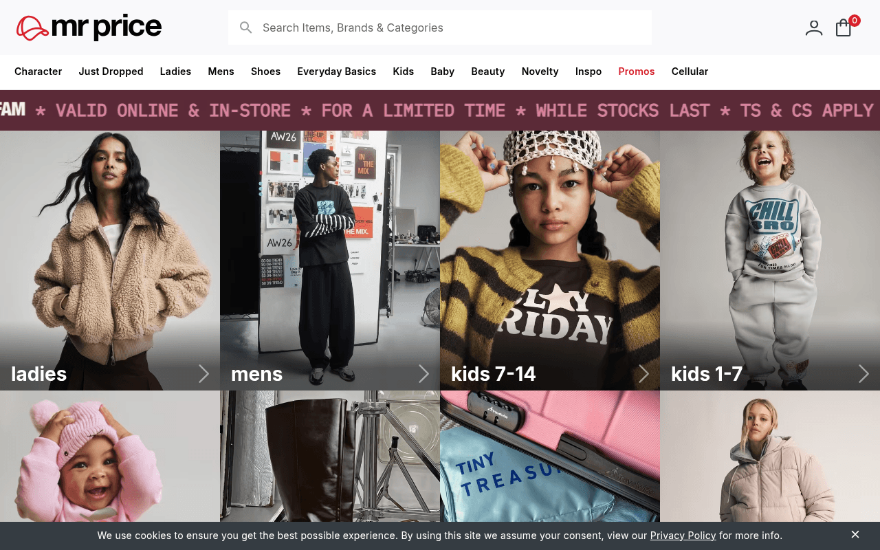
https://mrprice.com
https://mrprice.com
Screenshot of mrprice.com
45of 100
D

Mr Price leads with a four-panel category grid that looks editorial but communicates zero value proposition — no price anchoring, no hero offer, nothing that says 'affordable fashion' until you scroll past the fold. The marquee banner screams '30% off jackets' but the hero imagery below it ignores the promotion entirely, wasting the highest-intent real estate on the page.

Your action plan

Ordered by conversion impact. Click any fix to see the before → after.

1
Surface the jacket promotion in the hero imagery
High ImpactQuick WinFour-panel category grid (ladies, mens, kids 7-14, kids 1-7)
Currently
Generic editorial lifestyle shots with category labels only, no price or offer context
Recommended
Replace at least one panel with a dedicated promo tile showing '30% OFF All Jackets' with a CTA button and example price point (e.g. From R199)
Banner blindness research shows marquee tickers are ignored by 70%+ of users; embedding the offer in the primary visual grid captures attention where eyes actually land

Copy rewrites

Ready to use

Drop-in replacements for your highest-leverage text. Each rewrite explains the conversion principle behind it.

Marquee banner text
GET 30% OFF ALL JACKETS FOR THE WHOLE FAM * VALID ONLINE & IN-STORE * FOR A LIMITED TIME * WHILE STOCKS LAST * TS & CS APPLY
30% OFF ALL JACKETS — Shop Online & In-Store | Limited Time | While Stocks Last
Specificity and scarcity: leading with the discount number and removing redundant asterisk clutter improves readability and urgency
H1 heading (below fold)
Ready to bag your favourites?
Shop 400+ New Styles Weekly — Affordable Fashion for the Whole Family
Specificity: replaces a vague engagement question with a concrete value proposition that reinforces the brand's core differentiator
Sub-copy below H1
Shop hot trends and looks from anywhere, anytime! We've got safe and secure payment methods and delivery types to fit any budget, with the added convenience you know you deserve.
Trend-forward fashion at prices that make sense. Secure checkout, flexible delivery, and free in-store returns — because shopping should be easy.
Clarity and benefit-led copy: removes filler phrases like 'you know you deserve' and leads with the value exchange the customer actually cares about
💡

The killer move

High Impact
Introduce a dynamic price-anchor hero for first-time visitors

Use a cookie-based split to show first-time visitors a hero that leads with a specific price point (e.g. 'Jackets from R199') alongside the editorial imagery — this single change bridges the gap between aspirational visuals and the value-driven purchase decision that actually drives Mr Price's core customer base.

How visitors experience your page

Second-by-second walkthrough.

3 mixed2 weak
0-3 secondsMixed
0-3s First impression: Mr Price logo, search bar, nav with 11 categories, marquee promo ticker, four large editorial category panels
Visitor recognises a fashion retailer but receives no immediate price or value signal — the editorial imagery looks premium, which may confuse budget shoppers expecting affordability cues
3-8 secondsMixed
3-8s Orientation: Category labels (ladies, mens, kids 7-14, kids 1-7) on the image panels, second row of panels beginning to appear
Navigation is comprehensive but overwhelming with 11 top-level items; visitor likely scans for their category but has no promotional hook pulling them toward a specific action
8-15 secondsWeak
8-15s Engagement attempt: Second row of category panels (baby, shoes, novelty visible), no prices, no CTAs on panels beyond arrow icons
Arrow icons on panels are subtle; without explicit CTA buttons or price anchors, intent to click is driven purely by category interest rather than offer motivation — missed conversion opportunity
15-30 secondsWeak
15-30s Decision point: Continued scrolling reveals more category imagery; trust signals and delivery info appear far below fold
First-time visitors who haven't committed to a category by this point are likely to bounce; there is no social proof, no bestseller callout, and no urgency mechanism to re-engage wavering shoppers
30+ secondsMixed
30s+ Committed or lost: Footer with extensive links, social media icons, Mr Price ecosystem links (Money, Insurance, Cellular), FAQ and contact info
Committed shoppers have already navigated to a category; visitors still on the homepage at 30s are likely confused or comparison shopping — the footer ecosystem links may distract rather than convert

Health check

8 dimensions, weighted by conversion impact.

First impression & hero
20%
5/10
Editorial imagery is visually appealing but the hero communicates no price value, no primary offer, and no clear reason to choose Mr Price over any other fashion retailer
Copy & messaging
20%
4/10
Category labels do the heavy lifting; the only promotional copy is buried in a marquee ticker that suffers from banner blindness, and the H1 is a vague engagement question below the fold
Call-to-action
15%
4/10
No explicit CTA buttons above the fold; category panels use subtle arrow icons only, and the 30% jacket promotion has no dedicated shop-now button anywhere in the visible viewport
Trust & social proof
15%
4/10
Zero trust signals above the fold; payment methods and return policy are footer-only, and there are no reviews, ratings, or social proof elements anywhere on the homepage
Visual design & layout
10%
7/10
Clean four-panel grid is visually strong and on-brand; typography is legible and the layout scales well to desktop width, though the full-page render issue is a serious concern
Page structure & flow
8%
5/10
Category-first structure makes sense for a returning shopper but fails new visitors who need a value proposition before category selection; promotional content is disconnected from visual hierarchy
Technical & SEO signals
7%
4/10
12 images missing alt text, full-page screenshot shows near-blank render suggesting heavy JS dependency, and no PageSpeed data available — all red flags for Core Web Vitals performance
Differentiation & positioning
5%
4/10
Nothing on the homepage communicates why Mr Price beats Shein, Zara, or Woolworths on value; the brand's core affordable-fashion positioning is entirely absent from the visible hero

Want mobile analysis and fresh re-runs?

Buy roasts to unlock mobile analysis, re-analyze on demand, and more for mrprice.com.

See roast packs →