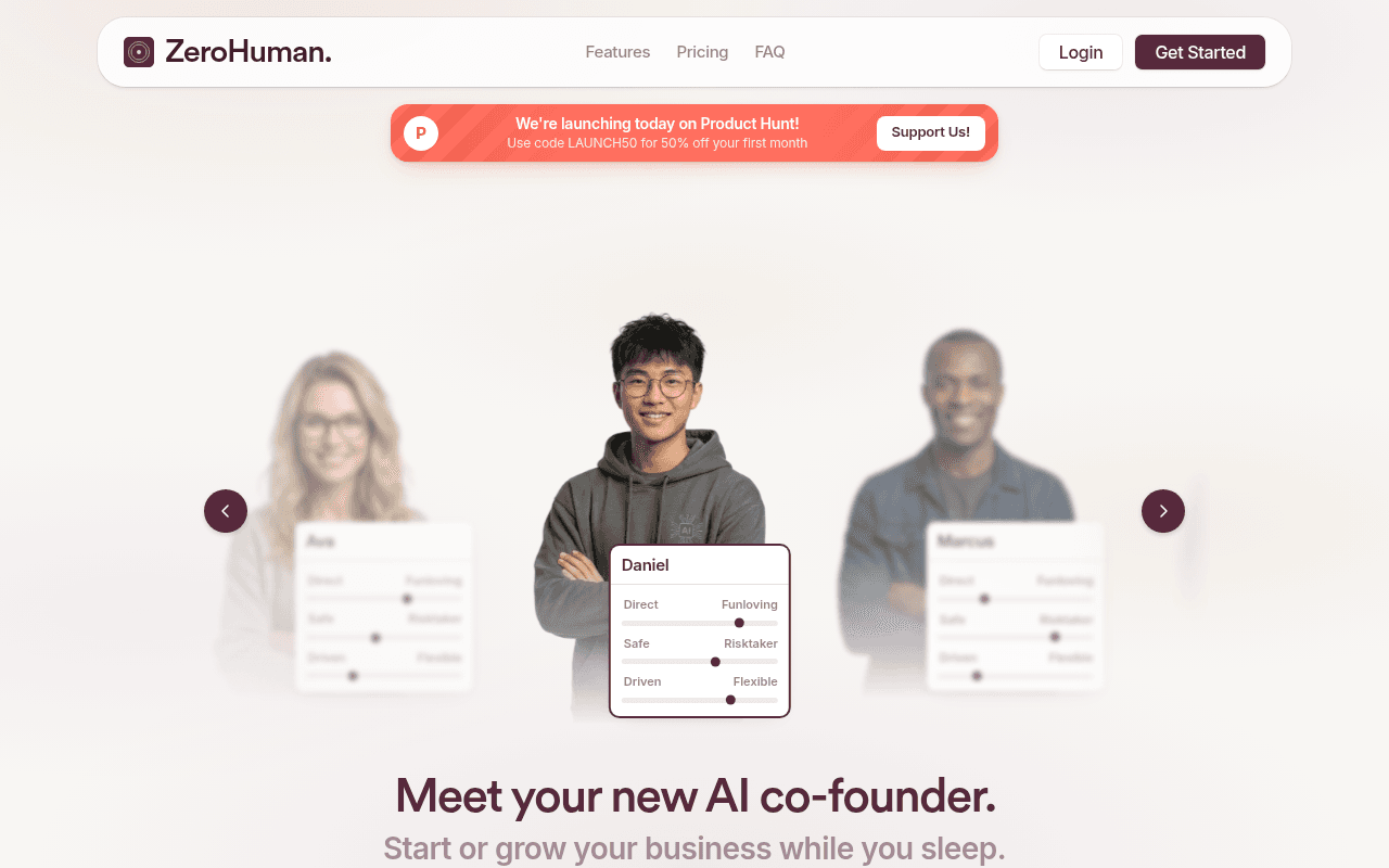
https://zerohuman.inc
Screenshot of zerohuman.inc
55of 100
C−

The hero buries the headline below a carousel of AI personas — visitors see 'Daniel' with personality sliders before they see what ZeroHuman actually does. 'Meet your new AI co-founder' is evocative but the subhead 'Start or grow your business while you sleep' is generic enough to describe 50 other AI tools launched this week. The Product Hunt launch banner is the most urgent element on the page and it's competing with a CTA that says 'Start Chatting with Marcus' — who is Marcus and why should I trust him with my business?

Your action plan

Ordered by conversion impact. Click any fix to see the before → after.

1
Restructure hero to lead with headline, not persona carousel
High ImpactSome WorkHero section — AI persona carousel (Ava, Daniel, Marcus) appears above the H1
Currently
Carousel of AI faces with personality sliders dominates above-fold; H1 'Meet your new AI co-founder' is below the fold at 1280px
Recommended
Move H1, subhead, and primary CTA above the carousel. Use carousel as supporting visual below the value proposition, not as the first thing visitors see.
Nielsen Norman Group: users decide to stay or leave in under 10 seconds. If the value prop is below the fold, bounce rates spike. The carousel is decorative; the headline is the conversion driver.

Copy rewrites

Ready to use

Drop-in replacements for your highest-leverage text. Each rewrite explains the conversion principle behind it.

H1 hero headline
Meet your new AI co-founder.
Your AI co-founder that builds, markets, and grows your business — while you sleep.
Specificity — the original is evocative but vague. This version names the three core jobs-to-be-done visible in the feature section, making the promise concrete and scannable.
Hero subheadline
Start or grow your business while you sleep.
From idea to first $10k MRR — your AI handles the tasks, you make the calls.
Specificity and outcome framing — replaces a generic benefit with a concrete milestone and clarifies the human-AI division of labor, reducing the fear of losing control.
Product Hunt launch banner subtext
Use code LAUNCH50 for 50% off your first month
Use code LAUNCH50 — 50% off your first month. Today only.
Urgency — adding 'Today only' to a launch-day banner is factually accurate and activates loss aversion, increasing banner click-through without any false scarcity.
Section header above testimonials
Don't take our word for it.
Founders went from $0 to $48k MRR using ZeroHuman. Here's how.
Social proof specificity — leading with the strongest metric from the testimonials (Ryan R.'s $48k MRR) turns a generic section header into a conversion-driving proof point.
💡

The killer move

High Impact
Make the AI persona selector the onboarding funnel, not just a hero visual

The carousel of AI co-founders (Ava, Daniel, Marcus) with personality sliders is a genuinely unique UI — turn it into an interactive quiz that routes visitors to a personalized trial experience based on their chosen co-founder style. This transforms a decorative element into a segmentation and personalization engine, increasing trial activation rates by matching the AI's communication style to the founder's preference from day one.

How visitors experience your page

Second-by-second walkthrough.

1 strong3 mixed1 weak
0-3 secondsWeak
0-3s First Impression: ZeroHuman logo, nav with Features/Pricing/FAQ, Product Hunt launch banner with LAUNCH50 code, and a carousel of AI personas (Ava, Daniel, Marcus) with personality sliders — no headline visible at 1280px
Visitor sees faces and sliders before understanding what the product does. Cognitive load is high, value prop is zero. High probability of bounce from non-technical founders who need immediate clarity.
3-8 secondsMixed
3-8s Orientation: Scrolls slightly to reveal H1 'Meet your new AI co-founder' and subhead 'Start or grow your business while you sleep' plus CTA 'Start Chatting with Marcus'
Headline lands with personality but the CTA creates confusion — who is Marcus? Visitor understands the category (AI for founders) but not the specific mechanism or why this beats ChatGPT directly.
8-15 secondsStrong
8-15s Evaluation: How It Works section with Start/Grow tabs, 6-step process (Brainstorm, Test, Build, Market, Support, Scale), and the daily routine 3-step workflow
The tabbed Start/Grow structure is smart segmentation. The 6-step journey maps directly to founder anxieties. Visitors who reach here are likely engaged and building mental models of the product.
15-30 secondsMixed
15-30s Consideration: Open source credibility section (OpenClaw 344k, Paperclip 43.6k), video creation feature with content grid, and pricing section ($49 Partner vs $99 Solo)
Open source badges add credibility for technical visitors but mean nothing to non-technical founders. The video creation feature is a strong differentiator but buried mid-page. Pricing is clear but the revenue share model on the cheaper plan may cause hesitation.
30+ secondsMixed
30s+ Decision: Three testimonials (Sarah C., Ryan R., Priya P.) with strong metrics, FAQ section with 8 questions, and a closing CTA section 'Make AI work for you' with Get Started button
Testimonials have compelling numbers but lack credibility signals (no photos, no company names). FAQ addresses key objections (ChatGPT comparison, data, contracts) which is good. Closing CTA is weak — 'Make AI work for you' is generic and the section lacks urgency to convert fence-sitters.

Health check

8 dimensions, weighted by conversion impact.

First impression & hero
20%
4/10
Persona carousel dominates above-fold at 1280px; headline and CTA are below the fold — the most critical conversion real estate is wasted on decorative UI.
Copy & messaging
20%
6/10
Headline has personality, feature copy is clear and benefit-oriented, but subheads are generic and the CTA copy ('Start Chatting with Marcus') creates confusion rather than confidence.
Call-to-action
15%
5/10
Primary CTA names a persona instead of the offer; free trial is present but undersold; closing CTA section lacks urgency and specificity to convert late-stage visitors.
Trust & social proof
15%
5/10
Three testimonials with strong metrics but anonymous initials only; open source GitHub stars add technical credibility; no logos, case studies, or user counts visible.
Visual design & layout
10%
7/10
Clean, modern aesthetic with good whitespace and consistent typography; persona carousel is visually polished but structurally misplaced in the conversion hierarchy.
Page structure & flow
8%
6/10
Logical progression from how-it-works to pricing to testimonials to FAQ, but the hero inversion (visual before value prop) disrupts the natural attention flow.
Technical & SEO signals
7%
6/10
PageSpeed 80 is acceptable; LCP at 2.7s is borderline — likely the hero carousel images; CLS at 0.10 is at the threshold and should be reduced; meta title and description are solid.
Differentiation & positioning
5%
6/10
AI co-founder framing is distinctive; video creation and open source infrastructure are genuine differentiators; but the FAQ question 'How is this different from ChatGPT?' signals the positioning gap isn't closed in the hero.

Page speed

Based on real Chrome user data
80/100
Overall score
Combined performance rating
2.7 s
Largest paint
Time until the main content is visible
0.10
Layout shift
How much the page moves while loading
2.2 s
First paint
Time until something first appears
62 ms
Responsiveness
How fast the page reacts to clicks

Want mobile analysis and fresh re-runs?

Buy roasts to unlock mobile analysis, re-analyze on demand, and more for zerohuman.inc.

See roast packs →