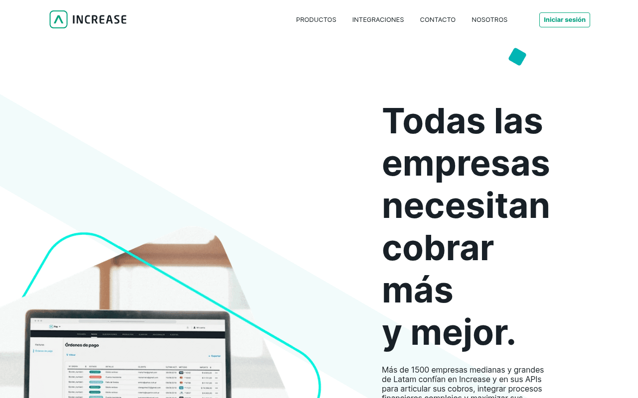
https://increase.app
Screenshot of increase.app
45of 100
D

The hero headline 'Todas las empresas necesitan cobrar más y mejor' is a truism, not a value proposition — every competitor could say the same. With 1,500 enterprise clients and a clear API-first product, the page buries its strongest proof point in small body text and never gives visitors a single, unambiguous next step beyond a vague 'Conoce más' repeated six times.

Your action plan

Ordered by conversion impact. Click any fix to see the before → after.

1
Replace all 'Conoce más' CTAs with intent-specific actions
High ImpactQuick WinSix 'Conoce más' buttons across hero, product cards, and feature sections
Currently
Conoce más (repeated 6 times with no differentiation)
Recommended
Hero: 'Solicitar demo gratuita'; Card product: 'Ver cómo funciona Card'; Pay product: 'Automatizar mis cobros'; section CTA: 'Hablar con un especialista'
Generic CTAs reduce click-through by up to 40% vs. specific action-oriented labels (HubSpot CTA study). Each button should match the visitor's intent at that scroll depth.

Copy rewrites

Ready to use

Drop-in replacements for your highest-leverage text. Each rewrite explains the conversion principle behind it.

H1 hero headline
Todas las empresas necesitan cobrar más y mejor.
La plataforma de cobros que usan más de 1.500 empresas líderes de Latam para automatizar pagos y maximizar ingresos.
Specificity + social proof: replaces a generic truism with a concrete, credentialed value proposition that names the audience and the outcome.
Hero subheadline
Más de 1500 empresas medianas y grandes de Latam confían en Increase y en sus APIs para articular sus cobros, integrar procesos financieros complejos y maximizar sus ingresos de una forma simple, escalable y segura.
Conecta tus cobros únicos y recurrentes, automatiza reintentos y accede a datos en tiempo real — todo desde una sola plataforma con API lista para integrar en días.
Specificity and benefit-led copy: replaces vague trust language with concrete product capabilities that answer 'what does it actually do for me today'.
'Ellos confían en Increase' section headline
Ellos confían en Increase
Más de 1.500 empresas de Latam ya optimizan sus cobros con Increase
Social proof + specificity: quantifies the claim and frames it as an active, ongoing benefit rather than a passive endorsement.
Footer CTA banner
Toma control de tu negocio y se uno de nuestros clientes
¿Listo para automatizar tus cobros? Solicita una demo gratuita hoy.
Urgency + clear next step: replaces a vague aspiration with a direct action that reduces friction and sets expectations (free, today).
💡

The killer move

High Impact
Launch a product-specific landing page with a live ROI calculator

Enterprise buyers in Latam justify software purchases with CFO-level numbers. A single-page 'Calcula cuánto pierdes en cobros fallidos' calculator — asking for monthly transaction volume and current failure rate — would generate qualified leads while simultaneously demonstrating Increase Pay's core value, replacing six generic 'Conoce más' clicks with one high-intent conversion event.

How visitors experience your page

Second-by-second walkthrough.

2 mixed3 weak
0-3 secondsMixed
0-3s first impression: Large bold headline split across 5 lines, partial product screenshot on left, minimal nav with Iniciar sesión button, no visible primary CTA button
Brand reads as modern fintech but the headline occupies the entire viewport without delivering a clear value prop or action — visitor understands the category but not why Increase specifically.
3-8 secondsWeak
3-8s value assessment: Subheadline with '1500 empresas' social proof, 'Conoce más' link, decorative teal shapes — still no CTA button above fold
The strongest trust signal (1,500 clients) is buried in body text at small size. Visitors scanning for 'is this for me' find no anchor — high risk of bounce before scrolling.
8-15 secondsMixed
8-15s product exploration: Green 'Productos Increase' section with Card, Pay, Count cards each with 'Conoce más' buttons, feature screenshots
Product differentiation between Card, Pay, and Count is unclear at a glance — names alone don't communicate distinct jobs-to-be-done. Visitors may feel confused about which product applies to them.
15-30 secondsWeak
15-30s trust evaluation: Increase Pay and Increase Card feature sections with screenshots, three icon blocks (Automatiza Procesos, Soluciones Integradas, Experiencias Únicas)
Icon blocks use abstract benefit language with no metrics or proof. No testimonials, no case studies, no ROI data — enterprise buyers need evidence at this stage, not icons.
30+ secondsWeak
30s+ decision point: Logo bar with 6 client logos, single teal CTA banner 'Toma control de tu negocio', footer with nav links
The only conversion CTA at page bottom is a passive aspiration statement, not an action. Visitors who made it this far are the most qualified — losing them here is the most expensive conversion failure on the page.

Health check

8 dimensions, weighted by conversion impact.

First impression & hero
20%
5/10
Modern aesthetic but headline is a truism, no above-fold CTA button, and the strongest proof point is hidden in body text.
Copy & messaging
20%
4/10
Benefit language is vague and repetitive; 'cobrar más y mejor' and 'Conoce más' appear so often they lose meaning entirely.
Call-to-action
15%
3/10
Six identical 'Conoce más' links with no hierarchy, no primary button in hero, and a passive footer CTA — a textbook CTA failure.
Trust & social proof
15%
4/10
1,500 client claim exists but is undersized; logo bar is near-footer; zero testimonials or case studies for an enterprise B2B product.
Visual design & layout
10%
6/10
Clean teal-and-white palette, good typography scale, but decorative shapes add noise without guiding the eye toward conversion.
Page structure & flow
8%
5/10
Products introduced early but no logical funnel from awareness to consideration to action; page ends without a strong conversion moment.
Technical & SEO signals
7%
7/10
SEO score 100, FCP 0.4s, LCP 1.1s are excellent; TBT 660ms and TTI 3.9s indicate JS bloat that may hurt mobile conversion.
Differentiation & positioning
5%
4/10
No clear articulation of why Increase beats alternatives; 'simple, escalable y segura' is table-stakes language every fintech uses.

Page speed

Tested via Google Lighthouse
72/100
Overall score
Combined performance rating
1.1 s
Largest paint
Time until the main content is visible
0
Layout shift
How much the page moves while loading
0.4 s
First paint
Time until something first appears
3.9 s
Interactive
Time until the page is fully usable
Accessibility: 88SEO: 100Best Practices: 81

Want mobile analysis and fresh re-runs?

Buy roasts to unlock mobile analysis, re-analyze on demand, and more for increase.app.

See roast packs →