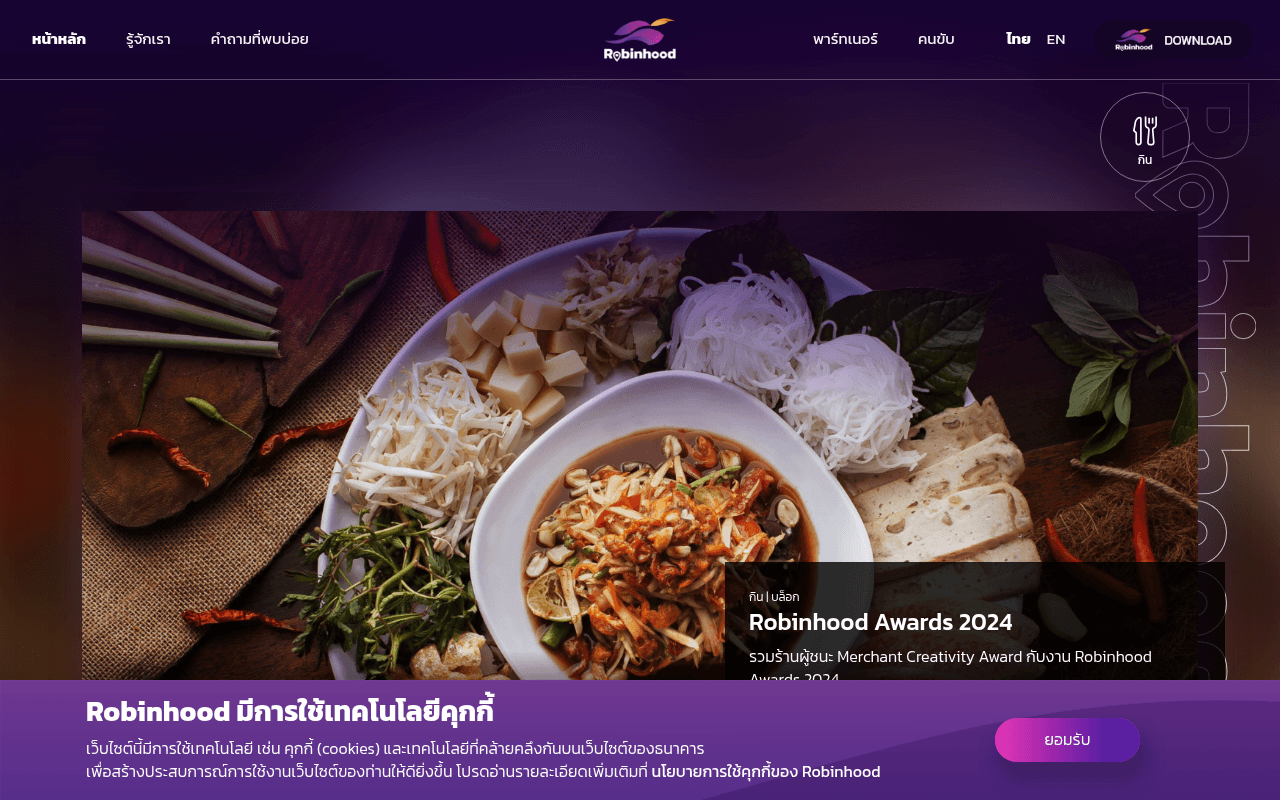
https://foodpanda.co.th
Screenshot of foodpanda.co.th
40of 100
F

The hero is a beautiful void — a massive gradient blur occupying the entire above-fold with zero headline, zero CTA, and zero reason to stay. The actual value proposition ('ทุกไลฟ์สไตล์ ครบ จบที่เดียว') is buried off-screen, and 24 of 28 images lack alt text, signaling this page was designed for aesthetics over acquisition.

Your action plan

Ordered by conversion impact. Click any fix to see the before → after.

1
Add hero headline and CTA above the fold
High ImpactSome WorkHero section — currently a full-viewport gradient blur with no text or button visible
Currently
Empty purple-to-orange gradient occupying 100% of viewport height
Recommended
Overlay headline 'สั่งอาหาร เรียกรถ ซื้อของ — ครบจบที่เดียว' with a prominent Download CTA button (purple, 200px wide) centered at 60% viewport height
Nielsen's F-pattern research: users decide within 3 seconds. Zero above-fold copy means zero conversion signal — this is the single biggest revenue leak on the page

Copy rewrites

Ready to use

Drop-in replacements for your highest-leverage text. Each rewrite explains the conversion principle behind it.

Meta title
Robinhood - ทางเลือกใหม่ของฟู้ดเดลิเวอรี่ไทย
Robinhood — สั่งอาหาร เรียกรถ ซื้อของ ครบจบในแอปเดียว
Specificity: lists concrete services instead of vague 'alternative' positioning, improving CTR from search results
Hero tagline (page text)
ทุกไลฟ์สไตล์ ครบ จบที่เดียว
กิน เที่ยว เรียกรถ ซื้อของ — ทุกอย่างในแอปเดียว โหลดฟรีเลย
Concreteness + urgency: replaces abstract lifestyle claim with specific service list and a free download nudge
Partner section headline
ขายดีแบบไม่เสียค่า GP
เปิดร้านบน Robinhood — ไม่มีค่า GP เพิ่มยอดขายได้ทันที
Benefit-first framing: leads with the zero-GP differentiator as a complete sentence, making the value proposition scannable for restaurant owners
Rider section CTA
สมัครเข้าร่วมเป็นไรเดอร์ส่งอาหารกับ Robinhood Rider
สมัครไรเดอร์ — รับเงินทุกวัน ไม่มีขั้นต่ำ
Urgency + specificity: 'รับเงินทุกวัน' is a concrete daily-pay benefit that directly addresses rider income anxiety, the primary sign-up motivator
💡

The killer move

High Impact
Launch a geo-personalized hero with live restaurant count

Detect visitor location and display 'มี 847 ร้านใกล้คุณใน [เขต] — สั่งได้เลย' with a single Download CTA; real-time local relevance is the highest-converting trigger in food delivery and directly counters Grab and LINE MAN's brand familiarity advantage.

How visitors experience your page

Second-by-second walkthrough.

1 strong3 mixed1 weak
0-3 secondsWeak
0-3s first impression: Full-viewport purple-to-orange gradient blur, small logo, nav bar, tiny DOWNLOAD button — no headline, no value prop, no CTA
Visitor sees a screensaver, not a landing page. No information hierarchy means the brain has nothing to anchor to — high bounce probability
3-8 secondsMixed
3-8s orientation: Scrolls slightly to find food photography and 'Robinhood Awards 2024' blog card partially visible
Food image creates appetite appeal but a blog award post is not a conversion element — visitor is still unclear what the app does or why to download it
8-15 secondsMixed
8-15s value assessment: Service section with icons for กิน เที่ยว เรียกรถ ซื้อของ and brief descriptions
First clear value communication appears here — too late. Visitors who stayed this long are self-motivated; the page has not earned their attention
15-30 secondsStrong
15-30s decision consideration: Partner and Rider sign-up sections with brief benefit copy and CTA buttons
Partner and rider sections have clear CTAs and benefit statements — best-converting section on the page, but positioned where most visitors have already left
30+ secondsMixed
30s+ commitment: Download section with app store links, footer with full nav, social links
Download CTA reappears at bottom — good for committed visitors, but no urgency, no incentive, and no social proof to close the conversion for hesitant users

Health check

8 dimensions, weighted by conversion impact.

First impression & hero
20%
2/10
Full-viewport gradient with no headline or CTA is a conversion dead zone — the page's most valuable real estate is completely wasted
Copy & messaging
20%
5/10
Value propositions exist but are buried below fold; partner and rider copy is benefit-oriented but hero copy is absent entirely
Call-to-action
15%
4/10
DOWNLOAD CTA exists in nav and footer but is visually weak; no above-fold CTA and no incentive to act now
Trust & social proof
15%
3/10
No testimonials, no download counts, no ratings visible — a consumer app with zero social validation on its homepage
Visual design & layout
10%
6/10
Brand colors are consistent and food photography is appetizing, but the hero blur-only treatment sacrifices conversion for aesthetics
Page structure & flow
8%
4/10
Critical conversion content (value prop, CTA) appears below fold; page structure prioritizes visual impact over user decision journey
Technical & SEO signals
7%
3/10
24 of 28 images missing alt text, no H1 or H2 headings detected, PageSpeed unavailable — significant SEO and accessibility gaps
Differentiation & positioning
5%
5/10
Zero-GP merchant model is a genuine differentiator but only appears mid-page in small text; not leveraged in hero or meta positioning

Want mobile analysis and fresh re-runs?

Buy roasts to unlock mobile analysis, re-analyze on demand, and more for foodpanda.co.th.

See roast packs →