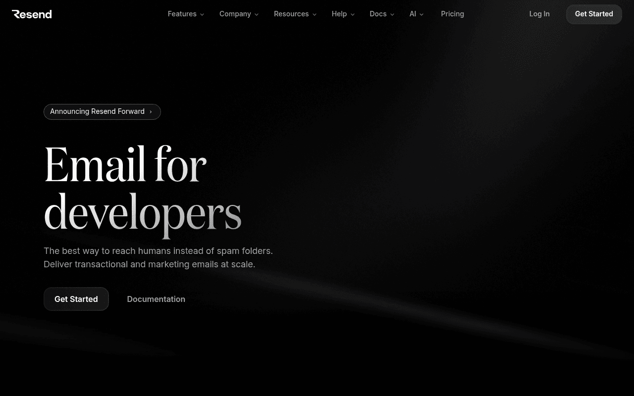
“Resend has a genuinely beautiful dark aesthetic and a clear developer-first headline, but the hero wastes 40% of viewport on empty black space below the CTAs, and there is zero social proof above the fold — no user count, no delivery stat, nothing to validate the choice before the scroll. The subheadline buries the real differentiator (deliverability + DX) in generic language that could describe any ESP from 2015.”
Your action plan
Ordered by conversion impact. Click any fix to see the before → after.
Copy rewrites
Ready to useDrop-in replacements for your highest-leverage text. Each rewrite explains the conversion principle behind it.
The killer move
High ImpactReplace the empty right-column dark space with a live send-email widget — visitor enters their own email address and receives a real test email from Resend in seconds. This transforms the hero from a passive pitch into a product demo, and nothing converts skeptical developers faster than experiencing the product before signing up.
How visitors experience your page
Second-by-second walkthrough.
Health check
8 dimensions, weighted by conversion impact.
Page speed
Want mobile analysis and fresh re-runs?
Buy roasts to unlock mobile analysis, re-analyze on demand, and more for resend.com.
See roast packs →