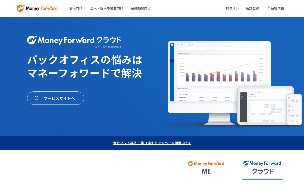
https://moneyforward.com
Screenshot of moneyforward.com
40of 100
F

The hero is doing two jobs at once and succeeding at neither — the Cloud hero dominates the viewport while ME is buried below the fold, yet the nav already splits audiences. The single CTA 'サービスサイトへ' sends users to another site instead of converting them here, and there are zero testimonials, customer counts, or trust signals anywhere on the page.

Your action plan

Ordered by conversion impact. Click any fix to see the before → after.

1
Split hero into two audience lanes above the fold
High ImpactSome WorkHero section — single blue panel showing only Cloud messaging with one CTA
Currently
One hero for Cloud only; ME audience must scroll past fold to find their product
Recommended
Two-column hero: left column for ME (consumer) with app download CTA, right column for Cloud (SMB) with free trial CTA — both visible at 1280px without scrolling
Audience segmentation at the hero reduces bounce by eliminating the wrong-audience mismatch; Nielsen research shows users decide relevance within 10 seconds

Copy rewrites

Ready to use

Drop-in replacements for your highest-leverage text. Each rewrite explains the conversion principle behind it.

Hero headline
バックオフィスの悩みはマネーフォワードで解決
経理・人事・請求書をひとつにまとめて、バックオフィスを自動化
Specificity principle — naming concrete pain points (経理、人事、請求書) outperforms vague category language; also improves SEO relevance
Primary CTA button
サービスサイトへ
無料で試してみる
Action-oriented, benefit-forward CTA with zero friction framing; removes the external-link ambiguity of the current label
Meta description (also usable as hero subhead)
すべての人のお金のプラットフォーム
XX万社が選ぶクラウド会計・バックオフィスソフト
Social proof + specificity; replaces abstract platform language with a concrete credibility signal that works both as subhead and SEO snippet
💡

The killer move

High Impact
Implement a 3-question audience router as the hero interaction

Replace the static dual-product layout with a brief interactive selector — company size, current pain point, individual vs business — that routes visitors to a personalized landing experience; this mirrors what Notion and Freee do and directly addresses the dual-audience problem that is currently costing conversions on both sides.

How visitors experience your page

Second-by-second walkthrough.

2 mixed3 weak
0-3 secondsMixed
0-3s first impression: Blue hero with Cloud logo, large Japanese headline, ghost CTA button, product screenshot on right
SMB visitors recognize the category quickly but consumer/ME visitors see nothing relevant — split attention risk is high and the ghost button reads as low-priority
3-8 secondsWeak
3-8s value scan: Headline, single CTA, campaign banner below hero, then ME vs Cloud tab selector
No supporting copy, no benefit bullets, no social proof — visitor has no reason to trust or act; campaign banner feels promotional not reassuring
8-15 secondsMixed
8-15s exploration: ME and Cloud product cards with さらに詳しく links, product screenshots
Audience routing finally becomes clear but requires scrolling; SMB visitors who landed for Cloud have already been asked to leave via the external CTA
15-30 secondsWeak
15-30s consideration: Massive product list grid — 30+ Cloud sub-products across 8 categories
The product taxonomy dump overwhelms rather than guides; no pricing, no comparison, no recommended starting point — decision paralysis likely
30+ secondsWeak
30s+ decision: Full product list, decorative lifestyle photo (woman smiling), footer
No closing CTA, no testimonials, no urgency mechanism — visitors who reach the bottom have no prompt to act and the lifestyle image adds no conversion value

Health check

8 dimensions, weighted by conversion impact.

First impression & hero
20%
5/10
Hero is visually clean but serves only one of two audiences and the sole CTA redirects off-site
Copy & messaging
20%
4/10
Headline is vague, no benefit bullets, no quantified claims — reads like a brand tagline not a conversion page
Call-to-action
15%
3/10
Ghost button linking externally is the primary CTA; no free trial, no urgency, no secondary conversion path above fold
Trust & social proof
15%
2/10
Zero testimonials, zero customer counts, zero logos — confirmed by metadata; a SaaS homepage without social proof in 2024 is a conversion liability
Visual design & layout
10%
6/10
Clean blue brand palette, good product screenshot placement, but lifestyle photo below fold adds no conversion value
Page structure & flow
8%
4/10
Audience split happens too late (below fold); product list is an unsorted wall of links with no hierarchy or recommended path
Technical & SEO signals
7%
8/10
PageSpeed 96, LCP 1.7s, CLS 0.00 — technically excellent; 10 images missing alt text is the only flag
Differentiation & positioning
5%
4/10
No competitive differentiation stated; すべての人のお金のプラットフォーム is too abstract to create preference over competitors

Page speed

Based on real Chrome user data
96/100
Overall score
Combined performance rating
1.7 s
Largest paint
Time until the main content is visible
0.00
Layout shift
How much the page moves while loading
1.6 s
First paint
Time until something first appears
38 ms
Responsiveness
How fast the page reacts to clicks

Want mobile analysis and fresh re-runs?

Buy roasts to unlock mobile analysis, re-analyze on demand, and more for moneyforward.com.

See roast packs →