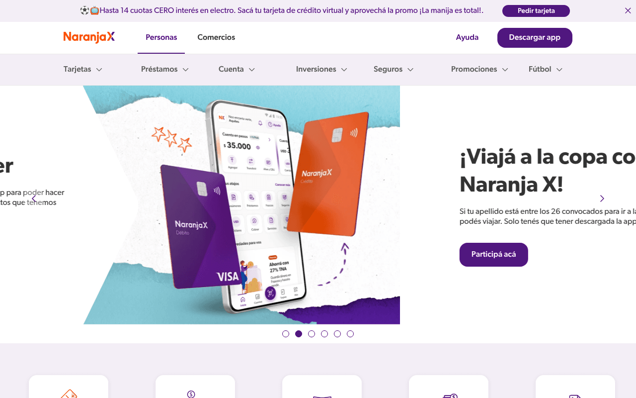
https://naranjax.com
Screenshot of naranjax.com
45of 100
D

The hero is a rotating carousel with the primary slide showing a Copa promotion that buries the core value proposition — a new visitor sees 'Viajá a la copa con Naranja X' before understanding what Naranja X even is. The left-side hero copy is literally cropped off-screen at 1280px, and there's no H1 anywhere on the page, which is both an SEO and clarity catastrophe for a fintech competing on trust.

Your action plan

Ordered by conversion impact. Click any fix to see the before → after.

1
Replace carousel hero with static value-prop hero
High ImpactSome WorkHero carousel (slide 2 visible: Copa promotion)
Currently
Rotating carousel leading with Copa travel promo, core brand copy cropped off-screen left
Recommended
Static hero with headline 'Una cuenta digital gratis para manejar tu plata' + subhead listing 3 key benefits + single primary CTA 'Descargar app gratis'
Carousels reduce conversion by 20-40% (Nielsen Norman Group); rotating banners are ignored like ads. The primary value prop is literally invisible at 1280px — this is the single biggest conversion killer on the page.

Copy rewrites

Ready to use

Drop-in replacements for your highest-leverage text. Each rewrite explains the conversion principle behind it.

Meta title / implied hero headline
Naranja X: una cuenta digital GRATIS para manejar tu plata
Naranja X: cuenta digital gratis, tarjeta Visa y préstamos al instante
Specificity — naming concrete products (Visa, préstamos) increases click-through vs. generic 'manejar tu plata' framing
H2: ¿Todavía no tenés tu tarjeta?
¿Todavía no tenés tu tarjeta?
Tu tarjeta Visa sin costo, en tu casa en 72hs
Benefit-first framing with specificity (no cost + delivery time) converts better than a question that implies the visitor is missing out
Announcement bar CTA area
Hasta 14 cuotas CERO interés en electro. Sacá tu tarjeta de crédito virtual y aprovechá la promo ¡La manija es total!.
14 cuotas sin interés en electro — sacá tu tarjeta virtual gratis hoy y usala al instante.
Urgency + specificity; removes slang ('La manija es total') that alienates older demographics and adds 'gratis' + 'al instante' benefit triggers
H2: Un préstamo para hacer lo que se te cante
Un préstamo para hacer lo que se te cante
Préstamos hasta $X en 24hs, sin papeles ni turnos
Specificity principle — concrete amount and timeline outperform vague lifestyle copy for high-intent financial product seekers
💡

The killer move

High Impact
Launch a segmented hero with audience-selector toggle

Add a Personas / Comercios toggle directly in the hero so each audience sees a tailored value prop, CTA, and social proof — this eliminates the mid-page merchant section confusion and can increase qualified conversion rates by 30-50% by matching message to visitor intent from second one.

How visitors experience your page

Second-by-second walkthrough.

2 mixed3 weak
0-3 secondsWeak
0-3s first impression: NaranjaX logo, dual nav CTAs, Copa travel promo carousel slide with 'Participá acá' CTA, product cards below
Visitor cannot determine what NaranjaX is — they see a soccer travel contest, not a fintech value proposition. Brand recognition required to proceed; new visitors likely confused and bounce-prone.
3-8 secondsMixed
3-8s orientation: Carousel dots suggesting multiple slides, quick-action icon row (sacar tarjeta, pedir préstamo, abrir cuenta dólar), scrolling TARJETAS marquee
Quick-action icons provide some orientation but the repeating TARJETAS marquee reads as visual noise. Visitor starts to understand product breadth but still lacks a clear reason to choose NaranjaX over competitors.
8-15 secondsMixed
8-15s evaluation: Tarjeta section with 'Todavía no tenés tu tarjeta?' H2, Plan Z 3-cuotas feature, Pago Flex feature
Product features are presented but without competitive differentiation or pricing anchors. Visitor evaluating whether benefits justify signup friction — no social proof to tip the decision.
15-30 secondsWeak
15-30s consideration: Préstamos section, Cobrar a tu manera (merchant section), blog teaser, impacto positivo section
Page shifts to merchant audience mid-scroll without clear segmentation signal, creating relevance confusion for personal banking visitors. Blog teaser dilutes conversion focus at a critical decision moment.
30+ secondsWeak
30s+ decision: Footer CTA bar 'Descargá la app', extensive footer link grid, legal links
The only bottom-of-page CTA is a small footer bar — no sticky CTA, no final conversion section with testimonials or guarantee. Visitors who scrolled this far are high-intent but get no closing argument to act.

Health check

8 dimensions, weighted by conversion impact.

First impression & hero
20%
4/10
Carousel leads with a Copa contest promo; core value prop is cropped off-screen at 1280px — new visitors cannot identify what NaranjaX offers in the first 3 seconds.
Copy & messaging
20%
5/10
Colloquial Argentine tone is on-brand but specificity is low; no H1, benefit statements lack numbers, and slang like 'lo que se te cante' sacrifices clarity for personality.
Call-to-action
15%
4/10
Two competing nav CTAs, a carousel CTA, and section CTAs create decision paralysis; no sticky CTA and a weak footer close leave high-intent scrollers without a clear next step.
Trust & social proof
15%
3/10
Zero testimonials confirmed by metadata, no user count or app rating visible above fold, no security badges — critical gap for a financial product requiring personal data.
Visual design & layout
10%
6/10
Brand colors are consistent and distinctive; product photography is clean, but the hero crop issue at 1280px and the TARJETAS marquee add visual clutter without conversion value.
Page structure & flow
8%
5/10
Personal and merchant sections are mixed mid-page without clear segmentation; no logical funnel from awareness to conversion — sections feel editorially assembled rather than strategically sequenced.
Technical & SEO signals
7%
5/10
Performance score 79 is acceptable; LCP 2.3s is borderline; missing H1, accessibility score unavailable, and 3 images without alt text are meaningful gaps for a high-traffic fintech homepage.
Differentiation & positioning
5%
4/10
No clear statement of why NaranjaX beats Mercado Pago, Ualá, or traditional banks; features are listed but competitive advantage is never articulated above the fold or anywhere visible.

Page speed

Based on real Chrome user data
79/100
Overall score
Combined performance rating
2.3 s
Largest paint
Time until the main content is visible
0.05
Layout shift
How much the page moves while loading
1.5 s
First paint
Time until something first appears
172 ms
Responsiveness
How fast the page reacts to clicks

Want mobile analysis and fresh re-runs?

Buy roasts to unlock mobile analysis, re-analyze on demand, and more for naranjax.com.

See roast packs →