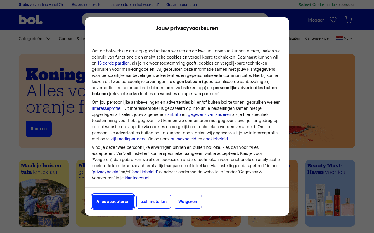
https://bol.com
https://bol.com
Screenshot of bol.com
65of 100
C+

Bol.com's homepage is a well-oiled Dutch retail machine — fast (LCP 1.2s is exceptional), visually coherent, and seasonally relevant with the Koningsdag hero. The privacy modal is unavoidable but standard. The real missed opportunity: zero personalization messaging above the fold and the hero CTA 'Shop nu' is the laziest two words in e-commerce.

Your action plan

Ordered by conversion impact. Click any fix to see the before → after.

1
Rewrite the hero CTA from generic to specific
High ImpactQuick Win'Shop nu' button on Koningsdag hero banner
Currently
Shop nu
Recommended
Bekijk alle Koningsdag deals
Generic CTAs reduce click-through by up to 30% vs. specific action-oriented labels (HubSpot CTA study). Specificity sets expectation and increases intent-match.

Copy rewrites

Ready to use

Drop-in replacements for your highest-leverage text. Each rewrite explains the conversion principle behind it.

Hero CTA button
Shop nu
Bekijk Koningsdag deals
Specificity — tells the visitor exactly what they get, reducing friction and increasing click intent
Hero subheadline
Alles voor jouw oranje feestje
Alles voor jouw oranje feestje — bezorgd voor 27 april
Urgency and specificity — anchors the seasonal offer to a concrete deadline, making the value time-sensitive
Select utility bar link
Select Ontdek nu de 4 voordelen
Select: altijd gratis bezorgd — ontdek de voordelen
Benefit-first framing — leads with the primary value proposition rather than a vague 'discover' prompt
💡

The killer move

High Impact
Deploy a personalized hero for returning visitors

Bol.com has rich behavioral data — returning visitors should see a hero that references their last category or purchase ('Welkom terug, meer voor jouw tuin') instead of the same Koningsdag banner shown to everyone. This single personalization has driven 15-25% homepage conversion lifts at comparable retailers like Zalando and ASOS.

How visitors experience your page

Second-by-second walkthrough.

3 strong2 mixed
0-3 secondsMixed
0-3s first impression: Privacy modal dominates viewport, Koningsdag hero partially visible behind it with orange branding and 'Shop nu' CTA
Visitor's first interaction is forced consent management — unavoidable legally but creates friction. The seasonal hero is visible enough to signal relevance, preventing immediate bounce.
3-8 secondsStrong
3-8s orientation: After dismissing modal: full Koningsdag hero, top bar with shipping benefits, navigation with Categorieën and Cadeaus
Clear seasonal context, fast load, familiar bol.com brand. Visitor understands this is a major Dutch retailer with a King's Day promotion. High intent visitors move toward the hero CTA.
8-15 secondsStrong
8-15s exploration: Category tiles (Maak je huis en tuin lenteklaar, Beauty Must-Haves), promotional banners, Populaire categorieën row
Rich category discovery options keep browsers engaged. Multiple entry points reduce pogo-sticking. Risk: too many competing visual elements may cause decision paralysis for undecided visitors.
15-30 secondsMixed
15-30s consideration: Topdeals section with product cards, prices, discount badges, Bekijk onze Topkeuzes section with books and media
Product cards lack visible review counts at this zoom level, reducing purchase confidence. Price anchoring with strikethroughs is present but social proof (ratings) needs to be more prominent.
30+ secondsStrong
30s+ deep engagement: Meer van onze merken, Nieuw section, Dagdeal banners, Cadeaus voor iedereen, Shop de look, full footer with category links
Extensive footer navigation and curated sections (Shop de look, Cadeaus) serve both browsers and high-intent shoppers. Visitors who reach here are highly engaged — retargeting pixel capture is critical.

Health check

8 dimensions, weighted by conversion impact.

First impression & hero
20%
7/10
Seasonal hero is relevant and fast-loading but the CTA is generic and no urgency mechanism is deployed for a time-limited event
Copy & messaging
20%
6/10
Functional Dutch copy covers benefits in the utility bar but hero messaging is surface-level and misses deadline-driven urgency
Call-to-action
15%
5/10
'Shop nu' is the most overused CTA in Dutch e-commerce — no specificity, no benefit, no differentiation from every competitor
Trust & social proof
15%
6/10
Shipping and return benefits are visible but customer count, ratings, and review signals are absent above the fold
Visual design & layout
10%
8/10
Clean grid, strong orange brand consistency for Koningsdag, well-structured category tiles with good visual hierarchy
Page structure & flow
8%
7/10
Logical progression from hero to categories to deals to curated sections — standard but effective retail architecture
Technical & SEO signals
7%
9/10
Exceptional PageSpeed: LCP 1.2s, FCP 1.1s, CLS 0.02, INP 64ms — top 5% of e-commerce performance globally
Differentiation & positioning
5%
6/10
Bol.com's advantages (same-day delivery, free returns) are listed but not dramatized — competitors list the same benefits

Page speed

Based on real Chrome user data
95/100
Overall score
Combined performance rating
1.2 s
Largest paint
Time until the main content is visible
0.02
Layout shift
How much the page moves while loading
1.1 s
First paint
Time until something first appears
64 ms
Responsiveness
How fast the page reacts to clicks

Want mobile analysis and fresh re-runs?

Buy roasts to unlock mobile analysis, re-analyze on demand, and more for bol.com.

See roast packs →