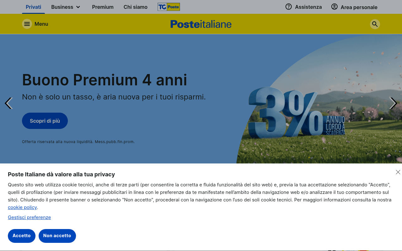
https://poste.it
https://poste.it
Screenshot of poste.it
45of 100
D

Poste Italiane's homepage is a government-portal-meets-supermarket-flyer: the hero leads with a 3% savings bond but buries the rate behind a vague tagline, while a CLS score of 0.57 means the page is literally jumping around on load. The cookie banner obliterates the bottom half of the hero on first visit, and the page tries to sell everything from stamps to insurance simultaneously — a classic case of serving the org chart instead of the customer.

Your action plan

Ordered by conversion impact. Click any fix to see the before → after.

1
Fix catastrophic layout shift before launch
High ImpactSome WorkFull page — CLS score 0.57
Currently
CLS of 0.57, far above Google's 0.1 threshold, causing visible content jumps on load
Recommended
Reserve explicit height/width for hero image, cookie banner, and carousel slots; lazy-load below-fold images with defined dimensions
CLS above 0.25 is rated 'poor' by Google Core Web Vitals and directly harms both SEO rankings and user trust — visitors who see content jump abandon at higher rates

Copy rewrites

Ready to use

Drop-in replacements for your highest-leverage text. Each rewrite explains the conversion principle behind it.

Hero H1
Buono Premium 4 anni
Buono Premium 4 anni: guadagna il 3% annuo lordo garantito
Specificity — embedding the key benefit (rate) in the headline eliminates the need to read the visual and reduces cognitive load
Hero subheadline
Non è solo un tasso, è aria nuova per i tuoi risparmi.
Rendimento garantito da Poste Italiane per 4 anni. Riservato alla nuova liquidità.
Trust and clarity — 'garantito da Poste Italiane' leverages institutional authority; removing the metaphor reduces ambiguity for a financial product
Hero CTA button
Scopri di più
Investi ora al 3%
Action specificity and urgency — ties the CTA directly to the offer's key differentiator, reducing friction and increasing intent signal
Meta description
Poste Italiane vi presenta l´offerta di prodotti e servizi postali, finanziari e assicurativi, disponibili online e negli uffici postali presenti in tutta Italia
Spedisci pacchi, gestisci il conto BancoPosta e investi con Buono Premium al 3% annuo lordo. Tutto online o in ufficio postale.
Specificity and SERP CTR — naming concrete products and the 3% rate gives searchers a reason to click vs. a generic category description
💡

The killer move

High Impact
Implement audience-split hero with intent detection

Poste Italiane serves radically different audiences (retirees saving, SMBs shipping, young adults banking) — a single rotating carousel serves none of them well. Deploy a hero with three persona-based entry points ('Risparmia', 'Spedisci', 'Gestisci il conto') that route users to tailored landing pages, reducing bounce and increasing product-specific conversion rates by eliminating the cognitive tax of a 15-category homepage.

How visitors experience your page

Second-by-second walkthrough.

2 mixed3 weak
0-3 secondsMixed
0-3s: First impression: Dual nav bars, Poste Italiane logo, hero with 'Buono Premium 4 anni' headline, 3% graphic on right, 'Scopri di più' CTA, cookie banner covering lower half of viewport
Brand is immediately recognizable to Italian users; however the cookie banner blocks the CTA area and the rate is only visible in the graphic — visitors may not register the core offer before the banner demands attention
3-8 secondsMixed
3-8s: Orientation: After dismissing cookie banner: full hero, carousel navigation arrows, disclaimer text 'Offerta riservata alla nuova liquidità', search bar for spedizioni, office locator
User understands this is a multi-service portal but the hero carousel creates uncertainty about which offer is primary; the disclaimer is appropriately placed but small — financially literate users will note the 'nuova liquidità' restriction
8-15 secondsWeak
8-15s: Exploration: Servizi in evidenza icon grid (Pagamenti online, Spedisci pacco, etc.), Offerte e promozioni section with PagoPA card, two-column promotional cards (BancoPosta loans, PostePlus delivery)
The page pivots abruptly from savings product to utility services — no narrative thread connects sections. Users with a specific intent (e.g., savings) lose the thread; users browsing feel overwhelmed by category switching
15-30 secondsWeak
15-30s: Evaluation: More promotional cards (Educazione Finanziaria, Il risparmio per la scuola), identity card expiry alert banner, News section with 3 articles
The page is now functioning as a corporate news portal rather than a conversion engine. No pricing, no comparison tables, no social proof visible at this scroll depth — users evaluating financial products have no data to act on
30+ secondsWeak
30s+: Decision or exit: Footer with extensive link grid (Poste Italiane, Area personale, Canali, L'azienda columns), social media icons, VAT number, cookie preferences link
Users who scroll this far are either lost or highly motivated researchers. No sticky CTA, no chat widget, no urgency mechanism to recapture attention — high exit probability for undecided visitors

Health check

8 dimensions, weighted by conversion impact.

First impression & hero
20%
5/10
Brand recognition is strong but the 3% rate lives only in the graphic, the cookie banner kills the CTA zone, and dual navbars waste 100px of hero space
Copy & messaging
20%
4/10
Metaphorical subhead ('aria nuova per i tuoi risparmi') sacrifices clarity for poetry on a financial product; 'Scopri di più' is used identically across every card on the page
Call-to-action
15%
3/10
Every CTA reads 'Scopri di più' regardless of product — zero differentiation, zero urgency, and the hero button competes with 10+ identical CTAs below the fold
Trust & social proof
15%
6/10
Poste Italiane's institutional brand carries inherent trust; however no customer ratings, testimonials, or AUM figures appear above the fold to reinforce the financial product pitch
Visual design & layout
10%
6/10
Clean yellow/blue brand palette is consistent; hero image is high quality, but the two-row nav and carousel arrows create visual clutter on a 1280px desktop viewport
Page structure & flow
8%
4/10
Page jumps from savings bond to parcel tracking to loans to financial education with no logical user journey — it serves the org chart, not the customer's decision path
Technical & SEO signals
7%
4/10
Performance score 70 is borderline; CLS of 0.57 is critically poor and will suppress rankings; FCP 981ms and LCP 1.9s are acceptable but CLS alone is a significant liability
Differentiation & positioning
5%
5/10
The 3% rate is a genuine differentiator but it is undersold in copy; the homepage positions Poste as 'everything to everyone' which dilutes the financial product's competitive edge

Page speed

Based on real Chrome user data
70/100
Overall score
Combined performance rating
1.9 s
Largest paint
Time until the main content is visible
0.57
Layout shift
How much the page moves while loading
981 ms
First paint
Time until something first appears
52 ms
Responsiveness
How fast the page reacts to clicks

Want mobile analysis and fresh re-runs?

Buy roasts to unlock mobile analysis, re-analyze on demand, and more for poste.it.

See roast packs →