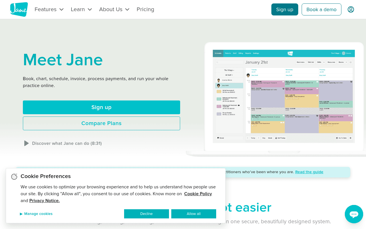
https://jane.app
https://jane.app
Screenshot of jane.app
60of 100
C

Jane has a clean, trustworthy aesthetic and solid feature breadth, but 'Meet Jane' as an H1 is a wasted headline — it tells prospects nothing about why they should care. The hero subhead buries the value prop in a feature list, and with two equally-weighted CTAs side by side, the page hedges its bets instead of driving a clear conversion action.

Your action plan

Ordered by conversion impact. Click any fix to see the before → after.

1
Replace 'Meet Jane' H1 with an outcome-driven headline
High ImpactQuick WinHero H1: 'Meet Jane'
Currently
Meet Jane
Recommended
Run Your Entire Practice Online — Booking, Charting, Billing, and More
Brand-name headlines waste the highest-attention real estate. Outcome-focused headlines increase conversion by communicating immediate relevance — visitors self-qualify in under 3 seconds.

Copy rewrites

Ready to use

Drop-in replacements for your highest-leverage text. Each rewrite explains the conversion principle behind it.

Hero H1
Meet Jane
Run Your Entire Practice Online — Booking, Charting, Billing, and More
Specificity and outcome-orientation: tells the prospect exactly what they get, not just a brand name
Hero subheadline
Book, chart, schedule, invoice, process payments, and run your whole practice online.
One beautifully designed system to handle every part of your practice — so you can focus on your patients.
Benefit-first framing: shifts from feature list to patient-care outcome, which resonates with practitioner identity
Section headline
Everyone's day just got easier
Less admin. More patient time. Jane handles the rest.
Specificity and pain-point targeting: directly addresses the core frustration of health practitioners — administrative burden stealing clinical time
Primary CTA button
Sign up
Start Free — No Credit Card Required
Friction reduction: removing payment anxiety at the CTA level is one of the highest-ROI copy changes in SaaS trial conversion
💡

The killer move

High Impact
Add a practitioner-type selector to the hero to trigger personalized messaging

Replace the generic hero with a simple 3-click selector — 'I am a: Physiotherapist / Chiropractor / Massage Therapist / Other' — that dynamically updates the subheadline, feature highlights, and testimonial to match the visitor's specialty, dramatically increasing relevance and trial conversion for each segment.

How visitors experience your page

Second-by-second walkthrough.

1 strong3 mixed1 weak
0-3 secondsMixed
0-3s First Impression: Clean teal nav, 'Meet Jane' headline, feature subhead, two teal CTAs, product screenshot on right
Visitor sees a polished, professional tool but the headline doesn't immediately communicate who this is for or why it matters — health practitioners may not self-identify instantly
3-8 secondsMixed
3-8s Value Assessment: Subheadline listing features, dual CTAs, video link, product UI screenshot
Feature list subhead reads like a spec sheet; visitor is scanning for 'is this for me?' and finds no practitioner-specific language or social proof to confirm fit — risk of bounce increases
8-15 secondsStrong
8-15s Credibility Check: Banner about New Practice Guide, 'Everyone's day just got easier' section, four feature icons (Booking, Schedule, Billing, Chart)
Feature icons with brief descriptions build confidence in breadth; the guide banner signals community and expertise — visitor starts to believe Jane understands their world
15-30 secondsMixed
15-30s Deeper Evaluation: Single testimonial, anytime/anywhere section with 24hr graphic, Staff & Owners benefits, patient benefits section
Good benefit segmentation (staff vs patients) but only one testimonial with no photo or rating — visitor wants more peer validation before committing to a demo or trial
30+ secondsWeak
30s+ Decision Point: Problem-solver section, booking UI screenshot, newsletter signup, footer with full feature list
No repeat CTA or urgency mechanism at page bottom; visitor who scrolled this far is highly qualified but gets a newsletter form instead of a strong trial/demo push — conversion opportunity wasted

Health check

8 dimensions, weighted by conversion impact.

First impression & hero
20%
6/10
Visually clean and professional but 'Meet Jane' headline wastes prime real estate and dual equal-weight CTAs create decision friction
Copy & messaging
20%
6/10
Feature-list subhead and generic section headlines miss the opportunity to speak directly to practitioner pain points and outcomes
Call-to-action
15%
5/10
Two equal-weight CTAs in hero with no friction-reducing language; no repeat CTA at page bottom for high-intent scrollers
Trust & social proof
15%
5/10
Single testimonial mid-page with no photo, no customer count, no ratings or logo strip — insufficient for a SaaS purchase decision
Visual design & layout
10%
8/10
Consistent teal brand, clean typography, good use of product screenshot in hero — design is a genuine competitive asset
Page structure & flow
8%
6/10
Logical feature-to-benefit flow but no sticky CTA, no urgency mechanism, and newsletter form at bottom instead of trial push
Technical & SEO signals
7%
9/10
Exceptional PageSpeed score of 94 with 829ms FCP and 951ms LCP — technical performance is best-in-class and a real conversion advantage
Differentiation & positioning
5%
5/10
No clear articulation of what makes Jane different from competitors like Cliniko or SimplePractice — 'beautifully designed' is not a defensible moat

Page speed

Based on real Chrome user data
94/100
Overall score
Combined performance rating
951 ms
Largest paint
Time until the main content is visible
0.00
Layout shift
How much the page moves while loading
829 ms
First paint
Time until something first appears
61 ms
Responsiveness
How fast the page reacts to clicks

Want mobile analysis and fresh re-runs?

Buy roasts to unlock mobile analysis, re-analyze on demand, and more for jane.app.

See roast packs →