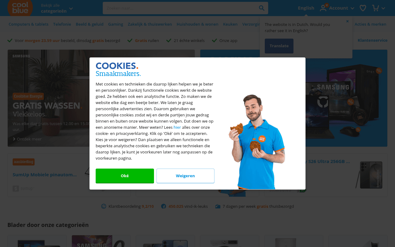
https://coolblue.nl
https://coolblue.nl
Screenshot of coolblue.nl
65of 100
C+

Coolblue is a well-oiled retail machine with strong trust signals — 9.2/10 rating and 450K Facebook likes visible above fold — but the homepage hero is buried under two simultaneous overlays (cookie banner + language prompt), meaning the first thing most visitors experience is friction, not the 'Alles voor een glimlach' promise. The GRATIS WASSEN hero is a missed opportunity: a service promotion where a product deal would convert harder.

Your action plan

Ordered by conversion impact. Click any fix to see the before → after.

1
Eliminate overlay collision at first paint
High ImpactSome WorkCookie modal + language translation tooltip appearing simultaneously over hero
Currently
Both the cookie consent modal and the 'Would you rather see it in English?' tooltip fire at the same time, fully obscuring the hero banners
Recommended
Sequence these: show language prompt first (top bar, non-modal), then trigger cookie banner only after dismissal or 3-second delay; never stack two interruptions
Simultaneous overlays increase cognitive load and bounce rate; Nielsen Norman Group research shows stacked interruptions reduce task completion by up to 40%

Copy rewrites

Ready to use

Drop-in replacements for your highest-leverage text. Each rewrite explains the conversion principle behind it.

Meta description
Beste webwinkel 2022. Voor 23.59u besteld? Morgen gratis bezorgd. Ook op zondag! Gratis retourneren.
Beste webwinkel van Nederland. Voor 23.59u besteld, morgen gratis bezorgd — ook op zondag. Klantbeoordeling 9,2/10. Gratis retourneren.
Specificity and social proof: adding the 9.2/10 rating to the meta description increases CTR from search results; also removes the outdated 2022 claim
Hero banner headline
GRATIS WASSEN Vlekkeloos.
Gratis bezorgd. Gratis geruild. 9,2/10 klanten bevelen ons aan.
Social proof and value proposition clarity: replaces a niche service hook with Coolblue's core differentiators that apply to every visitor
Trust bar delivery promise
Voor morgen 23.59 uur besteld, dinsdag gratis bezorgd
Vandaag voor 23.59u besteld? Morgen gratis in huis — ook op zondag.
Urgency and specificity: second-person framing and Sunday delivery callout increase perceived value; removes the day-specific hardcoding that requires daily updates
Category section heading
Blader door onze categorieën
Wat zoek je vandaag?
Visitor-centric framing: shifts from brand-centric browse language to intent-matching language, reducing decision friction and improving engagement with the category grid
💡

The killer move

High Impact
Personalize the hero banner by detected device category intent

Coolblue has the traffic volume and category breadth to A/B test hero banners segmented by referral source or on-site behavioral signals — a visitor arriving from a Samsung ad should see a Samsung hero, not a washing service. Even a simple returning-visitor cookie that surfaces recently viewed categories in the hero slot would measurably lift click-through to product pages versus the current one-size-fits-all promotional banner approach.

How visitors experience your page

Second-by-second walkthrough.

2 strong2 mixed1 weak
0-3 secondsWeak
0-3s: First paint: Coolblue logo, nav bar, search field — then immediately two overlapping interruptions: cookie consent modal with Coolblue employee mascot and language translation tooltip
Visitor's first emotional experience is friction, not the brand promise. Two simultaneous overlays signal poor UX governance and likely increase immediate bounces among impatient shoppers
3-8 secondsMixed
3-8s: After dismissing overlays: Hero banners (GRATIS WASSEN left, Gaming Deals right), trust bar with delivery/returns/stores/app icons, product deal cards below
Gaming Deals banner is strong and product-focused; GRATIS WASSEN is confusing as a primary hero. Trust bar is excellent but partially missed due to overlay delay. Visitor likely scrolls to find products
8-15 secondsStrong
8-15s: Scanning mid-page: Category grid, brand spotlights (Eufy, Apple, Wisberg), Gaming Deals product carousel with prices and ratings
Product carousels with visible ratings and prices are highly effective; brand world sections add depth. Visitor with clear intent finds navigation intuitive and likely clicks into a category
15-30 secondsMixed
15-30s: Deeper exploration: Gaming Deals products with crossed-out RRP prices, Coolblue Energie cross-sell section, Best Verkocht carousel
Coolblue Energie section interrupts the product shopping flow with a utility service cross-sell — relevant for existing customers but confusing for first-time visitors in purchase mode
30+ secondsStrong
30s+: Footer and trust signals: Klantbeoordeling 9,2/10, 450.025 Facebook likes, 7 days free delivery trust icons, footer with extensive link categories and payment method logos
Footer trust signals are comprehensive and the payment method icons reduce checkout anxiety. However, placing the strongest social proof (9.2/10) this far down the page is a structural conversion mistake

Health check

8 dimensions, weighted by conversion impact.

First impression & hero
20%
5/10
Strong brand identity and good hero content are immediately undermined by simultaneous cookie modal and language overlay that obscure everything on first load
Copy & messaging
20%
7/10
Delivery promise copy is clear and specific; product descriptions in carousels are benefit-led; meta description is outdated with 2022 claim still live
Call-to-action
15%
6/10
CTAs like Ontdek meer and Bekijk alle deals are present but generic; no urgency-driven or personalized CTAs visible above fold
Trust & social proof
15%
8/10
9.2/10 rating, 450K Facebook likes, 21 physical stores, and star-rated product reviews are all present — placement below fold is the only structural weakness
Visual design & layout
10%
8/10
Clean orange brand system, consistent iconography, well-structured grid layouts; the Coolblue employee mascot in the cookie modal is a charming brand touch
Page structure & flow
8%
6/10
Logical category-to-brand-to-deals flow but Coolblue Energie cross-sell mid-page disrupts purchase momentum for product shoppers
Technical & SEO signals
7%
7/10
PageSpeed 91 with LCP 2.0s and CLS 0.04 are excellent; 19 images missing alt text and zero accessibility/SEO scores in PageSpeed data are concerns
Differentiation & positioning
5%
7/10
Alles voor een glimlach positioning is distinctive in Dutch retail; physical store count and same-day delivery are genuine differentiators but underplayed in hero messaging

Page speed

Based on real Chrome user data
91/100
Overall score
Combined performance rating
2.0 s
Largest paint
Time until the main content is visible
0.04
Layout shift
How much the page moves while loading
1.7 s
First paint
Time until something first appears
68 ms
Responsiveness
How fast the page reacts to clicks

Want mobile analysis and fresh re-runs?

Buy roasts to unlock mobile analysis, re-analyze on demand, and more for coolblue.nl.

See roast packs →