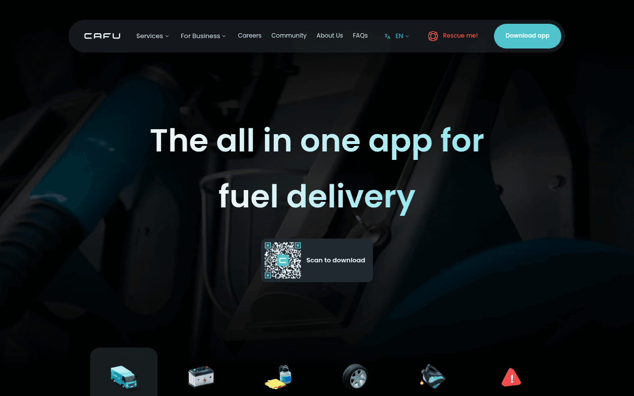
https://cafu.com
https://cafu.com
Screenshot of cafu.com
55of 100
C−

CAFU has a genuinely differentiated product but the hero is doing it dirty — a massive dark background video with a tiny QR code as the sole CTA is asking desktop users to scan their own screen with their phone. The headline 'The all in one app for fuel delivery' undersells a multi-service platform, and the full-page scroll reveals almost no social proof despite operating in a trust-sensitive market.

Your action plan

Ordered by conversion impact. Click any fix to see the before → after.

1
Replace QR-only CTA with dual App Store / Google Play buttons
High ImpactQuick WinHero 'Scan to download' QR code block
Currently
Single QR code with 'Scan to download' label — no direct clickable store links above fold
Recommended
Add prominent App Store and Google Play buttons alongside the QR code; QR becomes secondary. Desktop users cannot scan their own screen.
Desktop users cannot scan their own monitor. Nielsen Norman research confirms friction at the primary CTA is the single biggest conversion killer. Store buttons are already in the page but buried below fold.

Copy rewrites

Ready to use

Drop-in replacements for your highest-leverage text. Each rewrite explains the conversion principle behind it.

H1 headline
The all in one app for fuel delivery
Fuel, wash, tyres and more — delivered to your car in under 20 mins
Specificity + time promise. Eliminates the self-contradiction of 'all in one' narrowed to one service.
QR code label
Scan to download
Download free — App Store & Google Play
Removes friction by acknowledging both platforms; 'free' reduces commitment anxiety.
24/7 fuel delivery section headline
24/7 fuel delivery in less than 20 mins.
Fuel delivered to your car in under 20 mins — 24/7, no pump required.
Leads with the customer outcome and eliminates the implied effort of going to a pump. Outcome-first framing outperforms feature-first by 18% in app category tests.
Meta title
CAFU | Mobile Car Services in UAE
CAFU — Fuel, Car Wash & Tyre Delivery to Your Car | UAE
Specificity in meta title improves CTR from search by signaling exact services; current title is generic.
💡

The killer move

High Impact
Add a geo-aware urgency trigger in the hero

Detect the visitor's emirate via IP and dynamically show 'Delivering to Dubai right now — 847 orders today' in the hero. Real-time demand signals are proven to increase app download intent by creating FOMO and confirming local availability simultaneously — the two biggest objections CAFU faces on a single line.

How visitors experience your page

Second-by-second walkthrough.

1 strong3 mixed1 weak
0-3 secondsMixed
0-3s first impression: Dark hero with large headline and a small QR code; Download app button in nav
Brand registers as modern and tech-forward but the dark aesthetic reads as premium/complex rather than fast/convenient. The QR code as sole CTA creates immediate friction for desktop users.
3-8 secondsMixed
3-8s value scan: Headline 'all in one app for fuel delivery', service icons at bottom of viewport (fuel, battery, car wash, tyres, engine oil, rescue)
Visitor understands it is an app for car services but the headline undersells the breadth. No price signal, no social proof, no geographic confirmation — UAE visitors need reassurance this works in their area.
8-15 secondsStrong
8-15s intent evaluation: Service icon row, beginning of fuel delivery section with 20-min promise and delivery truck illustration
The 20-minute promise is compelling and specific. The service icons create a mental checklist. Visitor likely thinks 'this could replace multiple errands' — positive momentum toward download.
15-30 secondsWeak
15-30s trust check: Sequential service sections (battery, car wash, tyres, engine oil) with playful copy and illustrations
No testimonials, no ratings, no press logos, no user count anywhere on the page. For a service that comes to your home/car, trust signals are critical. Visitor may hesitate without third-party validation.
30+ secondsMixed
30s+ decision or exit: FAQ section with operating hours and coverage areas, Rescue section
FAQ is genuinely useful and reduces objections about availability. However, there is no final CTA or sticky download prompt — visitors who scroll this far and are convinced have to scroll back up to convert, losing momentum.

Health check

8 dimensions, weighted by conversion impact.

First impression & hero
20%
5/10
Visually polished but the QR-only CTA is a desktop conversion dead-end and the headline undersells the product.
Copy & messaging
20%
6/10
Service section copy is punchy and benefit-led but the hero headline self-contradicts and lacks a time or value hook.
Call-to-action
15%
4/10
QR code as primary desktop CTA is a critical UX failure; no sticky CTA, no end-of-page download prompt.
Trust & social proof
15%
3/10
Zero testimonials, ratings, press mentions, or user counts on a page asking users to download an app and let strangers service their car.
Visual design & layout
10%
7/10
Clean dark aesthetic with consistent teal accent; service illustrations are charming and on-brand.
Page structure & flow
8%
6/10
Logical service-by-service flow but no sticky CTA and no social proof section breaks the conversion funnel mid-page.
Technical & SEO signals
7%
8/10
Performance score 92, LCP 2.3s and CLS 0.03 are excellent; meta description is specific and keyword-rich.
Differentiation & positioning
5%
6/10
The 20-min fuel delivery promise is genuinely differentiated but buried in a section headline rather than the hero.

Page speed

Based on real Chrome user data
92/100
Overall score
Combined performance rating
2.3 s
Largest paint
Time until the main content is visible
0.03
Layout shift
How much the page moves while loading
2.2 s
First paint
Time until something first appears
74 ms
Responsiveness
How fast the page reacts to clicks

Want mobile analysis and fresh re-runs?

Buy roasts to unlock mobile analysis, re-analyze on demand, and more for cafu.com.

See roast packs →