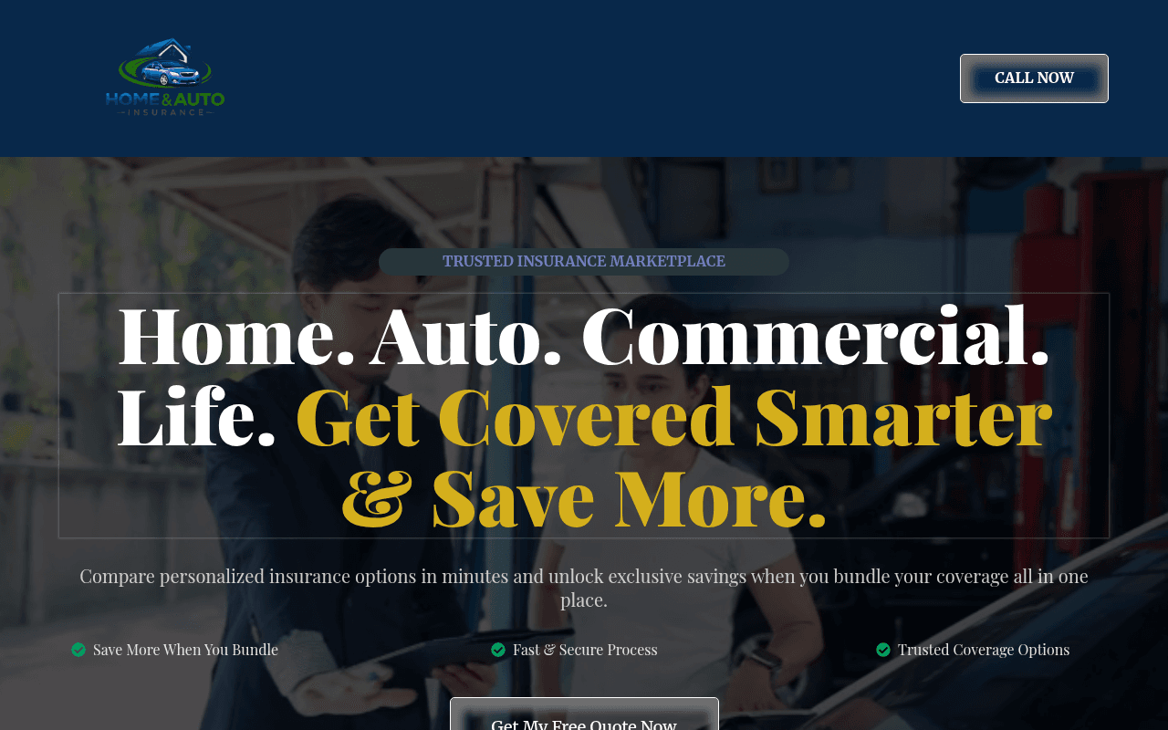
https://Theinsurancefinder.ca
Screenshot of theinsurancefinder.ca
55of 100
C−

The hero headline is massive and bold but the CTA button is half-buried below the fold at 1280px — the one job of a lead-gen page is to get the click, and it's failing at first glance. Social proof numbers (10K+ customers, $8M+ saved) appear with zero verification or carrier logos, making them feel invented. No meta title or description means this page is essentially invisible to Google.

Your action plan

Ordered by conversion impact. Click any fix to see the before → after.

1
Surface the CTA button above the fold
High ImpactQuick WinGet My Free Quote Now button — currently below the fold at 1280px viewport
Currently
Button appears after hero text and three trust badges, requiring scroll
Recommended
Move the CTA button directly beneath the subheadline, above the three trust badges, so it is fully visible without scrolling at 1280px
Above-the-fold CTA placement is the single highest-leverage change on any lead-gen page — Nielsen Norman Group data shows users spend 57% of viewing time above the fold

Copy rewrites

Ready to use

Drop-in replacements for your highest-leverage text. Each rewrite explains the conversion principle behind it.

Hero subheadline
Compare personalized insurance options in minutes and unlock exclusive savings when you bundle your coverage all in one place.
Compare quotes from top Canadian insurers in under 2 minutes — bundle home, auto, and more to save up to 25%.
Specificity and urgency: adds time commitment, geographic relevance, and a concrete savings figure to reduce friction
Social proof section headline
Trusted by Thousands of Canadian Resident
Trusted by 10,000+ Canadians Who Stopped Overpaying
Social proof specificity: replaces vague claim with the exact number already on the page, making it feel earned rather than asserted
Mid-page CTA section headline
Stop Overpaying for Insurance
You Could Be Saving Up to 25% — Find Out in 2 Minutes
Benefit specificity and urgency: transforms a generic command into a personalized value proposition with a low time-cost commitment
FAQ section headline
Any Questions? We've Got Answers...
Common Questions Before You Get Your Free Quote
Conversion framing: anchors the FAQ to the next action rather than treating it as a standalone section, maintaining momentum toward the CTA
💡

The killer move

High Impact
Add an inline quote estimator widget above the fold

Replace the static CTA button with a 3-field inline form (postal code, coverage type, current insurer) directly in the hero — this micro-commitment technique reduces perceived friction, captures lead data immediately, and has been shown to increase insurance lead-gen conversion rates by 40-60% versus a single button CTA.

How visitors experience your page

Second-by-second walkthrough.

1 strong2 mixed2 weak
0-3 secondsMixed
0-3s first impression: Large dark navy header, massive serif headline in white and gold, blurred garage background, CALL NOW button top right
Brand and category are clear but the garage background creates mild confusion — visitor registers insurance but the visual context feels off; no CTA is visible without scrolling
3-8 secondsMixed
3-8s value scan: Subheadline about comparing in minutes, three trust badges (Save More, Fast & Secure, Trusted Coverage), partially visible CTA button
Value proposition is readable but the CTA is cut off — motivated visitors will scroll but fence-sitters may not; the three badges are generic and add little differentiation
8-15 secondsStrong
8-15s consideration: One Platform section, 25% savings stat, Bundle & Save explanation, four insurance type cards with Get Started Now buttons
The 25% savings figure and four clear product lanes give visitors a concrete reason to act and an easy self-selection path — this is the strongest section on the page
15-30 secondsWeak
15-30s trust evaluation: 10K+ customers, $8M+ saved, 4.9 star rating — all unverified; Stop Overpaying CTA block
Numbers feel fabricated without logos, review platform attribution, or testimonial quotes — high-intent visitors in insurance will scrutinize these claims and may bounce
30+ secondsWeak
30s+ decision: Three-item FAQ with thin answers, footer with domain name and copyright
Only three FAQ items with shallow answers and no exit-intent capture or phone number reinforcement — visitors who reached this point without converting are lost with no recovery mechanism

Health check

8 dimensions, weighted by conversion impact.

First impression & hero
20%
6/10
Bold headline and clear category but CTA is below fold and background image undermines the message
Copy & messaging
20%
6/10
Benefit-led language is present but lacks specificity, Canadian context, and urgency throughout
Call-to-action
15%
5/10
Multiple CTAs exist but the primary one is below fold and button hierarchy is inconsistent across sections
Trust & social proof
15%
4/10
Stats are present but completely unverified — no carrier logos, no review platform badges, no real testimonials
Visual design & layout
10%
6/10
Clean dark-navy palette and readable typography but hero image is misaligned with the insurance bundling message
Page structure & flow
8%
6/10
Logical top-to-bottom funnel but FAQ section is underdeveloped and there is no recovery mechanism at page bottom
Technical & SEO signals
7%
5/10
PageSpeed 79 and missing meta title and description are significant gaps for an organic-dependent lead-gen site
Differentiation & positioning
5%
5/10
Marketplace positioning is stated but not proven — no carrier names, no comparison tool preview, no unique mechanism shown

Page speed

Tested via Google Lighthouse
79/100
Overall score
Combined performance rating
1.5 s
Largest paint
Time until the main content is visible
0.102
Layout shift
How much the page moves while loading
1.0 s
First paint
Time until something first appears
1.5 s
Interactive
Time until the page is fully usable
Accessibility: 94SEO: 82Best Practices: 100

Want mobile analysis and fresh re-runs?

Buy roasts to unlock mobile analysis, re-analyze on demand, and more for theinsurancefinder.ca.

See roast packs →