https://nodum.si
https://nodum.si
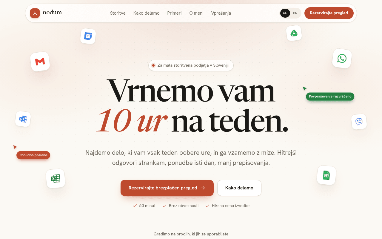
Screenshot of nodum.si
70of 100
B−

“The hero headline 'Vrnemo vam 10 ur na teden' is genuinely compelling and the floating tool icons are a smart visual metaphor — but zero testimonials on a trust-dependent consulting offer is a critical gap. Jan Ročnik's founder section is buried at the bottom when his credibility (OMV project, SCADA systems) should be doing heavy lifting much earlier.”

Your action plan

Ordered by conversion impact. Click any fix to see the before → after.

1
Add social proof above the fold or immediately below hero
▲ High ImpactQuick WinHero section — below the two CTA buttons
▾
Currently
60 minut | Brez obveznosti | Fiksna cena izvedbe (checkmarks only)
Recommended
Replace or supplement checkmarks with a short client quote and name/company, e.g. 'Prihranili smo 12 ur na teden že v prvem mesecu. — Ime Priimek, Podjetje d.o.o.'
Edelman Trust data: peer validation is the #1 trust driver for service purchases. A consulting offer with zero testimonials forces visitors to take a leap of faith — the checkmarks reduce friction but don't build belief.
✎

Copy rewrites

Ready to use

Drop-in replacements for your highest-leverage text. Each rewrite explains the conversion principle behind it.

Hero subheadline
Najdemo delo, ki vam vsak teden pobere ure, in ga vzamemo z mize. Hitrejši odgovori strankam, ponudbe isti dan, manj prepisovanja.
Najdemo, kateri procesi vam kradejo cas, in jih avtomatiziramo v 1 do 3 tednih. Brez novih programov. Brez ucenja. Sistem dela sam.
Specificity and objection handling — naming the timeline (1-3 weeks) and pre-empting the two biggest objections (new tools, learning curve) increases conversion by reducing perceived risk.
Process section headline
Brez mesecev analiz. En pogovor, jasen nacrt in sistem, ki dela.
Od prvega pogovora do delujocega sistema v manj kot 3 tednih.
Concreteness principle — replacing abstract promise with a specific timeframe gives prospects a mental commitment anchor and reduces the perceived cost of starting.
Services section headline
Izberite tezavo. Mi jo vzamemo z mize.
Katera od teh tezav vam vsak teden vzame vec kot 3 ure?
Pattern interrupt and self-qualification — turning the headline into a question activates the visitor's own pain recognition, increasing engagement with the problem cards below.
Primary CTA button
Rezervirajte brezplacen pregled
Rezervirajte brezplacen 60-minutni pregled
Specificity reduces anxiety — naming the duration (60 minut is already in the checkmarks but not in the button) makes the commitment feel bounded and manageable, a proven micro-conversion tactic.
💡

The killer move

High Impact
Add a live time-savings calculator to the hero section

A simple interactive widget — 'Koliko ur na teden izgubite?' with 3 sliders (povprasevanja, ponudbe, porocila) that outputs a personalized 'Prihranite X ur in Y EUR/mesec' — would transform passive reading into active self-qualification, dramatically increasing CTA click rates and pre-qualifying leads before the free call.

How visitors experience your page

Second-by-second walkthrough.

3 strong1 mixed1 weak
✓
0-3 secondsStrong
0-3s First impression: Large serif headline 'Vrnemo vam 10 ur na teden' with italic red accent, floating tool icons (Gmail, WhatsApp, Excel), warm beige background, prominent orange CTA button
Visitor immediately grasps the value proposition — time savings — and the tool icons signal familiarity. The niche badge 'Za mala storitvena podjetja v Sloveniji' creates instant relevance for the target audience. Strong first impression.
✓
3-8 secondsStrong
3-8s Subheadline scan: Subheadline about finding time-wasting work, two CTAs, three checkmarks (60 minut, Brez obveznosti, Fiksna cena izvedbe), tool logos row beginning to appear
Checkmarks efficiently handle the three biggest objections to booking a call. Visitor likely thinks 'this sounds low-risk' but immediately wonders 'who is this and has it worked for others?' — no social proof yet creates a trust gap.
✓
8-15 secondsStrong
8-15s Problem recognition: Six problem cards (Povprasevanja cakajo, Ponudbe pisete zvecer, Iste podatke prepisujete trikrat, etc.) with specific pain descriptions and solution teasers
This section is excellent — each card mirrors exact language business owners use internally. Visitor likely nods at 2-3 cards, building emotional resonance. Risk: they want to know if this has actually been solved for someone like them before scrolling further.
◐
15-30 secondsMixed
15-30s Process and credibility evaluation: 4-step process section with timeline graphic, case study cards (Spletna trgovina, ROCNIK-1, Argus, Aurora), founder section with photo
Process section is clear and the fixed-price promise is a strong differentiator. But case study cards lack outcome metrics — visitor cannot quickly assess ROI. Founder section has strong credentials (OMV, SCADA) but appears too late to rescue trust built on faith alone.
✗
30+ secondsWeak
30s+ Decision and conversion: FAQ section, final CTA button (Rezervirajte pregled), no testimonials anywhere on page
Visitor reaches decision point having seen compelling problem framing and a credible process but zero peer validation. For a service requiring trust in a single person, absence of testimonials is the primary conversion killer. Many will leave to 'think about it' and not return.

Health check

8 dimensions, weighted by conversion impact.

First impression & hero
20%
8/10
Headline is specific, benefit-led, and visually dominant; floating tool icons are a clever trust device; niche badge does targeting work efficiently.
Copy & messaging
20%
7/10
Problem cards use authentic customer language effectively; process copy is clear; subheadline could be more specific about timeline and objection handling.
Call-to-action
15%
7/10
Primary CTA is prominent and repeated appropriately; secondary CTA is too low-contrast; button copy could include the 60-minute duration for specificity.
Trust & social proof
15%
3/10
Zero testimonials on a solo-operator consulting offer is a critical conversion gap; case studies exist but lack quantified outcomes; founder credibility is buried.
Visual design & layout
10%
8/10
Warm, professional palette; excellent typographic hierarchy with serif/italic contrast; floating icons add visual interest without clutter; consistent and polished.
Page structure & flow
8%
7/10
Logical problem-solution-process-proof flow; founder section placement is strategically wrong — credibility should appear before case studies, not after.
Technical & SEO signals
7%
10/10
PageSpeed 96 performance, 100 accessibility, 100 SEO — near-perfect technical execution; LCP 1.1s is exceptional; no technical issues to address.
Differentiation & positioning
5%
7/10
Fixed price and fixed scope are genuine differentiators clearly stated; Slovenia-specific targeting is smart; OMV case study is a powerful proof point underutilized in positioning.
⚡

Page speed

Tested via Google Lighthouse
96/100
Overall score
Combined performance rating
1.1 s
Largest paint
Time until the main content is visible
0.003
Layout shift
How much the page moves while loading
1.1 s
First paint
Time until something first appears
1.1 s
Interactive
Time until the page is fully usable
Accessibility: 100SEO: 100Best Practices: 100

Want mobile analysis and fresh re-runs?

Buy roasts to unlock mobile analysis, re-analyze on demand, and more for nodum.si.

See roast packs →