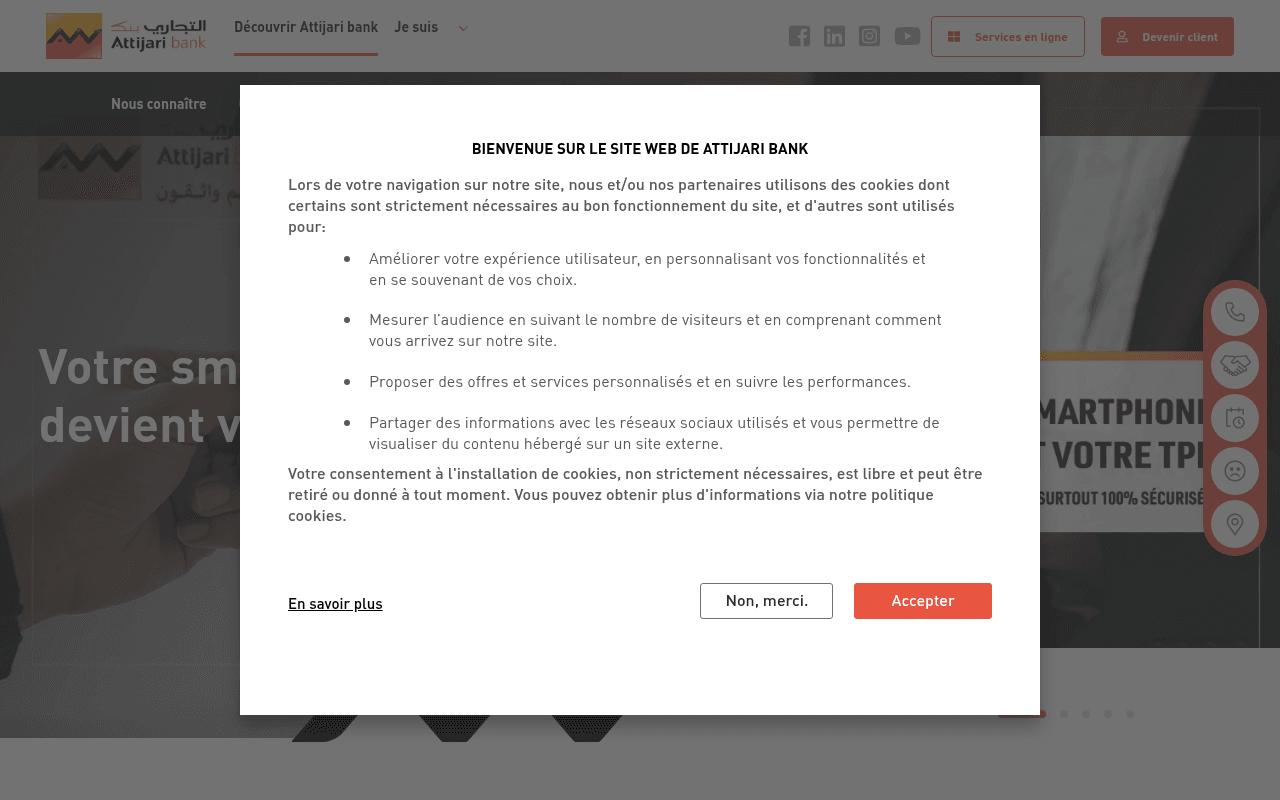
https://www.attijaribank.com.tn
Screenshot of attijaribank.com.tn
40of 100
F

The hero is immediately buried under a verbose cookie modal that reads like a legal brief, while the actual headline 'Votre smartphone devient votre TPE' floats half-obscured behind it. A CLS score of 0.76 — catastrophically bad — means the page visually jumps on load, and there are zero H1 tags on a banking homepage competing for high-intent search traffic.

Your action plan

Ordered by conversion impact. Click any fix to see the before → after.

1
Fix catastrophic CLS score immediately
High ImpactSome WorkPage layout / hero section (CLS: 0.76)
Currently
CLS of 0.76 — far above Google's 0.1 threshold, causing visible layout shifts on load
Recommended
Reserve explicit height/width for all hero images and banner slots; lazy-load below-fold images only; pre-size the cookie modal to prevent reflow
CLS above 0.25 is rated 'Poor' by Google Core Web Vitals and directly harms both SEO rankings and user trust — visitors who see content jumping abandon at significantly higher rates

Copy rewrites

Ready to use

Drop-in replacements for your highest-leverage text. Each rewrite explains the conversion principle behind it.

Hero H2 headline
Votre smartphone devient votre TPE
Gérez, payez et encaissez — tout depuis votre smartphone, 100% sécurisé
Specificity and benefit-led copy: the original states a feature; the rewrite names three concrete actions and adds the security reassurance critical in banking
Nos offres section headline
Qui que vous soyez, nous répondons à vos besoins
Des solutions bancaires pour chaque profil — particulier, professionnel ou entreprise
Specificity: the original is vague and generic; naming the three audience segments immediately helps visitors self-identify and continue scrolling
Meta description
Attijari bank, banque en Tunisie : Qui que vous soyez, nous répondons à vos besoins financiers avec des solutions bancaires digitales fiables et sécurisées
Attijari bank : ouvrez votre compte en ligne, gérez vos finances 24h/24 et accédez à plus de 200 agences en Tunisie. Banque digitale, fiable et sécurisée.
Specificity and action-orientation: adds concrete numbers and a direct action verb to improve CTR from search results pages
Digital services section intro
Vers une nouvelle expérience bancaire à travers une panoplie de services digitaux centrés clients
Simulez un crédit, suivez vos comptes en temps réel et payez en mobile — sans vous déplacer
Concrete over abstract: replaces marketing jargon with three specific use cases that trigger recognition and desire in the target audience
💡

The killer move

High Impact
Launch a personalized landing path from the 'Je suis' nav segment

Each audience segment click (Particulier, Professionnel, TRE, Jeune) should route to a dedicated landing page with a tailored hero, relevant product stack, and a single CTA — not a filtered version of the same homepage. Segment-specific pages convert 2-3x better than generic homepages in financial services because they eliminate irrelevant noise and speak directly to the visitor's situation.

How visitors experience your page

Second-by-second walkthrough.

1 strong2 mixed2 weak
0-3 secondsWeak
0–3s First impression: Full-screen cookie consent modal blocking the hero; partial glimpse of 'Votre smartphone devient votre TPE' headline and a dark hero image behind it
The very first interaction is a legal interruption, not a value proposition. Visitors cannot assess whether this bank is relevant to them before being forced to make a privacy decision — high early abandonment risk
3-8 secondsMixed
3–8s Orientation: After dismissing modal: hero with TPE headline, dual CTAs (Services en ligne / Devenir client), navigation with audience segments under 'Je suis'
The audience segmentation in nav is smart but the hero copy promotes a niche product (TPE payments) rather than a broad value proposition — visitors not interested in mobile POS may feel this bank is not for them
8-15 secondsMixed
8–15s Evaluation: News/events section with 3 articles, then 'Nos offres' with audience filter tabs and product cards
News items (dentist conference, dividend notices) are irrelevant to acquisition-stage visitors and consume prime real estate. The offers section is useful but product names like 'Rezki' and 'Zenith' require explanation — no benefit copy visible at card level
15-30 secondsStrong
15–30s Consideration: Digital services value statement, tools section (simulateur, cours de change, Attijari Bourse), agency finder banner
The tools section is genuinely useful and builds credibility; the agency finder addresses a key objection for offline-preferring customers. This section does real conversion work but arrives too late in the scroll
30+ secondsWeak
30s+ Decision: Footer with full sitemap, social links, legal mentions; no sticky CTA or repeated conversion prompt
Visitors who scroll to the bottom are highly engaged but find no final conversion nudge — no repeated 'Devenir client' CTA, no offer summary, no urgency element. A sticky bottom bar or footer CTA would capture this high-intent segment

Health check

8 dimensions, weighted by conversion impact.

First impression & hero
20%
4/10
Cookie modal dominates the above-fold experience; hero headline promotes a niche product rather than a brand-level value proposition, and zero trust signals are visible
Copy & messaging
20%
4/10
Heavy use of abstract marketing language ('panoplie de services', 'Qui que vous soyez') with few concrete benefits, numbers, or outcome-focused statements
Call-to-action
15%
5/10
'Devenir client' exists but competes equally with 'Services en ligne'; no CTA repetition below the fold and no sticky conversion element for scrollers
Trust & social proof
15%
3/10
No testimonials, no client count, no awards or certifications visible anywhere on the page — critical gap for a financial institution asking for account sign-ups
Visual design & layout
10%
6/10
Clean brand identity with consistent orange palette; hero imagery is professional but the news section breaks visual flow with text-heavy cards before the offers section
Page structure & flow
8%
5/10
News articles appear before product offers, prioritizing PR over conversion; tools and agency finder are buried below multiple content sections
Technical & SEO signals
7%
3/10
Performance score 76 is acceptable but CLS of 0.76 is critically poor; zero H1 tags on the homepage is an unacceptable SEO omission for a major bank
Differentiation & positioning
5%
4/10
No clear articulation of why Attijari over competitors; 'Croire en vous' tagline appears in the slider but is never developed into a substantive differentiator

Page speed

Based on real Chrome user data
76/100
Overall score
Combined performance rating
2.2 s
Largest paint
Time until the main content is visible
0.76
Layout shift
How much the page moves while loading
2.0 s
First paint
Time until something first appears
47 ms
Responsiveness
How fast the page reacts to clicks

Want mobile analysis and fresh re-runs?

Buy roasts to unlock mobile analysis, re-analyze on demand, and more for attijaribank.com.tn.

See roast packs →